The iPhone is closer than ever to disappearing. No, not in a dinosaur kind of way, not even in a Sue Storm kind of way. More like an Obi Wan Kenobi not wanting to be noticed kind of way.
Certainly, the iPhone is in high demand and nowhere near being in danger of losing its popularity. And, at least as of this point, Apple hasn’t figured out how to make it completely transparent. But what it has been working to do—on a number of levels—is to create devices that do everything they can to fade from your attention when you start to use them, like a gadget Jedi mind trick.
Apple has been making small but important decisions here and there since the original iPhone to ensure that as little as possible comes between you and whatever you happen to be interacting with on the screen.
If you look at the discarded prototypes and documentation from the creation of the original iPhone, for instance, you’ll note that a design with a prominent bezel was discarded because it attracted too much attention. And when it came time to update the original iPad, the second iPad’s metal trim was pulled back at the edges like the lips of a cornered cat—tucked away behind the edge of the device so it was invisible from the front during use.
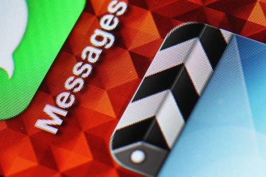
The Retina Display was another step towards the kind of invisibility Apple has been striving for. It removed the pixel from the equation. You see the images on the screen, not the mechanics that make it happen. The Retina MacBook Pro is another inch closer to the laptop ideal, which is a keyboard, touchpad and screen that feature very little other trim or adornment. An ‘invisible’ computer. And the iPhone 4 and newest iPad certainly benefit from the display’s lack of intrusion.
With the iPhone 5, Apple takes another stride in that direction, but it does it on another vector: weight.
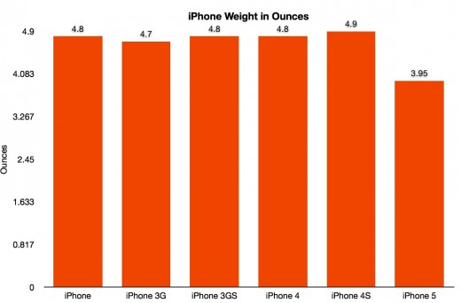
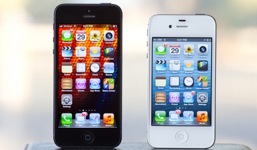
For as much as the screen and possibility of LTE drove the discussion leading up to the release, the lightness of the iPhone 5 has been one of the biggest shocks for me. Previously, the iPhone 3G was the lightest model Apple’s made, and its casing was cheap-feeling plastic. The iPhone 5 beats that out by 3/4 of an ounce and its made of aluminum. Frankly, it’s an insane achievement.
I know that there have been initial reviews and impressions mentioning that it might be ‘too light’, but after having used it for ten days I can tell you that this is not the case. After a while I stopped thinking of it as ‘way lighter’ and instead started thinking of the iPhone 4S as oppressively heavy. The lightness is another way Apple is working to make what appears on the screen your main focal point, allowing everything else to fade away.
The aluminum backing helps a lot in this regard. It warms to your touch quicker than the glass of the iPhone 4S and doesn’t retain heat as long as glass. This means that it rapidly matches the temperature of your hand, removing the feeling of holding a hot or cold brick of technology. It becomes an extension of your palm. I’d expect aluminum to stick around in the iPhone for some time.
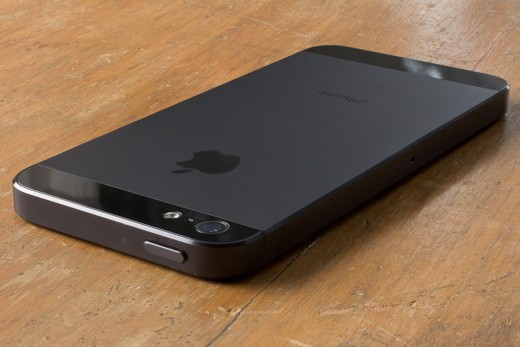
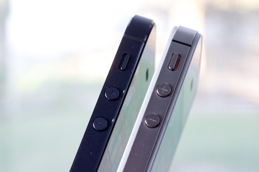
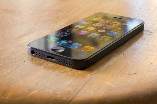
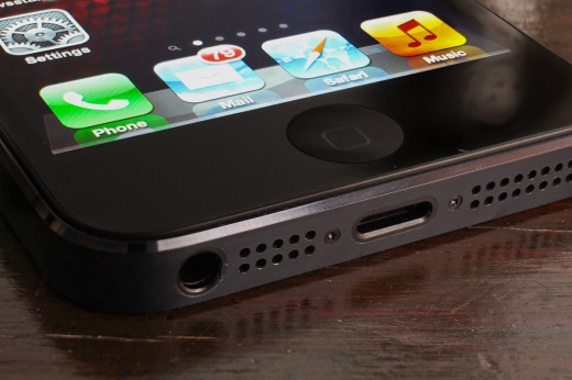
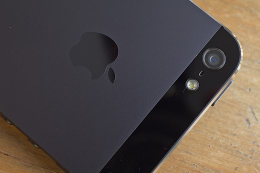
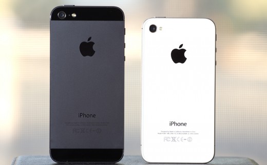
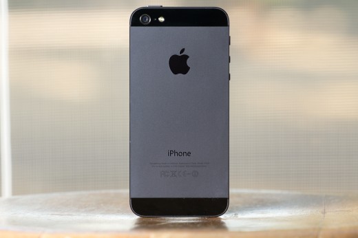
The overall thickness of the iPhone 5 has decreased by 18% from the iPhone 4S as well, which heightens its ability to disappear in your hands. There isn’t much about the newly subtle design of the device (especially in black) that isn’t making some effort to help it disappear, really. The black iPhone 5 is actually so subtle that it’s difficult to photograph without pouring light on it.
And part of that reduction in thickness comes from Apple’s aggressive pursuit of screen quality.
The screen
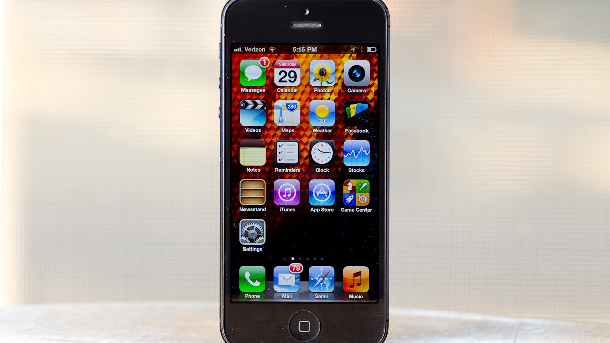
When Apple laminated the touch sensor to the front glass with the iPhone 4, It was hard to think that they could bring the images on the screen any closer to looking like you were directly touching them. They blew that feeling of ‘closeness’ away with the iPhone 5 by integrating the touch sensors and the display panel and then laminating that unified panel to the front glass.
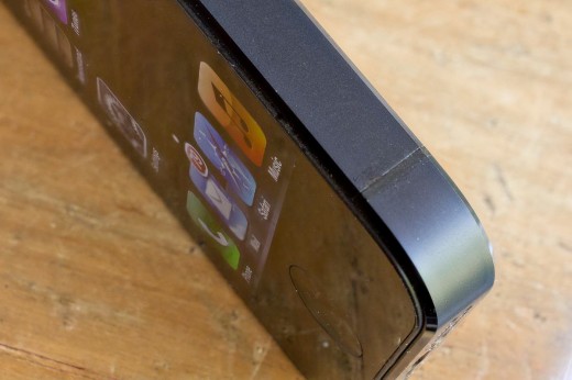
This results in a reduced feeling of ‘gap’ between the glass and panel. When I say reduced, I actually mean pretty much nonexistent. If you turn the iPhone on edge and look at were the gap between glass and panel should be, you can still see a sliver of black, but it’s incredibly tiny. By comparison, the small gap in the iPhone 4S’ display array looks like a canyon, it’s pretty impressive.
This heightens the feeling that you’re manipulating the things that you see on the screen directly, rather than having your touch transmitted through the glass. It’s as close as it can get to holographic projection without it actually jumping out of the screen.
In addition to giving benefits in thickness, this screen is also a combination of manufacturing processes, which means that — in the long run — it will be cheaper and more efficient to make than the older crop of Retina displays.
The color quality is also off the charts. From the first moment you see it you know that this screen is displaying deeper blacks, more accurate colors and more vibrance than ever before. I’ve had the opportunity to look at a massive amount of LCD displays both as a reviewer of gadgets and as a photographer who spent way too much on color-correct displays and testing equipment over the years. I’ve never seen a display this impressive in any device — much less a couple hundred dollar phone.
But you don’t have to take my prose for it, Chris Heinonen at Anandtech ran a bunch of tests with a colorimeter and spectrometer and the results blew most other displays he’d seen away. They did say that there was a $20,000 projector which came close, but I don’t think that’s necessarily in the iPhone’s class.
And the all-important bright-light visibility is great on the iPhone 5 as well. When shooting images to test out the improvements in camera, I had both the iPhone 4S and iPhone 5 at maximum brightness and the 5 clearly outshone (heh) the older display. This should make it easier to use the still very shiny glass screen of the new device in direct sunlight. A lot of this is due to the fact that the iPhone 5 reflects 52% less ambient light than the iPhone 4S due to better coating.
The size of the screen was a worry for me from the first moments that we began hearing rumors about an increase. The 3.5“ screen of the previous iPhone models was far smaller than a lot of Android phones, like the 4.3” Galaxy Nexus or 4.6″ Samsung Galaxy S III, but it made up for it in relative quality and easy one-handed operation. I have a Galaxy Nexus and I constantly make subtle shifts in grip while using it. A slide downwards to reach a button at the top of the screen, a finger crawl to the top to reach a top button and so on. It’s not a lot, but it’s noticeable to a person used to the iPhone’s solid one-handed performance.
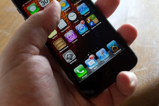
Increasing the size of the screen vertically by 176 pixels has done little to change the way I use or hold the iPhone 5. For the first couple of days I found myself anticipating the need to reach to the top corners of the screen and adjusting my grip to do so. But after ten days or so with it, I no longer shift my beloved ‘pinkie on the bottom’ grip, and I’m able to reach all corners of the screen. It does require more stretching than it used to, but not uncomfortably so. If you try out an iPhone 5 in a store or handle a friends and feel uncomfortable, I’d encourage you to spend a week or so with one before you make the final call, because you get used to it faster than you’d think.
Lightning connector
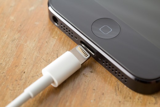
The iPhone 5’s new Lightning connector is a smaller and more clever solution to its decade old 30-pin Dock Cable connector. Introduced with the third generation of iPod, the Dock Connector was intended as a way to offer additional connectivity to third-party devices and, yes, to lock up that ecosystem so that Apple could control the ways that the connector was being used. Lets not kid ourselves that Apple’s motives were completely altruistic when coming up with its original connector or the new Lightning connector.
However, Apple has a proven track record (at least in recent years, though generally always) of not making decisions to lock users down to a certain standard without some tangible benefits. They may make choices that benefit themselves, but they’re never without tradeoffs that also benefit the user. Only the blindly anti-Apple would argue otherwise.
The new connector is radically smaller, with rock-solid construction that even experts are finding tough to disassemble for analysis.
In the case of the Lightning connector, there are some clear advantages over generic connectors like Micro USB. For one, the Lightning connector is reversible, allowing you to forget about trying to align it right before you insert it. Add up those missed seconds over the years and they’re gifting you minutes of confused fumbling back. This is facilitated by the inward bevel of the connection port, which guides it into place when you stab it.
The Micro USB standard also would not allow for full-speed charging of the iPad, which pulls more current than the USB 2 versions of that standard allow. Since the Lightning connector is doubtless coming to the next version of the iPad, they had to think ahead. If Apple wanted to go with a USB 3 compatible controller then there would have been bulky additional chips necessary, increasing the internal volume of the device and likely its thickness.
Those are the tradeoffs that Apple decided to make in order to provide a majority of the connectivity offered by the old 30-pin connector along with a path to the future.
Does it suck that people are going to have to buy one or two extra cables, or adapters that are kind of pricey because they have electronics embedded in them? Yes, absolutely. Is But there was a point when the original iPods switched from Firewire to 30-pin that people had to do that as well. And one connector change in 9 years isn’t too shabby.
And aside from those technical advantages, there’s always the ergonomic bonus that the new dock connector provides.
Camera
Unlike the iPhone 4S, the iPhone 5 does not feature a jump up in resolution. This means that you should be seeing relatively similar images in most lighting conditions, with perhaps a slight improvement in color quality. Tapping to focus and expose in Camera.app has resulted in fairly similar results in my testing, but the iPhone 5 does tend to target mid-tones more aggressively, resulting in more blown highlights. Since it’s a lot quicker now, my advice would be to use HDR more often, as long as your subjects are not in motion.
I shot some video and still image comparisons, but most of them turned out so very similar that I’m not bothering to include them here. You can see from the ones that I have that there’s nothing to complain about with regards to image quality. The iPhone 5 is on the left and iPhone 4S on the right in all of the images in this section, you’ll notice a slight increase in sharpness at times, but that’s likely a software improvement.
And, if you’ve read anything about the iPhone 5 suffering from purple lens flare, the answer is yes, it does. But so does the iPhone 4S and many other compact cameras with coated lens covers. This stray UV light is an unfortunate byproduct of the lens construction here, but it’s not all that much more prominent or frequent than it was in the iPhone 4S, according to my testing:
The major improvement with the iPhone 5 comes in poor or very low light situations. The difference between it and the iPhone 4S is literally between blackened and unusable to passable and from dim and poor to completely respectable. The increase appears to be around two stops, from the iPhone 4S’ maximum of ISO 800 up to a boosted ISO 3200. The increase comes at the cost of more aggressive gain and supersampling, which causes the image to have more of that ‘platelet’ watercolory look that users of Lightroom’s noise reduction slider are familiar with. But the brightness of the image is more than compensation enough for a slightly noisier image.
Simply put, the iPhone 5 can capture an image in situations where you wouldn’t have even bothered to pull your iPhone 4S out of your pocket.
The iPhone 5 retains the fixed f2.4 aperture of the iPhone 4S, which — due to the compressed distance between the objective and sensor — is roughly equivalent to f/18 on a 35mm camera. This means that you still get the massive depth of field compression that you’d get from a much smaller aperture. Unless you’re very close to a subject, both the foreground and background will remain very, very close in focus sharpness.
The sapphire lens cover, which has absolutely nothing to do with the purple flaring above, should provide better scratch protection than the glass in the iPhone 4S, though I had no problems with that to begin with.
Overall, it’s a nice improvement to an already great camera, and the low light utility means that you’ll take it out and use it in more situations than ever.
The front-facing camera’s improved resolution means that you’ll end up with crisper conversations over FaceTime, but the network management of the protocol means that you’ll rarely see that resolution top out. It is nice for local self portraits though.
Performance
The iPhone 5 is quick. It’s kind of difficult to quantify just how fast as there are so many hardware-accelerated elements to iOS that you don’t see a raw performance boost reflected in many day-to-day activities. But a general feeling of quickness is pervasive throughout the phone, even when comparing it to a freshly wiped iPhone 4S. With both devices at a ‘day 1’ state, the iPhone 5 loads and plays videos quicker, renders iOS 6’ vector maps quicker and generally feels…wait for it…snapping turtleier.
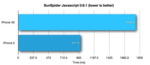
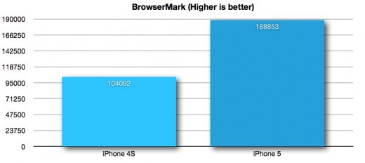
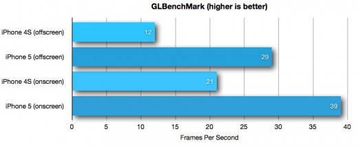
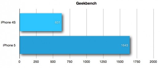
If you like your anecdotal evidence backed up with numbers, here are some tests for you to look at, including Sunspider, which measures JavaScript performance, Browsermark which tests general browser-based rendering prowess, GLbenchmark, which is all about pushing the GPU and Geekbench, which tests processor operations:
Needless to say, the iPhone 5 stomps the iPhone 4S in these tests. A lot of that has to do with the custom-built CPU. Apple’s A6 processor doesn’t just feature a bespoke design, which was the case with all of the previous A-series processors as well. It also features custom cores designed by Apple’s own chip team, likely made up of folks acquired along with P.A. Semi in 2008 and Intrinsity in 2010. A Chipworks examination of the A6 reveals that uses a 32nm HKMG process that results in very low power consumption, and that its cores were laid out by hand, a time consuming and expensive process that speaks to Apple’s commitment to eking out every last bit of performance and power conservation it can from its chips. In many ways, this is the first fully custom CPU Apple has included in its iPhones.
And the battery life suffers nearly no hit from this increase in performance. In my testing, it hit nearly identical life under normal usage (about 3/4 WiFi and 1/4 LTE with some gaming and email but mostly Twitter browsing). The fact that Apple was able to only increase the battery by around 1% in capacity, yet still manage to eke out roughly the same battery life just speaks volumes to the care it took in balancing the battery consumption of the components inside, including the hand-crafted CPU and bleeding edge Qualcomm radio chips.
LTE, Siri and FaceTime
LTE is punch you in the face fast when compared to AT&T’s ‘4G’ or Verizon’s 3G connectivity. That goes for both major networks in the US, but your mileage may vary depending on coverage and network load. Apple has done a lot of work to support as many major LTE bands as it can around the world, but there are still some gaps here and there. But if you do get LTE, you’re going to notice and you’ll notice big time.
Obviously downloads of apps, videos, websites and more are blazing fast, and you’re going to get some huge ratings in Speedtest runs. But two core services get an enormous helping hand from LTE in the iPhone 5: Siri and FaceTime.
FaceTime over cellular, as enabled by iOS 6 and allowed on a per-carrier basis, is really a matter of finally allowing the feature to reach its potential. I laid this out in my iOS 6 review:
For it to work, to be a truly major leap in video calling, FaceTime always needed 3 things
- It needed to be easy to use. People have had access to video calling on cell phones for a long time, but it’s been terrible. Hard to set up, wonky to use and frustrating overall.
- It needed to be on both ends. Plenty of apps out there perform functions similar to FaceTime, but part of its brilliance is that it comes pre-installed on every one of the millions of iOS devices that are sold every year, and it’s integrated so well that you can initiate a call from almost anywhere.
- It needed to work everywhere. A video calling solution that only worked from home to work or work to a Starbucks wasn’t going to change anything about video calling. It needed to work anywhere you were, be that Disneyland or the beach or the game.
That third step turned out to be a bit more of a doozy than Apple had expected. Due to the destructive force of Apple’s devices on AT&T’s network, and its slow catching up process, FaceTime over cellular was delayed for years. Once other carriers joined, we were sure it was on the horizon, but it stayed just out of reach.
With iOS 6, FaceTime finally comes of age, with the ability to initiate an easy to use video call between almost any two iDevices from wherever you are. That’s the promise that Apple made from the beginning and we’re only just now seeing it.
Now that it’s available to people calling from anywhere to anywhere, FaceTime will likely see a huge explosion in use. And LTE is going to play a big part in that by providing a fast enough pipe that the process will be seamless and pleasant.
The second feature that will get a massive boost from LTE is Siri. With the iPhone 5, I’ve found Siri’s expanded iOS 6 capabilities to work better than ever as the larger data pipe eases the transmission of my voice snippets out to Apple’s servers for translating, and their return as well. Queries are processed faster and more accurately and there are far less false positives or dead ends with the service. I think LTE is going to spur the adoption of Siri in a major way, not only because it will be available on more devices, but because the process will be smoother and more productive.
Conclusion
The iPhone 5 is the most capable and carefully designed smartphone ever. There is no other on the market that combines the best screen in the world with a completely custom processor and a wafer thin chassis to produce an LTE-fast device with industry standard or better battery life.
The only way that the iPhone 5 could be unimpressive is if you’re the kind of person that thinks that the more aftermarket fiberglass fins that a car has, the faster it will go.
This device is a tour de-force performance of a company firing on all cylinders. The internal components work together in concert to deliver one of the most pleasant and powerful experiences of any ever produced. If you’re reading these sentences and rolling your eyes, then you probably have an allergy to hyperbole, and I understand because I do too. But this isn’t hyperbole, it isn’t exaggeration.
The more research I did into the construction of the iPhone 5, the more I put the pieces together about how they managed to combine these parts to deliver the product they did, the more insanely impressive this device is. When the iPad 3 was released, I mentioned that it was the least impressive tablet ever, in that it managed to be more subtle than ever but still deliver a crazy amount of value with its Retina display. Well, the iPhone 5 does an even better job at this kind of sleight of hand.
Apple actually managed to create a phone that’s so good it has become an archetype. And when things become archetypes, they become intrinsically less interesting to people who thrive on dissonance and disruption. That’s why the iPhone 5 got such a converse reaction from the tech press when it was revealed. It’s an exercise in precision and restraint, not a play for our wildest imaginations.
When Apple’s Jony Ive says that they “take changing the iPhone very seriously”, it doesn’t mean that they’re averse to changing it at all, it just means that they’re only going to change the parts that would make it work better. The radical re-imagining stages of the way that the iPhone looks are over, but the process goes on at magma-hot levels inside, and there’s a ways left to go.
The next iPhone isn’t going to be boring, it’s going to be more exciting than ever. You’re just going to have to look inside to see it.
Don’t miss: TNW’s Complete Review of iOS 6
Get the TNW newsletter
Get the most important tech news in your inbox each week.

