One of the first things that I ever wrote about the iPad was that it felt like holding a slab of the future in your hands. Two versions of Apple’s tablet later and that future has become commonplace, enough so that many now consider themselves unimpressed.
The iPad has always been about enabling a very human computing experience. You use your senses of sight, hearing and — mostly — touch to interact with and control it directly. The intent was to give people a new way to manipulate software, one that felt more natural and was, by extension, easy to master. The iPhone was a byproduct of the iPad project, it demonstrated that multitouch could work and laid a basis for the technology on a larger scale.
The fact that anyone can feel unimpressed by the new iPad is a testament to just how well Apple has accomplished those goals.
The original iPad wasn’t exactly a technological wonderland. The way it was put together was impressive, the manufacturing advancements that got it to market were almost inconceivable just a few years ago, but the ‘nuts and bolts’ of the device were not exactly futuristic. Regardless, the whole effect was one of seamless integration and polished execution that resonated with customers on a huge scale — especially with those customers who wouldn’t know one processor from another.
The iPad has always been designed to disappear, to make you forget you’re using it.
When you use the iPad, you forget you’re even holding the hardware after a few minutes. The cold aluminum back warms as the heat of your hands causes it to match up with your body’s internal temperature until it feels like an extension of your hands. It removes itself from your view as a device and becomes a portal to the content on the screen. Its purpose is to get out of the way, to let you interact with the screen on a basic human level.
It’s the biggest trick that the company has ever played on the spec-hound gadget mongers who trot out casual dismissals with each new model of iPad. Specifications that don’t contribute to a good user experience are the are the tablet equivalent of Truck Nutz. Any additional components and controls that aren’t needed should be trimmed away and the ones that are should be improved to the point at which they disappear to the user.
This is exactly what Apple has done with the Retina display of the new iPad. It’s designed to disappear, to make it feel as if you were looking at a physical object rather than one rendered on a screen. This is why some people are so ‘unimpressed’ by it. Not because it isn’t an incredible technical achievement. The technology that is used to make the Retina display happen could only have been implemented in a device by Apple, it shouldn’t exist for years yet. But Apple did its job so well that it feels completely obvious and natural.
“Of course the screen should look like this,” your brain tells you when you look at it. “This is what everything I touch looks like.”
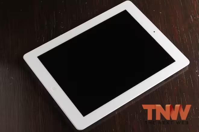
This effort to make the iPad disappear, to be more ‘transparent’ to the user is nothing new. The main reason that the second iPad conjured up the same feelings of transparency in me was that everything about it was designed, much like the iPhone, to draw attention to, in Apple Industrial Design chief Jony Ive’s words, ‘a single piece of multi-touch glass, and that’s it’.
The focus on the screen and little else leads you to interact with the iPad like a portal. Whatever it’s displaying on it’s screen is allowed to capture your whole attention, transforming your iPad into a single purpose device, much in the way that Macintosh team leader Jef Raskin imagined a device like this working back at the genesis of that project. The term he coined, ‘information appliance‘ is so incredibly apt when applied to the iPad.
The iPad itself is a machine that is designed to be as transparent as possible so that the content you’re consuming or the software that you’re using takes center stage in your consciousness.
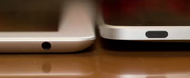
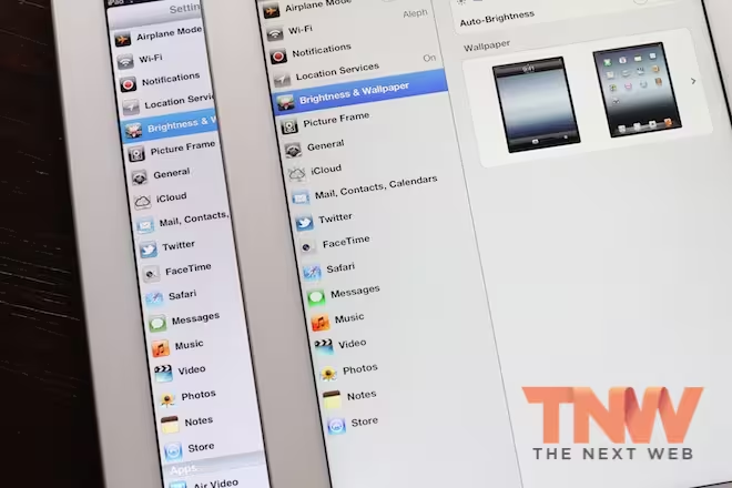
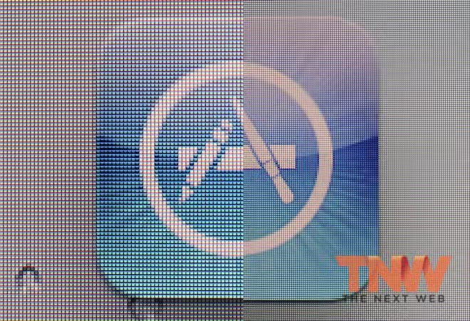
When the iPad 2 was released, the aluminum trim of the first model had been thinned to its limits and pulled backwards around the edges. The headphone jack, dock connector and buttons are almost invisible when looking at the iPad from the front. This pushes the screen forward, focusing your attention there. That’s why the increase in resolution, exactly four times the number of pixels that were present on the last iPad’s screen, is so important. The screen is essentially the iPad’s reason for being. Now, it has moved beyond our ability to see it as a screen, allowing us to experience the content that it displays without distraction.
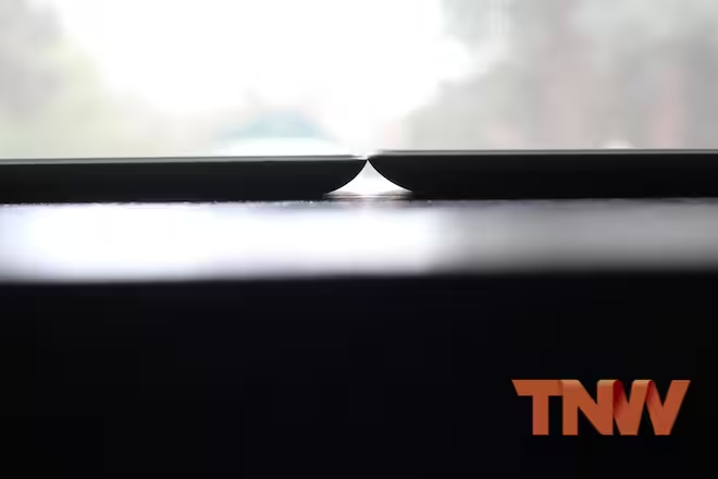
That is why Apple was willing to make the new iPad heavier by just over a tenth of a pound and thicker by less than one millimeter. These are sacrifices that were worth making in order to power the higher-res screen and the faster processor needed to push all of those pixels.
Making the new iPad slightly bigger and heavier than its predecessor breaks the mold, but the new screen is well worth it. It’s a gorgeous display that renders colors more accurately, if at a slightly warmer color temperature — at least on my unit. Text is sharper, apps that have been updated to take advantage of it look amazing and there is little here to complain about.
If you own an iPhone 3GS or earlier, another tablet or a first-generation iPad, you’ll likely be the most pleased by the screen because it’s an enormous improvement over previous devices. If you’re an iPhone 4 or 4S owner, then its likely to feel less shocking as you’re used to Retina-level graphics. Nevertheless, it’s still fantastic to see it applied on a larger scale.
The graphics processing power increase nets better performance in some games, but in general it treads water with the iPad 2 because it has to handle so many more pixels. There are no issues with performance drops in any apps that I saw, but neither are there any major gains. If an app ran well on your last iPad, it will likely run well on this one. There has been an increase in memory as well, but the same basic rules apply. You may notice a better browsing experience in Safari, especially with the number of tabs that you have open, but otherwise it should be considered an unimportant detail as it is largely done to support the newer, higher-res screen.
The new iPad runs slightly warmer than the old version, but the increase in temperature is not dramatic. It’s also to be expected because the newest model is more powerful than the older ones. The battery is also 70% physically larger, which explains the increase in size. The new processor and better screen are more power-hungry and Apple needed to increase battery capacity somehow. It chose the brute-force method of increasing the physical size of the battery instead of an improved battery technology.
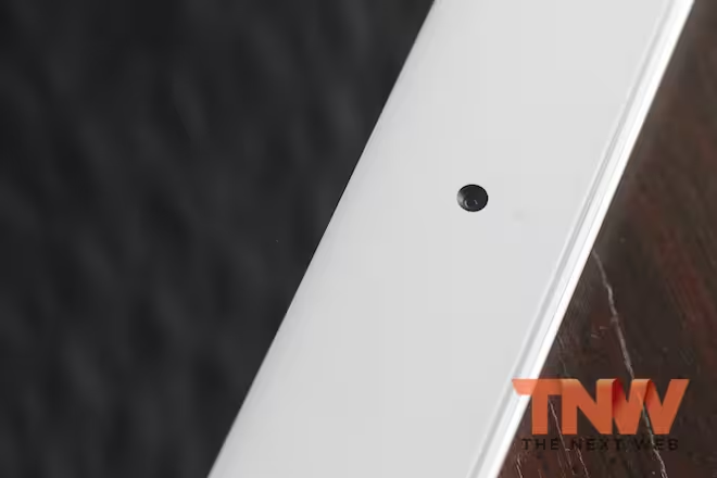
The camera has been improved significantly, making the new iPad a tool that can be used to capture images and video that are roughly equivalent to the ones you can capture with an iPhone 4. The video is higher resolution, however, at 1080P vs. 720P. Either way, if you’re taking pictures and video with your tablet, this is great. Most people don’t and that’s probably wise as it’s unwieldy and annoying to do so in public.
The front-facing camera remains at a very poor VGA resolution, marking one of the only major disappointments with the new iPad. The screen is so good that using the new model for FaceTime or Skype actually looks worse than the older models because the flaws of the terrible front-facing camera are made more evident.
The new iPad is also available with a faster cellular connection, using 4G LTE (Long-Term Evolution) to connect to the Internet. This makes for a faster browsing experience than previous models and, due to the larger battery, does so without compromising battery life over its 3G predecessor. This is an excellent addition, but one that most people probably don’t need anyway. But if you do, it should provide a faster and more fluid browsing experience.
The most interesting thing about LTE on the new iPad doesn’t have anything to do with the iPad, where cellular connection use is a rarity. Instead, this can be seen as Apple’s LTE dry run, its way to test the technology with users and get it ready for introduction in the next version of the iPhone. While the iPad simply uses a larger battery to solve the issue of LTE power drain, an iPhone is much smaller and doesn’t have that option. Newer, lower power chips and better battery technologies are in the works though, so we should see LTE in the next Apple smartphone.
The dictation feature of the new iPad works exactly the same as it does on the iPhone, aside from the fact that you have to be more conscious of having an internet connection when using it, especially if you’re on a WiFi iPad. The feature connects with Apple’s servers to process the data and to send back a text rendition, so your use cases are more limited than the iPhone. But, oddly enough, I feel that it will actually be a better fit for the iPad, where I find myself much more comfortable settling in to do some writing than on the iPhone. You’re much more apt to be using the iPad at home as well, where speaking aloud to your device is not only easier, but less embarrassing.
The overall effort to make the iPad disappear when you’re using it also makes it easy to see what the next versions will bring. Newer battery technology will help to make it lighter and thinner again, further improving its transparency. The front camera simply must be upgraded, to make it worthy of the new screen. The processing power will likely continue to improve in order to give app developers more room to stretch. Everything that is done will be done in order to make the experience more natural, more invisible.
It’s clear at this point that Apple has created an archetype with the iPad. Its clear vision, concise features and focus on delivering a pleasant experience to its users. And this vision has been emulated by every other tablet manufacturer much in the way that the iPhone has influenced the design of almost every smartphone maker in the world since its release. The iPad isn’t just a tablet, it is ‘the’ tablet, the mold in which every other one has been created since.
The enormous sales numbers of the iPad show that Apple’s courage to concentrate on making our computing feel more natural has paid off. It works against conventional wisdom by avoiding the ‘look what I can do’ mentality that is pervasive in our technology. All of its components are devoted to helping it deliver an experience that feels effortless and human, without the feeling that it is trying to impress you with its features, which is what makes it so good.
Get the TNW newsletter
Get the most important tech news in your inbox each week.
