This post originally appeared on the Buffer blog.
One of the first things I do when I join a new social network is to upload a profile picture.
But which profile picture should I choose? Is there a best one?
Profile pictures have always been a bit of a gray area for me inasmuch as I post a picture I think looks good without knowing its actual effect on my audience.
Is there such thing as a perfect, best profile picture?
Interestingly, there’s been some rather great research about the different elements of profile pictures that have the biggest impact on an audience. The psychology and science behind a perfect profile picture leaves some great guidelines on how to influence your audience and possibly gain more followers.
I’m happy to share what we’ve found about the perfect profile picture, based on the best science, research, and psychology out there.
The 7 Elements of the Best Profile Pictures
In 40 milliseconds, we’re able to draw conclusions about people based on a photo.
That’s less than one-half of one-tenth of a second. Wow!
This finding from Psychological Science underscores the vital importance of a profile picture and the effect it has on making an impression.
There’s been a host of research done on the various elements of a profile picture—how to look, how to not look, what to wear, whether to smile. The specifics of these studies are outlined below.
Here’s an overview of all the best practices for coming up with the best profile picture on social media:
- Smile with teeth
- Dark-colored suits, light colored buttondowns
- Jawline with a shadow
- Head-and-shoulders, or head-to-waist photo
- Squinch
- Asymmetrical composition
- Unobstructed eyes
Worth trying out:
- Facing the camera (or not)
- Bright background
And things to avoid:
- Hats
- Sunglasses
- Hair, glare, and shadows over the eyes
- Laughing smile
- Sexiness
Here’s a bit more about the science, research, and psychology behind these recommendations.
How to appear approachable, helpful, and attractive
Researchers at the Department of Psychology at University of York analyzed 1,000 images of faces in order to find the specific facial tics and features that help make a good first impression.
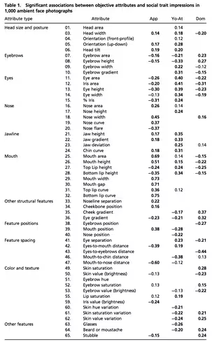
They came up with 65 different features that could affect one’s perceptions, things like “nose curve” and “cheekbone position” and “head area.” For each of the 65 features, they noted the effect of each on the following three distinct dimensions:
- Approachability – “Does this person want to help or harm me?”
- Dominance – “Can this person help or harm me?”
- Youthful-attractiveness – “Might this person be a good romantic partner or a rival?”
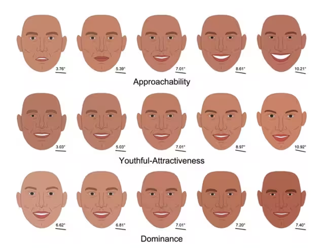
(It’s amazing the level of detail the researchers found. They created cartoon-like faces based on every possible variation.)
Here were the findings:
(How to read this chart: App stands for Approachability, Yo-Att stands for Youthful-attractiveness, and Dom stands for Dominance. A positive number means a positive correlation, and a negative number means a negative correlation.)
Overall, the researchers noted that the most meaningful factors in each of the three dimensions seemed to group around common traits.
For approachability, the mouth was key.
- Mouth area
- Mouth height
- Mouth width
- Mouth gap
- Bottom lip curve
This is consistent with previous research that smiling is a key component to approachability.
For youthful-attractiveness, the eyes were key.
- Eye area
- Iris area
- Eye height
- Eye width
This is consistent with previous research that relatively large eyes link to a youthful appearance.
For dominance:
- Eyebrow height
- Cheek gradient
- Eye gradient
- Skin saturation
- Skin value variation
These all link to stereotypically masculine appearance.
In the final report, the researchers put together composite faces that show the range in each of the three dimensions—e.g., from least approachable to most approachable, left-to-right. Can you notice the variations in the aforementioned facial features from one face to the next?
How to appear likable, competent, and influential
PhotoFeeler, a neat tool that lets you get feedback on your profile pictures via feedback from actual people who vote on your picture, shared their learningsfrom over 60,000 ratings of competence, likability, and influence that were left on photos submitted to the PhotoFeeler app.
Here’s a quick overview of what they learned:
- Don’t block your eyes. Sunglasses drop likeability score, and hair, glare, and shadows drop competence and influence.
- Define your jawline. A shadow line that outlines the jaw all the way around helps with likability, competence, and influence.
- Show your teeth when you smile. A closed mouth smile has a small increase likability. A laughing smile increases likability even more, but you lose ground in competence and influence. The best smile, according to PhotoFeeler, is a smile with teeth. This leads to gains across the board in likability (nearly twice that of a closed-mouth smile), competence, and influence.
- Try formal dress. Dark-colored suits and light-colored buttondowns (with ties, for men) had the greatest effect on competency and influence out of all other factors.
- Head and shoulders (or head to waist). Close-ups on just headshots brought scores down, as did full body shots.
- Try a squinch. A squinch is a slight squint. The idea behind it is that wide eyes look fearful, vulnerable, and uncertain. Slightly squinted eyes may come across as comfortable and confident. PhotoFeeler found that squinching eyes has an increase across the board in competence, likability, and influence.
(The photo on the left is the normal, wide-eyed headshot. The one on the right is a squinch.)
What avatars can teach us about profile pictures
Researcher Katrina Fong of Toronto’s York University conducted a study on 2D avatars, coming up with some neat observations that could extrapolate to profile pictures.
Participants were more interested in being friends with people whose avatars had
- open eyes
- oval face
- smiling expression
- brown hair
A few characteristics that turned participants away—going so far as to signal traits like intorversion, neuroticism, and disagreeableness—included
- neutral or negative expression
- black or short hair
- hat or sunglasses
Should your profile picture be alluring?
Former Oregon State psychologist Elizabeth Daniels polled 118 teenage girls and young adult women about their impressions of a 20-year-old woman’s Facebook profile. Half of the participants were shown a sexy profile picture; the other half saw a more conservative image.
The results: The conservative image won out in all three categories.
- Attractiveness: “I think she is pretty”
- Social: “I think she could be a friend of mine”
- Competence: “I have confidence in her ability to get a job done”
Caitlin Dewey of the Washington Times had a great takeaway from the study:
It demonstrates the degree to which, even among footloose digital natives, edgy photos are seen as a sign that the subject isn’t credible or competent.
Which matters more: Profile pic or bio?
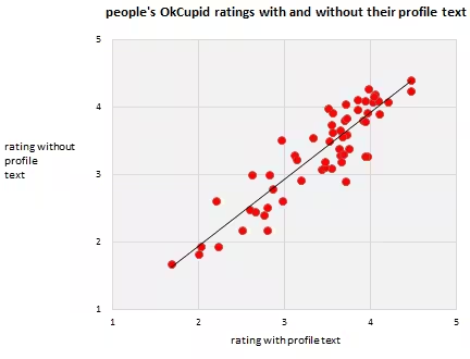
Dating website OkCupid is well-known for its data analysis. Last year, they released some interesting details on the influence of profile pictures compared to text descriptions. How much of each matter for a person’s overall impression of your profile?
OkCupid hid their profile text for a sample of users, showing just the profile picture. This gave the site two sets of data to analyze: one for “the picture and the text together” and one for “the picture alone.”
Their takeaway:
Essentially, the text is less than 10 percent of what people think of you.
Guy Kawasaki’s 4 keys to profile pictures
Canva’s Guy Kawasaki, an early evangelist for all things tech and social media, has found four factors to be key for a profile picture.
- Faces only. No family, friends, dogs, logos, etc.
- Asymmetrical. Use the Rule of Thirds to create your profile picture
- Face the light. The source of light should come in front of you.
- At least 600 pixels wide. There are varying shapes and sizes of profile pictures on social media. A 600-pixel image will look great no matter where it’s viewed.
The asymmetrical advice in particular has a lot of solid psychology and design history behind it.
The Rule of Thirds is a method for composing the elements of an image to be visually pleasing and to be in sync with the way our eyes prefer to scan an image. Photographers know the Rule of Thirds well; it is a foundational piece of photography.
The way it works is by dividing an image into a grid of thirds both horizontally and vertically. Basically, put a tic-tac-toe board on an image.
The tic-tac-toe board creates intersections of lines, and according to Rule of Thirds, these intersections are where the eye is most likely to be drawn.
The design lesson here is to place your key elements along these intersections. Avoid placing a key element right in the center.
Blogger, author, and speaker Rebekah Radice does this to great effect with her profile picture.
To face the camera or not to face the camera
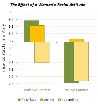
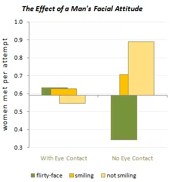
Another study from OkCupid looked at the profile pictures of over 7,100 users and noted which effects brought the most contacts. One of the most interesting takeaways here was the effect of looking at the camera vs. looking off-camera.
For a woman’s profile picture, the greatest effects were noticed when looking at the camera.
For a man’s profile picture, the greatest effect came when looking away from the camera.
What eye-tracking studies say
“You look where they look.”
This title from a Usable Word blog post provides a great synopsis for the research on eye-tracking studies.
We follow the eyes of the people we see on screen. Looking directly into the camera can help make a direct connection with someone. Looking to the left or right will help guide the reader’s eyes in that direction (toward a “Follow” button maybe?)
KISSmetrics has done a great job of explaining a bit about this reasearch:
Human beings have a natural tendency to follow the gaze of others, and we have been coached since birth to follow arrows directing us to where we should be looking/going.
And this picture helps put it into great perspective:
Try a bright, orange background
Orbit Media dug up this gem from Rand Fishkin of Moz: Test different background colors for your photos.
Brightly colored backgrounds are Rand’s recommendation. For his personal profiles, he found that orange worked best. (Rand has since changed to a green background.)
Summary
What have you found to work best for your profile picture?
The recommendations here cover all sorts of research, science, and psychology. They may be great jumping off points for research of your own. If you’re interested in trying something new with your profile picture, consider trying images where you’re
- Smiling
- Squinching
- Asymmetrical
- Head-to-shoulders
- Head-&-torso
- Facing the camera
And feel free to report what works best! If you’d like to share any possibilities for profile pictures, it’d be great to see them and hear your thoughts in the comments.
Read next: 18 incredibly useful tools for getting to know your audience better
Get the TNW newsletter
Get the most important tech news in your inbox each week.

