This is the sort of blog post that includes one real nugget of information. We’ll put it in context, but really, this post is about a new logo, how hard can we spin it?
Right, with no further ado, via WinRumors, is the new set of Windows Phone 7 logos, in a variety of colors:
Who are you calling a square, chump?

The 💜 of EU tech
The latest rumblings from the EU tech scene, a story from our wise ol' founder Boris, and some questionable AI art. It's free, every week, in your inbox. Sign up now!
Frankly, the logo makes sense. With ‘metro’ taking over the world of Microsoft, it was only a matter of time until the Windows Phone logo took on the shape of a live tile.
The logo is fine. It’s passable. We give it a B. Hardcore fans won’t like the change. Regular users won’t notice. But, now you know. Our job is complete.
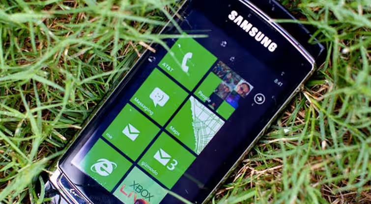
Now, for some background information. Windows Phone 7 is, not surprisingly, continuing with its struggle to sell units. Recent sales numbers are on the sad side of dismal. However, with Mango on the horizon, Microsoft is hoping that the second generation Windows Phone hardware, most notably from Nokia, will boost sales.
The company needs to move more units, or risk a decline in momentum that will lead to a calcification of the mobile line that will result in its death.
Right, now sound off in the comments as to whether you like the new logo.
Get the TNW newsletter
Get the most important tech news in your inbox each week.