No.
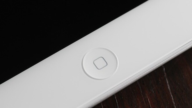
That’s the answer that immediately sprang to mind when I read an article from The New York Times’ Nick Bilton this morning entitled: Does the iPad Have One Button Too Many?
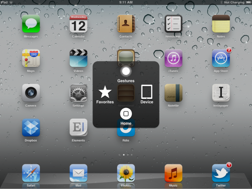
In the piece, Bilton describes a week he spent without using the home button. He exited apps, switched between two apps and revealed the multitasking tray with a series of gestures that Apple introduced to testers last year and made officially accessible with the release of iOS 5 for the iPad.
After using the gestures exclusively, Bilton found himself enamored of a buttonless existence on the iPad.
For the last couple of weeks I’ve been using the iPad without touching that physical home button. I even put a piece of black tape over it to pretend it doesn’t exist. Not only is it entirely possible to navigate the device this way, it’s actually often more enjoyable.
That’s great, and I actually completely agree with Bilton that — especially after using the gestures for a time — you won’t want to stop using them. In my review of Apple’s iOS 5, I said this about the gestures:
Since beginning to use the gestures earlier this year, I have grown completely addicted to the quickness and slickness of their use. I rarely ever touch my home button besides waking the device now and it truly feels great to be able to jam around between apps and access the multitasking bar with just a swipe of your fingers.
Honestly, they’re mostly fun. The four-finger gestures especially feel great. Apple does a lot right with the way that the gestures trigger actions. They’re all directionally correct, meaning that they trigger actions that reflect the motion of your fingers on the screen. In many cases, like swapping from one app to another, they actually map nearly 1:1 to your finger movements, as if you’re physically sliding the app on the screen, very logical.
The ‘close app’ gesture isn’t so fantastic in actual use though, the hand positions can be awkward and I’ve seen many people struggle with getting that one just right, even with me coaching them. And when I’m tired or distracted, any time I’m not thinking about what I’m doing, I still end up going back to the home button. It’s the default.
Which leads us to the major problems with a gesture-only iPad. The issue of discoverability and usability.
See, I’ve never handed the iPad to anyone and had them find those gestures on their own, ever. They are nearly completely un-discoverable without you telling them explicitly how they work. Even if Apple were to instruct users on first launch of the device, as many apps that use gestures do now, anyone who had not gone through that orientation would have to be instructed how to use the gestures to get home.
This is a sharp contrast to the near-instant usability that the iPad enjoys now. I’ve seen babies, toddlers, octogenarians and technophobes all pick up the iPad and be using it within minutes. The button invites them to press it and when they’ve entered an app, it welcomes their tentative press to ‘get back to where they were’. It’s brilliantly simple and eminently discoverable. Removing it would decimate usability for new or unfamiliar users.
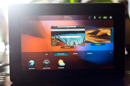
This was an issue that I noted last year in my review of the BlackBerry PlayBook. The PlayBook offers an interesting gesture mechanic for switching from one app to another. You swipe from the bezel on the edge of the tablet back onto the screen to swap between apps. They had a nice little demo on bootup and a screen overlay which told you how to use it. No one ever figured it out unless I told them first.
Bilton also dips into the iPhone by saying that it can ditch the home button too by using navigation similar to that found in the iPod nano. No, a thousand times, no. The nano’s interface is terrible and would have people in fits using it on a device that is designed to be held in one hand and used with speed on crowded busses and walking down the street. The physical button serves the same purposes there as on the iPad, but it also serves the additional need of using it with an offhanded casual familiarity without your full attention.
The iPad can currently be used to its full potential within seconds of someone picking it up, whether they’ve been vetted and instructed by Apple or by a current user. The Home button offers familiarity and ease of use by touch. It’s easier to work with stiffer, older fingers that aren’t as dextrous as young technophiles.
It’s just one button, and it’s not going anywhere any time soon.
Get the TNW newsletter
Get the most important tech news in your inbox each week.
