The devil is in the details, or how I learned to start worrying and sweat the small stuff.
The phrase ‘God is in the details’ has fairly murky origins. Although versions of it have been used since at least the 19th century, no one knows for sure where it came from.
The phrase generally means that every detail is important enough to be paid attention to. The counterpart phrase, ‘The Devil is in the details’, refers to the fact that there is often a hidden catch buried in the small things that will cause you mischief.
Both of these phrases came to mind when reading the recent commentary on articles by The Verge Editor Joshua Topolsky and MG Seigler, he of Techcrunch. Seigler’s take on the Galaxy Nexus and Topolsky’s impassioned response that addressed a perceived elitism in that review have sparked a lot of discussion.
The crux of the discussion, in my eyes, rested on the perception of the importance of details, and how those details are appreciated.
While they were talking about the Galaxy Nexus in particular (which I’ve been playing with and will have some thoughts on soon), I think that the discussion has more far-reaching implications than just that one phone. These thoughts came to a head on a recent trip to Disneyland.
Unlike various models of car, which—as a car enthusiast—I actually thought was a pretty good analogy, Disneyland is a place for everyone. Yes, it can be a bit pricey to visit, but in general it is enjoyed by folks of all walks of life and all backgrounds.
Now, it’s nothing new to have a discussion about the details applied to Disneyland’s construction and creation. The park is lauded for its creative and carefully considered engineering in a lot of ways. The speakers are set up to blend the music of one land into another, the lines of sight are carefully controlled so that you feel immersed, everything is repainted almost every year, those kinds of things are relatively well known.
But what fascinated me on this latest trip was some of the details that I noticed. These things are incredibly small, perhaps trivial items on their own, but the contribute to the experience of the park in a really meaningful way when combined.
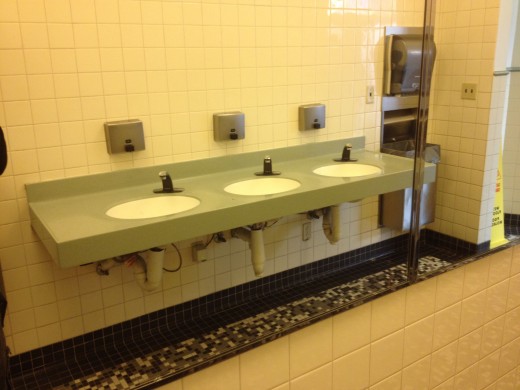
One interesting thing that I noted on my visit this time around was that the mirrors in the bathrooms are all placed on opposite walls from the sinks. If an opposite wall is not available, they are placed near the door, but never above the washbasins. I’m positive I’ve seen this setup in other restrooms, but it was additionally poignant in the context of Disneyland.
Because the mirrors were not positioned above the sinks, they didn’t get that constant shower of droplets from hands (hopefully) being washed in the sink. If you look in a public restroom, you’ll see that the mirrors above sinks almost always have a film of splashed and dried water and soap several inches up from the bottom edge.
By switching the mirrors to the other side, they had significantly lowered the amount that they had to be cleaned and, by extension, had enabled the restrooms to ‘feel’ cleaner for longer.
As Mike Gowan of Yobongo pointed out on Twitter when I remarked on this, it also clears the flow of traffic, as you don’t stand in front of the sink to fix your hair.
This is a seemingly obscure detail, and most people will never notice it, but it still makes their bathroom experience better, whether they know it or not.
That’s a functional ‘civil engineering’ detail. But what about something that is ‘chrome’ or seemingly unnecessarily flash. Non-functional in a nuts-and-bolts way, but that adds to the visitors experience?
Disney recently added a Little Mermaid ride to its California Adventure park in an ongoing effort to ‘character’ up the place. The ride isn’t that spectacular but my little nephew seems to like it so maybe I’m not the target audience. What did strike me though is the level of detail that went into it from the moment that you walked up to the building.
The railings along the walk are topped with knobs, as are many throughout the park. But instead of regular round knobs, these are topped with brass globes cast into the shape of sea anenomes. Very cool, but that’s right at waist level, to see the attention that they put into the experience, head even lower, to the concrete under your feet.
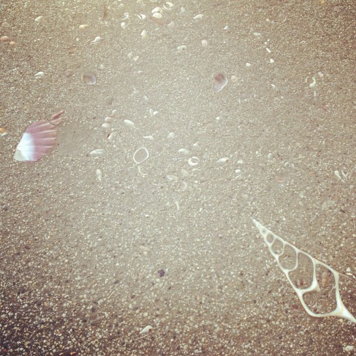
Disneyland normally does a great job of encorporating glitter and texture into the concrete, to make it look just a bit better than average. But the concrete here takes it a step further by incorporating the sea motif. Bits of shell and other beach flotsam are actually floated right into the top layer of the concrete.
Most people are rushing in and out or standing in line talking, the soles of their feet standing on what is an inspired and fantastic detail that adds to the spirit and experience of the undersea ride.
Once again, a detail which, if removed, many people wouldn’t actively notice. For those that are there with an eye to detail, it is a delightful little smile to add to your overall enjoyment. For those that may not notice it actively, it’s something that exists in the periphery, to coax them along into the ride’s experience while waiting in line, even if it’s doing it on a sub-concious level.
My takeaway from all of this?
It doesn’t matter whether you see the details or not, they’re important. It always, always, pays to give attention to the small things, whether you think that the user of your product—whether it be a piece of software, a phone, or a theme park—will notice or not.
Anyone, no matter how poor or rich—or what kind of car they drive—can discern the difference between a product it’s made well with attention to detail and one that is not, even if it is on a level that is below the concious. Some may choose to make decisions based on other criteria like price or bullet points, but the details still do contribute to the experience.
In my opinion, this is what is present in devices like the iPhone and Nokia Lumia 800, and software like iOS, Path and Instapaper that make them so attractive, either on a concious or unconscious level. Someone has sweated every detail so ridiculously hard, that you feel a trust and comfort in using the product. For more great discussion on why details are so important to people who create great software, check out this post from MarsEdit developer Daniel Jalkut.
It’s also what I feel is still lacking in many Android devices, even as the latest version, Ice Cream Sandwich, makes incredible strides forward in feel and usability. Those subcutaneous currents of care feel far more patchy. Some applications and interactions feel nurtured and crafted, while some feel neglected. But I’ll be touching more on the fantastic and the flawed about Ice Cream Sandwich and the Galaxy Nexus soon.
For now, I encourage anyone who has an interest in seeing why certain things feel great and appear to just work better than others to pay attention to the small stuff.
If you’re wondering why something isn’t feeling absolutely right, remember that the lack of attention to detail can affect you more than you know. It is important to pay attention to those things, as it can be incredibly noticeable when they are gone, whether it actively percieved or not.
Just as ‘God’ can be in the details, the ‘Devil’ can be there too and not acknowledging this can lead to a product that feels less than the sum of its parts, rather than more.
Get the TNW newsletter
Get the most important tech news in your inbox each week.


