The BBC is launching a new homepage which it hopes will help users find a broader selection of its content.
As of 10am today, UK visitors to BBC Online can access the ‘work-in-progress’ beta BBC Homepage from a link on the current homepage, and it hopes users will provide feedback over the coming weeks and months before permanently replacing the existing homepage later this year.
Back in January, the BBC announced plans to reshape its online offering, centering around ten products – including the BBC Homepage. This was part of its ‘Delivering Quality First’ programme of change, which at its core it says is about doing less things, but doing those things better.
Last month, the BBC launched a new version of iPlayer specifically for TVs, before setting out its vision for the service in the future, as it strives to take it beyond the tech-savvy, beyond catch-up and beyond the PC.
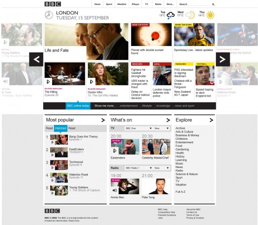
The BBC Homepage is the broadcaster’s third most popular section after News and Sport, and the beta launch of the new portal provides a first glimpse into the core design principles that is likely to underpin the reshaped BBC Online service. Indeed, during a demo yesterday at BBC Broadcasting House in London, it was clear it’s looking to feed changes in user behaviors into its future designs – for example, the preference for ‘swiping’ through content, which has become increasingly popular thanks to smartphones and tablets.
It’s likely that these principles will be reflected across BBC Online services and will be rolled out gradually, leading to a “graphically-rich London 2012 Olympics digital offering”.
Beyond reorganization of content and clearer signposting, a key facet of the redesign is a ‘carousel’ designed to let users browse the BBC’s content more easily, whilst also providing an easier route to discover new content.
The beta BBC Homepage will be released in stages, and will eventually include:
- Carousel featuring colour coding to denote categories and icons to depict content type.
- Filters for users to tailor the page based on their interests.
- Sliding ‘drawers’ that reveal more or less detail across the most popular content on BBC Online, and real-time listings for BBC TV and Radio.
- At-a-glance aspects: News and sport headlines, weather forecasts with lottery and travel news updates to follow, plus traditional index-based navigation for quick look-up.
- Nations’ homepages united into a single product to provide relevant local and national information based on a user’s choice of location.
Location will form a key part of the new Homepage too, with users able to set a location preference which will determine what content they see. Part of this will also eventually include traffic and travel information which is tailored to the user’s vicinity.
Phil Fearnley, General Manager of News & Knowledge, BBC Future Media said:
“We’ve made improvements progressively to the BBC Homepage since it launched in 1997. The beta version launched today represents a real step change: we’ve rebuilt from first principles to deliver an intuitive experience which makes it easier for users to explore the wealth of BBC content on the web than ever before.The BBC Homepage attracts over 9 million unique browsers a week across devices and the new page is designed to meet the challenge of serving this mass audience by showcasing the breadth of what we create on the web, whilst enabling the simple filtering which users have come to expect.”
The BBC’s remit to take its online offering ‘beyond the PC’ means that the new BBC Homepage will subsequently be optimised for mobile and connected TV devices too, but for the time-being it will be limited to the desktop.
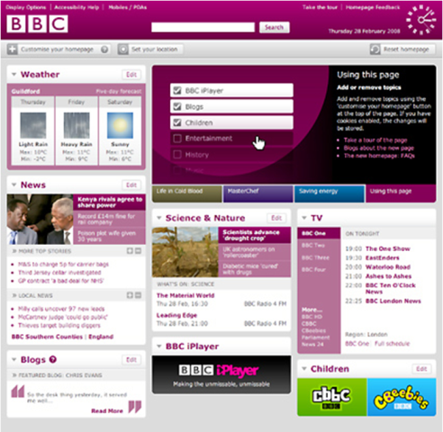
The BBC’s Homepage has undergone a few marked changes over the years, and it’s last big overhaul was in 2008, with the launch of a new ‘drag-and-drop’ widget-based portal which allowed users to customize it to suit their preferences:
The latest redesign is its biggest change yet, and it seems it has been completely rebuilt from the ground up. It’s important to stress that it is a work in progress, and it will be fine-tuned in the months ahead. It’s hoped that this will be the last ‘big’ change to the BBC Homepage, with all future alterations merely building on this new layout.
The new beta BBC Homepage is now live via a link on the BBC’s UK Homepage, or you can simply enter the following URL: http://beta.bbc.co.uk/.
Get the TNW newsletter
Get the most important tech news in your inbox each week.


