
Jerry Cao is a UX content strategist at the wireframing and prototyping app UXPin. For visual case studies of IxD from top companies like Google, Yahoo, AirBnB, and 30 others, download the free e-book Interaction Design Best Practices: Volume 1.
Language is what separates man from the beasts.
Our ability to rapidly communicate with words is the reason why the three-toed sloths aren’t ruling the world right now. Language is a bit like our claim-to-fame as a species, but it is a multi-faceted and complicated tool that can just as easily cut your hand as aid you.
Source: “Poetry Books.” Chilli Head. Creative Commons.
The words you choose in your interface copy, even if the message seems meaningless to you, directly affect the users’ impressions of your brand – especially since it only takes users about 10 seconds to decide if they’ll stay on a site.
Your copy as your mouthpiece is a silent but powerful medium. In this piece, we’ll explore the different applications of copy in interaction design.
Why Copy is Essential in Interaction Design
Interface copy is your side of the dialogue between your product and your user, and you should always approach interactions as a conversation. In fact, words are the first dimension of interaction design, followed by visuals, space, time, and behavior.
Just like the way you speak in everyday life, your words and how you use them reflect your personality in design. This “personality” of words creates the voice and tone of the design just as much as the images, visual hierarchy, colors, icons, and animations.

Source: MailChimp Voice & Tone
The tone of interface copy creates the context for interactions. After a few words, the user will be able to gauge how serious or casual the interaction will be, whether or not the product is what they’re looking for, and even the overall quality of the company.
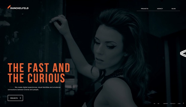
Source: Dunckelfeld
Words are also themselves interactions as users scan a website. They form mental images, create emotional connections, and suggest next steps.
For example, on the homepage of German design agency Dunckelfeld, you can see how the words “The Fast And the Curious” complements the mesmerizing background showing snippets of life from geometric patterns to camels in a desert.
The sharp copy enhances the video’s effect of showing the user that this is an agency who can spot the beauty in everyday moments (and presumably incorporate them into their work).
Now imagine how the design would feel if the headline said something typical like “Better ideas today”. The illusion of wonder is destroyed, and the background video feels meaningless.
It doesn’t matter if you sound sophisticated or blunt, if you use big words or small, if you speak the Queen’s English or prefer abbreviations…what matters is that your tone matches the visual design – that’s what entices people into interacting with the design.
The Variability of Context
Taking the above point a step further, the context surrounding your product determines the best tone and other language choices you make. The golden rule is that no one rule will apply in every circumstance… but similar contexts will have similar best practices.
When isolating the context you’re working with, there is two areas to focus on:
- The Medium – App or website? Home page or About Us page? Chosen content or pop-up? Each will have different expectations from the users, and so the text will need to be modified appropriately for the best results.
- The Audience – Who is reading the text? Targeting your specific audience is one of the fundamentals of communication since the dawn of time, whether designing an ecommerce website or editing an ancient Greek play.
The rules for a specific medium tend to be pretty common sense – you shouldn’t try to fit a paragraph inside a single call-to-action button. What you don’t know by instinct, you can always discover by checking around the Internet at some popular examples.
Writing for a specific audience, on the other hand is one of the hardest skills to learn.
The key element here is knowing who your audience is in the first place. For that, the more you know, the better. Demographics are a good start: age, gender, ethnicity, social/economic status, education level – different tones appeal more and less to each different type.
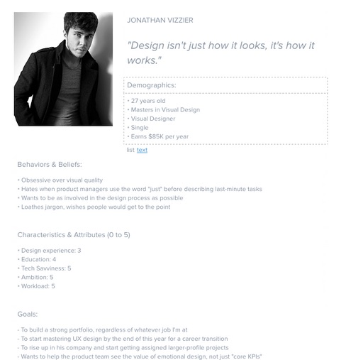
Source: UXPin
From there, you can get into more personable features. Are your target users impatient, impulsive, or generally rushed? If so, shorter, independant blocks of text will be better than eloquence and flow. Are they avid readers? If so, you may be able to win their hearts with well-paced paragraphs that tell a story (like what Blue Bottle coffee does).
These personality traits are difficult to discover, so we recommend falling back on your user research. As we explain in Web UI Design Best Practices, personas act like another person in the room when it comes to design decisions. Print out your persona and stick it on a wall – being able to see demographics, personality traits, and behavioral patterns will save you a lot of stress and headache throughout the design process.
The Different Forms of Copy
It’s true that interaction design is a dominantly visual medium.
What we said about tone holds true equally if not more-so for visuals – if your company wants to exhibit a calm and relaxing personality, heavy use of reds is a poor choice. But a site or app can’t rely exclusively on visuals.
We can categorize when copy is most essential by the forms it takes. Below we’ve listed the some common forms of copy for interaction design.
(Note that we don’t discuss actual content, like news articles or blogs. This article is about language in interaction design – language in written content is a topic that could fill a library on its own.)
i. Greeting
All sites and apps welcome their users, even if it’s not an explicit “Welcome to our site!”. A prominent greeting, even if just one or two words, can put the user a little more at-ease right from the start, not to mention easily distinguish the home page from the rest.
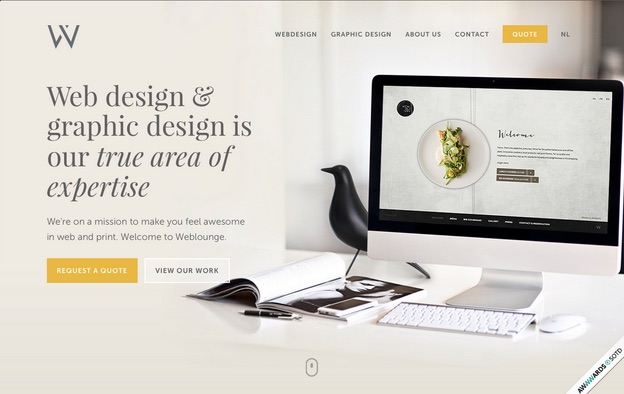
Source: Webdesign Agency Weblounge
Within moments of landing on Weblounge’s home page, you know who they are and what they do. Even if you know nothing about them going in, you can gauge their style and personality by their language (words like “expertise” and “awesome” are all signals). As a more subversive motive, their greeting even funnels the users’ focus into their calls-to-action, and gives more incentive to click.
Their choice of serif fonts and italic styles in the headline enhances the message with a strong sense of professionalism, although these fall more under visual representation.
Like we said before, your site interface must create a conversation with the user. In this case, the headline explains the agency’s expertise, so it makes sense that it’s presented in a more traditional typeface. The more casual copy beneath, with words like “awesome”, is better presented as a serif font. It’s the same effect as someone formally introducing themselves, then diving into lighter conversation.
ii. Navigation
Even the most minimalistic sites use words in their navigation bar and buttons (even if they’re triggered on hover). The only other alternatives would be to no buttons or navigation bars at all (which you usually only see on some single-page sites), or representing each option with an icon metaphor, as with the Facebook example below.
That works in some situations, but would be problematic with abstract pages like “Portfolio” or “Products”.

At their core, words are symbols, albeit highly stylized ones.
The word “home” represents in sight and sound that place your return to at the end of the day. The idea remains the same whether its represented by a drawing of a square with a triangle on top, or a string of four specific letters.
The advantage that words have over visual metaphors, though, is their range: they’re able to express complex concepts like “portfolio” in a way that every speaker of the same language will immediately comprehend. A drawing of a portfolio, however, is open to interpretation – and misinterpretation.
So most sites choose to simplify things by uses words in their navigation menu. This may seem pretty direct – “home” for home page, “help” for the help page – but its the subtleties that matter.
Do you say “My Account,” “Your Account,” or simply “Account.” “Contact,” “Contact Us,” or add some enthusiasm with “Contact Us Now!”

Source: Urban Influence
The site for Urban Influence favors simplicity with one-word navigation hints, then breaking that rhythm with their call-to-action. Remember to choose your words carefully for top navigation and buttons. “Save” is not the same as “Proceed”, and “Let’s go!” isn’t as clear as just simply stating the action.
iii. Instructions
Sometimes, even the best interfaces aren’t self-explanatory. If a certain procedure risks confusing the user, maybe it’s best to spell it out for them. These explanations can range from short to long, sometimes being a single line, sometimes a step-by-step instructional. They can also be dry or humorous – their primary purpose is communicating useful information, with personality a secondary concern.
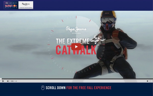
Source: Pepe Jeans: Extreme Catwalk
For their Extreme Catwalk jeans page, Pepe Jeans uses a simple “scroll down for the free fall experience“ to ensure that everyone knows how to use the site. While the mouse icon with the prominent scroll wheel might be enough on its own, the copy actually entices people by telling them the fun experience that’s triggered by scrolling.
iv. Feedback
As described in Interaction Design Best Practices, feedback is how you communicate directly with users in response to their actions.
Feedback is a core aspect of interaction design because it encourages users and provides a sense of security. As UX consultant Joe Napoli suggests, feedback helps provides four types of answers to users:
- Location – What page the user is visiting
- Current status – What’s happening on the page, and if the user is any closer to their goal
- Next steps – What will happen next, and how the user can trigger it
- Validation – If any errors were made, or any outstanding actions required
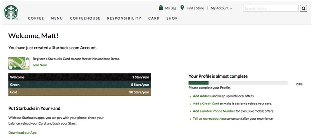
Source: Starbucks
One of the most common feedback messages is the confirmation that a signup was successful, as with the Starbucks example above. Not only is it nice to be appreciated with a warm “welcome” or “thank you,” but the feedback message also signals that the signup process is finished so that we can move on.
This Starbucks feedback page also allows for furthering ulterior motives – after the signup is a good time to plug buying a Starbucks card, completing the profile, or downloading their app.
Error messages, too, fall under this category, although they would sometimes have equal claim to instructions if they explain how to handle the problem. Language is especially important for error messages, as a means to “soften the blow” of there being an error in the first place. When used with skill (and a bit of humor), word choice can actually turn a bad experience into a good one, as with amusing 404 pages.
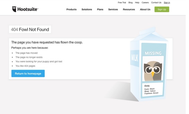
Source: Hootsuite
Hootsuite adds a little humor and furthers their bird brand identity with their 404 page. Their use of bird-related humor and clever reasons for having arrived there turn what could have been a damaging user experience into a surprisingly positive one.
v. Calls-to-Action
Anyone in sales will tell you the importance of wording when closing a deal.
Just as with navigation, the key to language in calls-to-actions subtlety. Because you are limited to only a few words within a button, each one must be weighed and optimized. If you don’t know the significance a single word can have, look at this example from Organizing for America, provided thanks to Smashing Magazine.
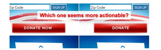
Source: Jacob Gube via Smashing Magazine.
The single word “now” goes a long way by infusing the CTA with an energy and attraction the word “donate” alone can’t match. You don’t need to know why a single word can create this effect, as long as you can recognize the results.
In a much more direct fashion, we again see how words have the power to entice users into interacting with the design in a way that’s valuable to the business.
vi. Data
The most basic use of language in a site or app is data: the company’s addresses, phone numbers, legal text that’s required to be there, etc. There’s very little wiggle-room on the data itself (except for visual choices, such as font or size), but the introduction of the data can be adapted to your tone.
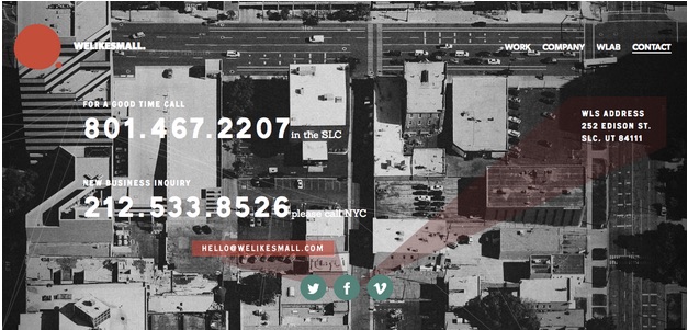
Source: Welikesmall
The digital agency Welikesmall adds a little spice to an otherwise bland contact page. All the necessary information is there – numbers, address, email, even social media links – but jokes like “for a good time call…” add a little something extra – and memorable, which is good for adding a bit of delight to the experience.
Conclusion
As Basecamp suggests in their excellent online book Getting Real, “If you think every pixel, every icon, every typeface matters, then you also need to believe every letter matters.”
You can’t separate copy from design because it’s all part of the same interface. Know your user, know your constraints, and make sure you have clear and interesting copy to complement the design.
To learn more about the tangible elements of IxD, download the free e-book Interaction Design Best Practices: Words, Visuals, Space. Visual case studies are included from 30+ companies including Google, AirBnB, Facebook, and Yahoo.
Read Next: Why designers should never use fake text
Image credit: Shutterstock
Get the TNW newsletter
Get the most important tech news in your inbox each week.