Jerry Cao is a UX content strategist at UXPin — the wireframing and prototyping app. To learn more about content-first design, download the free e-book Web UI Design for the Human Eye: Content Patterns & Typography.
We’ve said it before and we’ll say it again: content is king.
That means content should not be the last stage in design, something to be filled in right before the launch. Content is the backbone of your site, and must be developed together with the visual design.
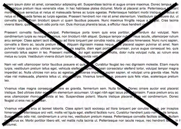
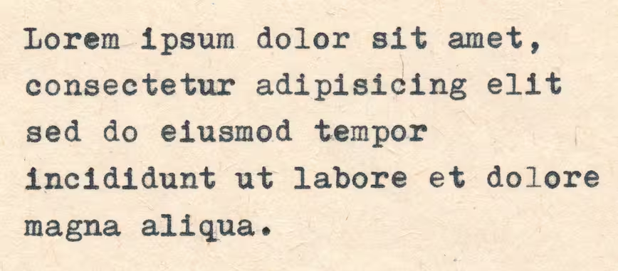
Sure, using a placeholder like lorem ipsum is tempting with its convenience — but ultimately it will hold you back. For starters, using a placeholder perpetuates the idea that content is secondary. But more importantly, using lorem ipsum means passing up the opportunity to further improve your site’s most important asset: king content.
In this piece, we’ll discuss why real content matters, then review how you can take a more content-first approach to your site design.
The Real Pitfalls of Fake Text
It may seem like an insignificant point, but avoiding filler content actually does make a difference.
In our experience, the only time filler content is acceptable is during very early stages of design when you’re trying to brainstorm as many usable layouts as possible. In that case, lorem ipsum can help as a quick and dirty way of getting something to fill the space so you can get a rough idea of the aesthetics of a layout with text.
Approach lorem ipsum the same way you would an early sketch. Play around with it, use it to arrive at better design ideas, and then move on.
Once you’re ready to go beyond low-fidelity, it’s time to ditch the lorem ipsum.
As we discussed in the Guide to Usability Testing, a webpage with a simple structure but quality content performs much better than a nice layout with subpar text. That at least proves its worth — but the importance of content in design goes even farther beyond that.
Words are the foundation of all interaction. They are the language used for primary communication with your user, regardless of how engaging the other interface elements are. Content Strategist Ahava Leibtag said it best:
We need to start urging our clients to think about their content not just as a commodity, but as the starting point, the building blocks of a website. It’s time to stop building the house without knowing how many bedrooms it may need. Because you know what they call things that are beautiful, but have no function? Useless.
This seems like an obvious argument, and yet some designers might still attempt content shortcuts until the zero hour. But why?
In an interview with Adaptive Path, Kristina Halvorson, founder of Brain Traffic, explains that the clients (and sometimes stakeholders) are partly at fault. According to her, clients and internal teams might urge designers to deliver designs and structure as quickly as possible — spending time on content then slows down the completion of the deliverables that the clients want to see.
Halvorson goes on to explain that designers use lorem ipsum as a way to focus on the layout, but this is counter-intuitive. The layout should be built around the content, not the other way around. The structure and flow of a page should be heighten the effect of the words, but that’s impossible if it’s built with nonsense words that will eventually be replaced.
In her opinion, content strategists, web writers, editors, or any other kind of representatives of content should be present at the drawing board with designers and the product team from day one. This not only gives a head start to the writing, it also holds someone accountable for the content throughout the process.
And what’s the alternative, when you don’t design for content?
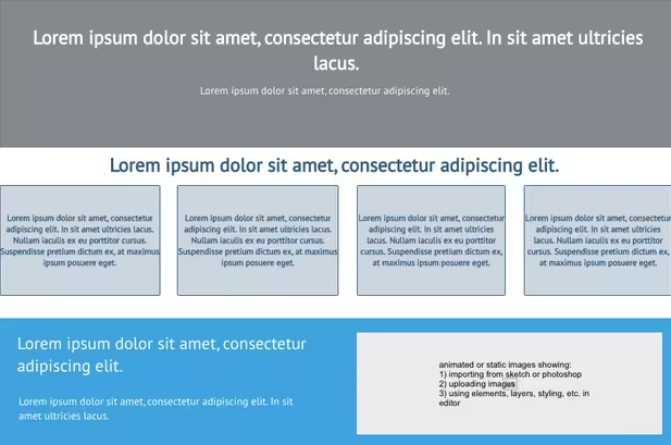
Rian van der Merwe, in an article for Elezea, describes with visual aids the all-to-common approach when content is a secondary concern to design. A typical wireframe with lorem ipsum placeholders would look like this:
Source: UXPin
It looks fine, doesn’t it? After all, the layout and structure were all designed to perfectly fit the lorem ipsum text, so everything is in order. But what happens when it’s time to add the actual content?
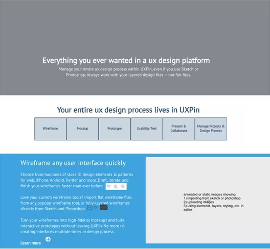
Source: UXPin
The chances that your actual content will fill the same space as your placeholder are very slim, almost inconceivable. In most cases at least some redesigning and restructuring must be done, which is a waste of time and resources.
As Merwe describes it, the design is the packaging for the content. If you design the packaging first, you’re doing so without knowing what’s going into it. When, inevitably, the content doesn’t fit the packaging, you must either start over with a new design, or alter the content to make it fit by sacrificing some parts or adding filler.
Developing content early ensures its place at the top of your priorities. It’s better to modify a design around the content than the content around design.
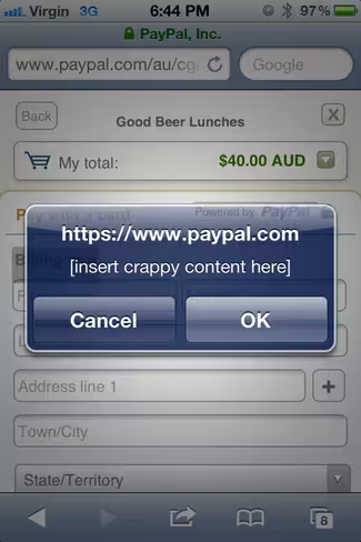
Additionally, avoiding lorem ipsum-esque placeholders can also safeguard against embarrassing mistakes. You don’t want your site to accidentally end up like this:
Source: What Happens When Placeholder Text Doesn’t Get Replaced
Applying the Content-First Approach
Don’t get us wrong — no one’s expecting your content to be perfect before the rest of the design commences. In fact, it’s usually a gradual process, as with the other areas. The content doesn’t need to be finished early; we’re saying it should be started early.
Let’s look at a few tips from Liam King, who we think has provided some of the most practical advice on the matter.
Write the Content Yourself
UX designers aren’t copywriters, but this isn’t the final version. With your experience in web design, you know enough about written text to create valid proto-content — content that will be later improved and perfected by a professional copywriter. For the time being, though, your text will be close enough to a working copy to be able to design around. We don’t just recommend this method — we practice it ourselves.
The downside to this method is, yes, it is more time and effort on your part, especially in comparison to copying-and-pasting the content from a lorem ipsum generator. However, it’s worth the extra effort: the end product can only benefit from content being generated as early as possible.
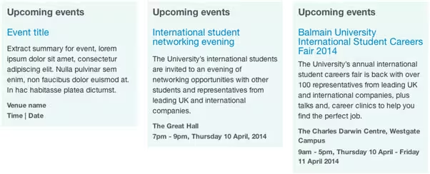
Source: Designing Content First for a Better UX
The first example on the left is the abominable lorem ipsum, the second example is content fit for print, and the third example is a rough but adequate content for design purposes.
As you can see in King’s examples, even the rough third example still gives the designer more valuable insight than the lorem ipsum. While not perfect, the third “proto-content” still draws attention to a lot of important design issues that should be addressed, such as:
- both building and campus names are too long
- multi-day events could cause problems
- promo panels must support long titles
- the time and date format isn’t very readable
No, the third example is not perfect… but the important point to remember is that all of the above issues would have gone ignored until the final stages (where they would be rushed to complete) if the lorem ipsum content was preserved through the process.
2. Design with Existing Content
While this method is not applicable if you’re building a brand new site, it’s quite helpful if you’re redesigning an existing site. The old site’s content will be a much more helpful placeholder than the meaningless lorem ipsum. Granted, it won’t be a perfect match for your new content after the rewrites, but chances are it will be similar enough to work.
Like King says, content like staff profiles and about pages will probably not be changed radically, and previously written articles and posts won’t be changed at all. Try copying and pasting your pre-existing text into a wireframe/prototype to see how it looks.
3. Pull Content from Competitors
While we don’t necessarily recommend this method as a first choice, it’s still better than a generic placeholder (think of it like a “smart lorem ipsum”).
The procedure is pretty self explanatory: simply copy and paste some relevant example text from your competitor (or competitors), then change the names, places, etc. accordingly. It will be a lot more suitable than lorem ipsum, plus you can take an in-depth look at how they designed for the same issues.
If you’re like further details into the processes of designing your site around content, the Web Standards Sherpa has an excellent post about the methodology behind what they call “messaging hierarchy.”
Once you’ve created your content, you can help structure it in your design with Content Slice Diagrams, described in detail on Elezea.
Takeaway
It’s a fact that can’t be overstated: content is king. Any extra time and effort spent on developing content, no matter how superfluous it seems, will improve the end product. You’ll want to start on your content as early as possible, and avoid the corner-cutting use of generic placeholders like lorem ipsum.
By the time your content audit comes around, you’ll notice drastic difference between content that was originally planned since the beginning, and content that was written at the end and jammed into the already-made design.
To learn more about content-first design, download the free e-book Web UI Design for the Human Eye: Content Patterns & Typography. The e-book offers practical advice on visual hierarchy, designing for readability, and creating visual language through typography. Design examples are also analyzed from 30 companies including Dropbox, AirBnB, Marketo, Hulu, and Evernote.
Read Next: How to create the right emotions with color in web design
Get the TNW newsletter
Get the most important tech news in your inbox each week.
