Jerry Cao is a UX content strategist at UXPin — the wireframing and prototyping app. To learn more about how to create visually digestible interfaces, download the free e-book Web UI Design for the Human Eye: Colors, Space, Contrast.
The skill of using colors is no less than an artform.
Across human history, master painters and other artists have earned global recognition for their ability to manipulate colors. In the modern era, the artform now opens up a lot of new commercial and business applications, first in advertising, and now in web design. With an almost bottomless depth, the skill of color usage can be improved and refined endlessly.

The 💜 of EU tech
The latest rumblings from the EU tech scene, a story from our wise ol' founder Boris, and some questionable AI art. It's free, every week, in your inbox. Sign up now!
We’ll explore the fundamentals of color theory and color scheme, then examine the emotional effects of certain colors.
Don’t miss: How to apply optical illusions to Web UI design
Color Theory
The topic of color could fill a whole book on its own, so we’ll stick to what’s relevant to UI design here. We can break down color theory into three parts with regards to web UI design:
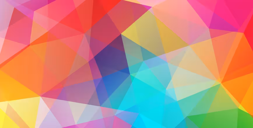
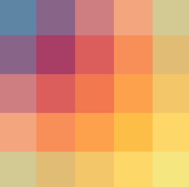
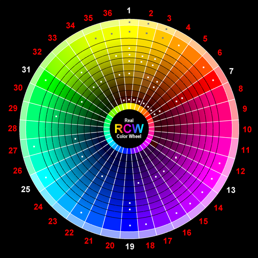
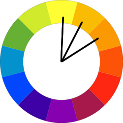
Contrast — Every shade of color has a set opposite — an “arch-nemesis” whose contrast is far greater than any other color. You can use the color wheel below to find each specific color’s opposite. Simply locate the color on the opposite end of the circle.
Source: Joos!
Complementation — Colors aren’t always at odds with each other: complementary colors accent each other and bring out their best, the opposite of contrast. These are the colors opposite each other on the color wheel, for example, purple’s complement is green.
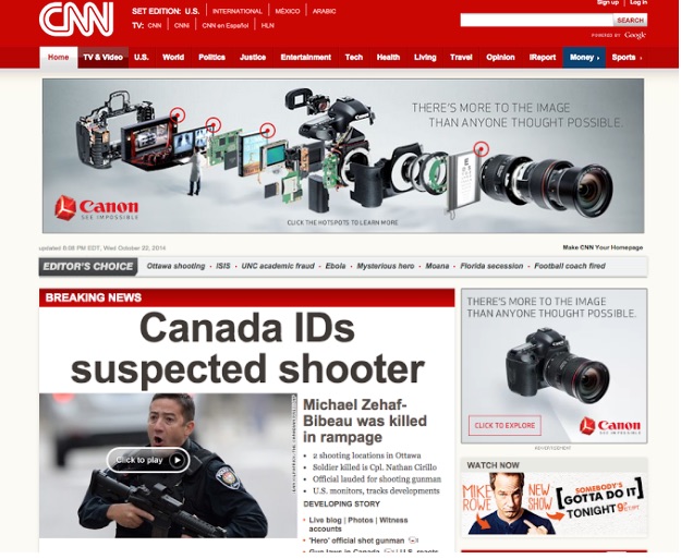
Vibrancy — Each color evokes specific moods: the brighter warm colors (red, orange, yellow) tend to energize a user and make them more alert, while darker cool shades (green, blue, purple) tend to be more relaxing and tranquil. CNN uses a red banner in their top navigation to heighten alertness, a color decision that suits the site’s breaking news content.
Color theory in web design is more than just a visual garnish, it can have game-changing effects on your business. If you don’t believe us, read conversion consultant Jeremy Smith’s article explaining how the psychology of color can expand your business.
Vibrancy: Emotional Implications of Color
There’s no denying the link between emotions and colors: in fact, the human race has been documenting the psychological impact of color since the Middle Ages. Naturally, any web designer wants to harness this as well, since the right colors create the right moods and atmosphere for your site.
We’ve analyzed the advice of the researchers at Vandelay Design and Smashing Magazine, and filtered it through our own experience at UXPin.
Please note that different cultures around the world perceive colors differently. We describe emotional associations that are most relevant to Western cultures. For a more in-depth look of how different cultures perceive color, read this thorough piece from Web Designer Depot.
Red
Promotes: power, importance, youth
The most stimulating color, red is so energizing it has been used to increase blood circulation. Representing passion and power, red is the color that will attract the most attention, which is why it is commonly used for warnings and important notices.
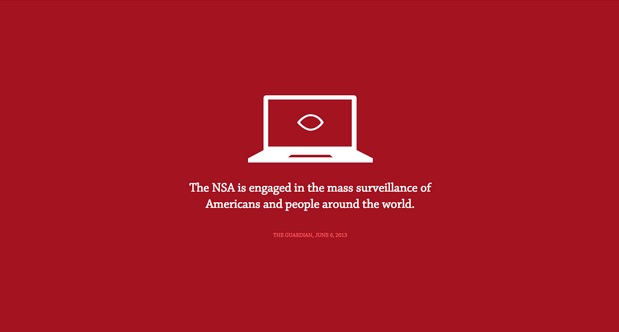
Red is very appropriate for the No Way NSA website, whose purpose is calling alarm to a perceived threat from the NSA. Using red in the first section of the single-page site is especially clever because it calls attention to the primary message while physiologically inducing people to “get out of the danger zone” by scrolling downwards. This, of course, only makes the user engage with more content.
However, this could work against you, as red can incite anger, or at least overstimulation. If you’re going for a more relaxed atmosphere, use it sparingly (or at least in a lighter shade) or not at all.
Orange
Promotes: friendliness, energy, uniqueness
As the most muted of the warm colors, orange is uniquely versatile. As a primary color it can be engaging and energizing, and as a secondary color it also retains these properties in an unobtrusive way. Orange also helps to create a sensation of movement and energy.
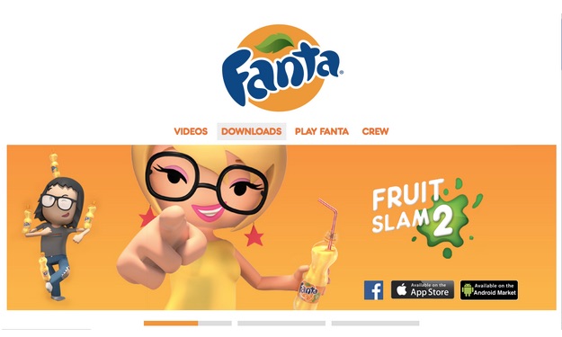
Aside from it being part of the brand style, orange works well with Fanta’s lighthearted and cartoonish site. The color shows creativity while retaining familiarity.
Yellow
Promotes: happiness, enthusiasm, antiquity (darker shades)
Yellow is one of the more versatile colors, depending on the shade.
A bright yellow is the most energetic of the colors, without the severity of red. Middle shades of yellow give a sense of comfort while still feeling invigorating. Darker shades (including gold) can give the impression of antiquity, and lend an air of timelessness, wisdom, and curiosity.
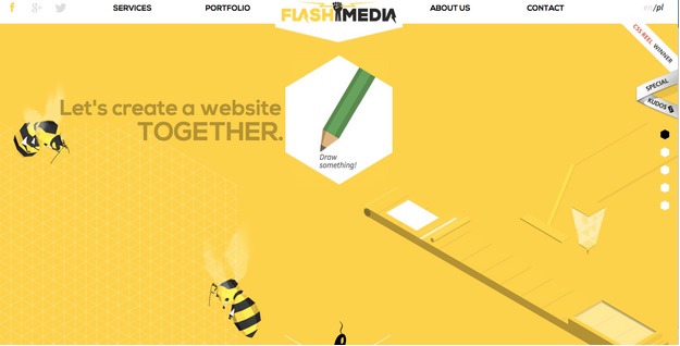
In the above example from web design agency Flash Media, the darker shade of yellow exudes energy, curiosity, and authority. This makes a lot of sense for a company who thrives on the value of their consultancy and skills.
Green
Promotes: growth, stability, financial themes, environmental themes

Green bridges the gap between warm and cool colors, though tends to be more of a cool color. This means green has the same relaxing effects of blue, but still retains some of the energizing qualities of yellow. As such, it creates a very balanced and stable atmosphere. Darker shades give off more of the money/affluence feelings which you can see with Ameritrade above.
Blue
Promotes: calm, safety, openness (lighter shades), reliability (darker shades)
Like yellow, blue’s meaning varies greatly depending on the shade. All blues are universally relaxing and safe, but the lighter shades will seem more friendly while the darker ones seem more somber. Social media sites like Twitter and Facebook take advantage of light and medium shades, while corporate websites prefer dark shades’ tones of strength and reliability.
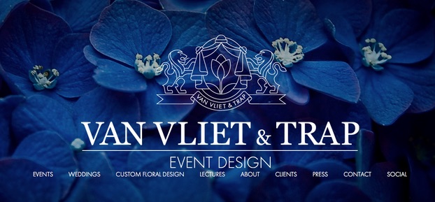
Van Vliet & Trap, an event design agency, makes clever use of dark blue. By using the blue in the flowers in the background, they visually hint at their expertise in floral design while also exuding trust and reliability. It makes a lot of sense since they plan high visibility (and somewhat nerve-wracking) events like weddings.
Purple
Promotes: luxury, romance (lighter shades), mystery (darker shades)

Historically associated with royalty, purple retains the tone of luxury, even to the point of decadence.
Purples suggests lavishness and wealth in general, making it a popular choice for fashion and luxury goods (and even chocolate, like the Cadbury example above). Lighter shades like lavender (with pink hues) are considered romantic, while darker shades seem more luxurious and mysterious.
Black
Promotes: power, edginess, sophistication
The strongest of the neutral colors, black exists on almost every website.
It can take on varying characteristics depending on its supporting colors, or dominate all of them if used in excess. Its strength amidst neutrality makes it the color of choice for long blocks of text, but as a primary color can give the impression of edginess, sophistication, or even evil.
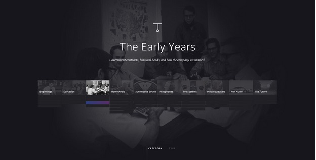
For most websites, black is used to create an instant feeling of sophistication and timelessness. The feeling of elegance is especially strong well when paired with white font and set against a minimalist layout, as you can see in the “Dream and Reach” microsite from Bose.
White
Promotes: cleanliness, virtue, simplicity
White is the color most associated with virtue, purity, and innocence in Western cultures.
Minimalist and simplistic sites most often use it as a background. By drawing the least attention of all the colors, white is the best for accenting the other colors on the page.
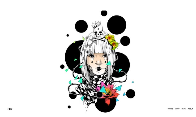
This works particularly well for the awwwards-winning website of artist Kaloian Toshev. The white background draws attention to his vibrant artwork, while creating an art-gallery aura of elegance.
Gray
Promotes: neutrality, formality, melancholy
While in certain situations it can seem brooding or sad, gray is nonetheless a popular choice for looking traditional or professional. However, one of the greatest advantages of gray lies in varying its hues — changing the shade can give you a customized mix of properties from white and black, a powerful tool in skillful hands.
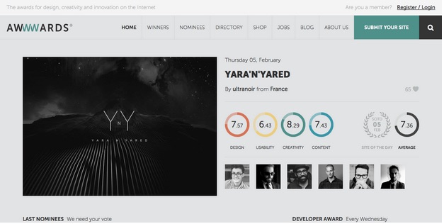
When paired with brighter colors and presented in a flat UI, the grey background of awwwards feels much more modern than it does somber.
Beige
Promotes: traits of surrounding colors
Beige is the wildcard of the colors, as its main use is in drawing out other colors.
On its own, beige is dull, though this can be used to symbolize humility. However, it will take on the characteristics of the colors around it, making it an interesting design tool. For these reasons, beige is almost always a secondary or background color.
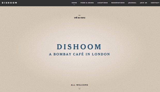
Darker shades of beige (like on the Dishoom site) will create an earthy and almost paper-like texture, while lighter shades feel fresher. In this case, the lighter shade around the brand name, which darkens outwards, help create the feeling that the restaurant is a fresh modern take on earthy cuisine.
Ivory
Promotes: comfort, elegance, simplicity
In terms of emotional response, ivory (and cream) are slight variations on white.
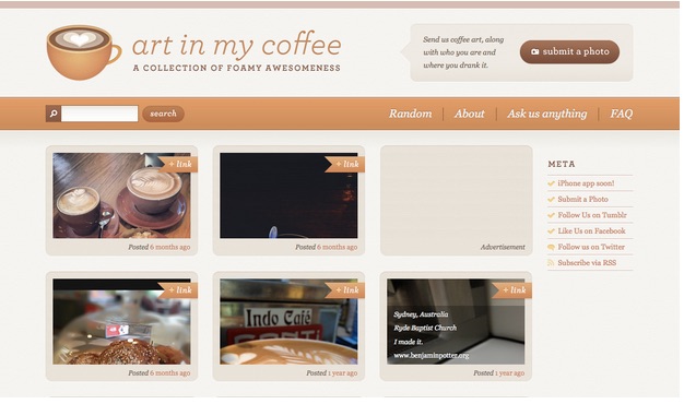
Ivory is seen as warmer (or less sterile) than white, making it more comforting while still exuding the same minimalistic and complementary aspects. Ivory should be used in place of white to soften the contrast between it and darker colors. For the art in my coffee site, an orange/brown accent is added to the cream background (which looks slighly greyish) to create a sense of warmth.
If you’d like to read more analysis of color and emotion, check out this piece by 1stWebDesigner which deconstructs color use from 20 top brands.
Color Scheme
Every site has a color scheme, the primary colors it uses for its main areas. As we’ve been discussing, the repeated use of these colors will affect the user’s mind and mood, typically subconsciously, so choose them well.
While there are lots of different ways to mix colors togethers, we’re going to focus on the 3 most successful, and common, ones:
Triadic — The triadic is the most basic and balanced of the three structures. Using vibrancy and complementation, but straying from the trickier contrast, the triadic structure is the safest and most reliable scheme. On the 12-step color wheel, select any three colors located 120 degrees from each other: one color for the background, and two for content and navigation.

Source: tuts+
Compound (Split Complementary) — The next scheme gets a little trickier to pull off, but can be rewarding if done well. The concept uses four colors: two contrasting pairs and two complementary pairs.

Source: tuts+
Look at how stunning the page for Florida Flourish looks just based on its colors alone. The red and green contrast together with the text tags and plants, plus the blue and orange with the sky atop the desert. At the same time, the red/orange and blue/green complements really bring the whole view together nicely.

Source: CSS Design Vault
Analogous — Lastly there is the analogous scheme, which focuses exclusively on complementary colors. This one really highlights the vibrancy of the colors chosen, for example, a red-orange-yellow analogous scheme will seem very energetic and lively. While this scheme is relatively easy to pull off, the trick is in deciding which vibrancy of color to use, as it will be exaggerated.
Source: tuts+
By using blues, turquoise, and greens for their analogous site, Blinksale creates a subdued and even safe atmosphere for its site. Notice how they use the contrasting yellow to draw attention to their call-to-action.

What we’ve just discussed are just the fundamentals of how color theory can enhance your UI design, but there’s no limit to how in-depth you can go with colors on your site. If you’d like to know more, you can check out this piece in Smashing Magazine on how to create your own color palette.
Color Assistance Tools
Thankfully, there are plenty of tools to help you put color theory into practice. Check out these pre-made color palettes so you don’t need to start from scratch.
- Adobe Color CC — Previously known as Kuler, this is one of the most trusted color assistance tools available.
- Paletton — If you’re in need of a tool for speed or a simplified ease-of-use, this minimal tool can help you. Great for beginners.
- Flat UI Color Picker — While for flat UI designs only, this is still a useful and convenient tool for color selection.
To further shorten the learning curve, you can also check out this list of 28 website color tools.
Takeaway
No one’s expecting you to be Michelangelo, but a basic understanding of color usage is a solid prerequisite for web design.
As we’ve just explained, colors carry with them a lot of extra weight that sometimes goes unnoticed. No matter what colors you choose, they have a definite influence on the design as a whole — from communicating contrast or similarity, to evoking precise emotions.
To learn more about how to create visually digestible interfaces, download the free e-book Web UI Design for the Human Eye: Colors, Space, Contrast. Visual case studies are included from 33 companies including Tumblr, Etsy, Google, Facebook, Twitter, Medium, Intercom, and Bose.
Read Next: How to create visual relationships with contrast & similarity
Get the TNW newsletter
Get the most important tech news in your inbox each week.