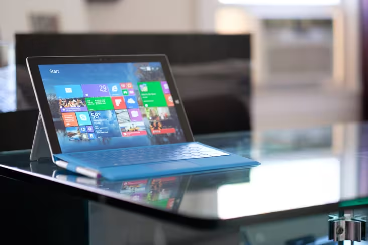
Microsoft has always had lofty goals for the Surface Pro. The notion of a singular device to handle all your laptop and tablet needs is undoubtedly enticing, and for Microsoft, it represents the future of the PC. The Surface Pro is, in theory, a sound idea.
Unfortunately, bringing that vision to fruition has proved a bumpy ride. The first two models were better as laptops than tablets, and even then they probably weren’t your best option. Featuring a lower starting price, redesigned hardware, and an improved Type Cover, it’s no surprise that the Surface Pro 3 is the best Surface device so far. But are these changes enough to make you ditch a dedicated laptop and tablet this time around?
Hardware and design
The Pro 3’s announcement was unexpected. When nearly everyone was anticipating a Surface Mini to pop up – and with it a refined focus on the tablet market – instead we saw Microsoft reasserting the Surface as a laptop replacement. The company has gone to some lengths with the hardware to see that this is true.
The Pro 3 is the line’s first major redesign, and it’s an improvement in virtually every respect. The most obvious change is the display: the screen size has been increased from 10.6 to 12 inches, the resolution bumped up from 1920×1080 to 2560×1440, and the aspect ratio improved from 16:9 to 3:2. While the resolution still isn’t the highest you’ll find nowadays, the accurate colors and deep blacks make for one of the best displays I’ve used in a device of this category, and the new aspect ratio makes a lot more sense for anything that isn’t video.
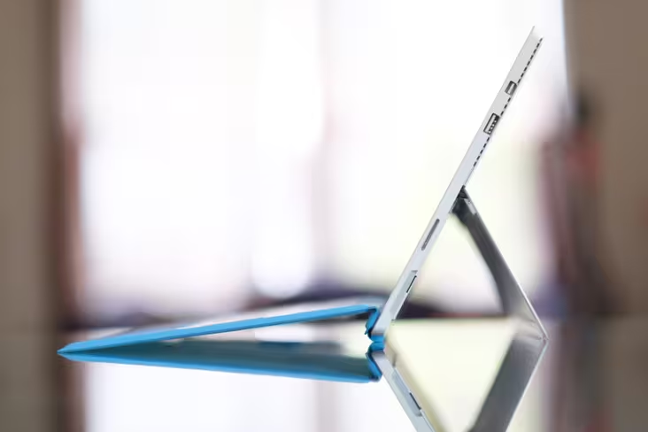
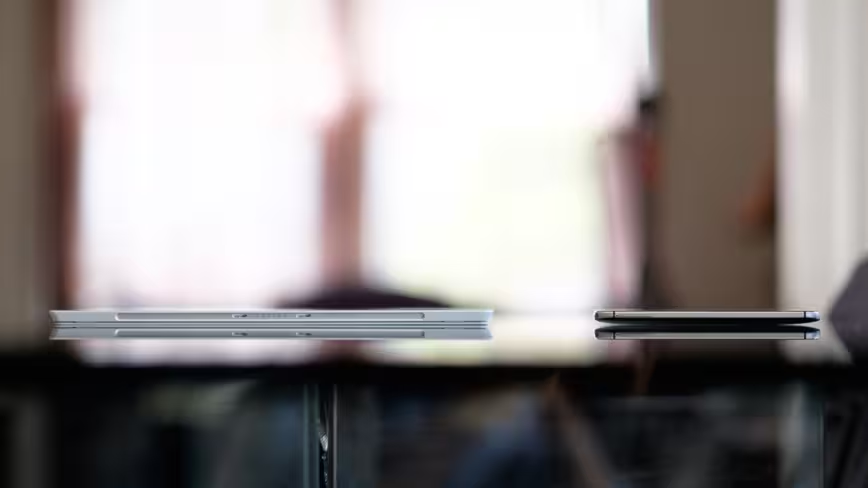
Impressively, Microsoft managed to increase the screen size while making the chassis thinner and lighter – 9.1mm and 1.76lb, respectively. That’s thinner than my HTC One M8 at its thickest point (9.4mm). The weight comes up to 2.4lb with the Type Cover attached, but it’s still lighter than the 13-inch Macbook Air’s 2.96lb, and the device feels as solid as ever.
Unfortunately, Microsoft hasn’t found a way to add more ports to the computer; like the Pro 2 before it, it features just a single USB 3.0 port, a Mini DisplayPort connector, and a microSD slot hidden under the kickstand. Why they couldn’t fit a full-size SD slot beats me, but it seems like a missed opportunity for photographers and videographers, especially now that the Surface features a very photography-friendly 3:2 aspect ratio, and given that you only have one USB port to work with.
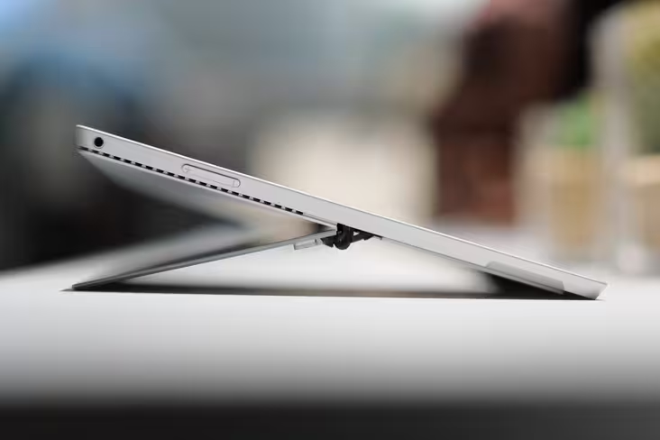
Speaking of the kickstand, rather than just clicking into two angles like in the previous model, it now features a full 150-degree range provided by a very sturdy-feeling hinge. This both significantly improves its ability to be used on your lap and makes the Surface a better, well, writing surface. You have to wonder why Microsoft didn’t implement this sort of flexibility from the very beginning, but I’m glad they finally did.
The other big ergonomic change comes from the new Type Cover, which features two major updates. Firstly, the trackpad is 63 percent bigger and made of a more glass-like material, contributing to a better mouse experience. Mind you, it’s still not particularly great. It’s usable enough to not be a point of serious frustration, but it’s smaller than those on many competitors, and I found the default sensitivity to be too low for my tastes.
Secondly, the Type Cover now features a cool trick where it magnetically folds an upper portion of itself into the bottom bezel of the Surface’s screen, all with a satisfying ‘snap’. What this does is place the keyboard at a much more ergonomic typing angle, as well as improve the stability of the keyboard when used on your lap. The raised position does make the keyboard a tiny bit louder and more bouncy, but it’s still a surprisingly sturdy experience for a keyboard cover. It’s backlit, too.
Other changes include a new and improved Surface Pen, which is now all metal and includes a button to access OneNote directly; speakers that are 45% louder (and have great stereo separation); an easier to connect power plug; and both rear and front-facing 5MP cameras.
Internally, the Surface Pro 3 features largely the same specs as the Pro 2 before it, but it now allows for Core i7 configurations should you want extra the extra power. In all, there are five different trims:
- $799: 64GB, Core i3, 4GB RAM
- $999: 128GB, Core i5, 4GB RAM
- $1,299: 256GB, Core i5, 8GB RAM
- $1,549: 256GB, Core i7, 8GB RAM
- $1,949: 512GB, Core i7, 8GB RAM
Keep in mind none of these prices include the Type Cover, which you’ll almost certainly want and will run you an additional $130.
Performance
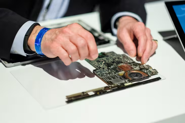
As to how those specs perform? Naturally, not much differently from the Surface Pro 2 if you’re using a similar configuration – but that’s not necessarily a bad thing. We tested the midrange model, and despite the higher resolution screen on the newer Surface, it was mostly smooth sailing.
I was able to stream 4K video on YouTube without dropping frames, and general usage of both ‘Metro’ and traditional desktop apps felt swift and responsive. It never got uncomfortably hot, and Microsoft also claims you won’t hear the fan in the Surface Pro 3. Generally, that’s true, although it does whir up more audibly during intense processing or while playing video games.
On that note, you won’t be playing any modern titles at their max settings and native resolution – these are ultrabook specs after all – but I was able to have GlaDOS threaten to kill me at decent frame rates so long as I kept the resolution low in Portal 2. In all, it performs the way you’d expect any similarly configured Haswell ultrabook to perform, perhaps aided a bit by a distinct lack of bloatware.
Regarding battery life, Microsoft says you’ll get up to nine hours web-browsing battery life, but that’s a bit of a stretch for real-world usage. Yes, I saw close to that number when actively trying to maximize battery life, meaning low screen brightness and doing nothing but light web browsing, but chances are you do more than that on your computer. In my typical usage – web-browsing, watching Netflix, listening to music, image editing, all at a relatively high brightness—my battery life averaged around seven hours.
That’s a decent enough number, and in line with many other Haswell computers. It should get you through a workday fine, but you may not be as confident about leaving your charger at home as you might be with some laptops, let alone a tablet. It’s also worth noting that though the there was a battery-extending Power Cover for the Pro 2, Microsoft has not announced any plans to release one for the Pro 3 thus far.
Next page: The Surface Pro 3 in use
In use
Given that the Pro 3 is being released well less than a year after the previous iteration (which also runs Windows 8.1), there haven’t been many changes on the software side. Window 8.1 Update 1 has been released since then, but those updates primarily benefit desktop users. For more on Windows 8.1, check out our review. For more on the new features in Update 1, check out this post.
Rather than new software or beefed up specs, what makes the Surface Pro 3 a different and all around better experience than the Pro and Pro 2 before it are the changes to the external hardware and ergonomics.
Firstly, I’m pleased to report that yes, you can use the Pro 3 on your lap. Quite comfortably, too. The combination of the new, flexible kickstand and the sturdier angled keyboard means the Surface is able to handle virtually any of the awkwardly convoluted positions you may find yourself in during a lazy day at home.
I was able to type with it comfortably on a crowded NYC subway – about as difficult as a ‘lapability’ test gets – and I’m writing this very review with the Surface on my lap. In all, the new kickstand goes a long way toward letting the Surface adapt to you, rather than forcing you to adapt to it.
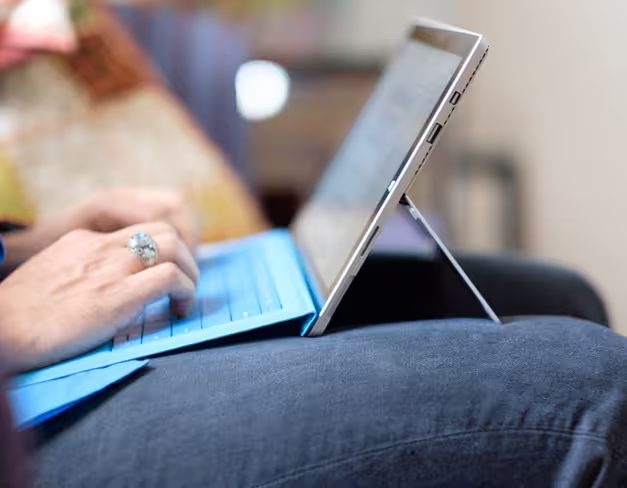
There are some caveats, however. If you’re someone with shorter legs (I’m 6’0”), the lowest angles could be more difficult to use, as the kickstand might start to extend past your knees. The procedure of adjusting the kickstand isn’t as quick and seamless as on a regular laptop hinge either; it’s always a two-handed process. Also, while the Type Cover is almost certainly the best keyboard cover around, key travel is necessarily still on the shallower side. It’s a surprisingly solid keyboard, but like the trackpad, you will find better ones on dedicated laptops.
The tablet side of things also sees improvements. 12 inches makes for quite the gargantuan tablet (hey, we’ve seen larger), but it manages to feel more usable than the older design. The thinner and lighter construction surely contribute, but the biggest factor is the new 3:2 screen aspect ratio, which means you might actually want to use the Surface in portrait mode for once. It also means that you’ll finally have room left over to view content when using the on-screen keyboard in landscape mode.
It’s no Nexus 7 – you won’t be holding it in one hand while jogging on a treadmill and drinking your morning latte – but it’s totally fine for carrying around the house cradled in arm, or for watching Netfix in bed (where the kickstand comes quite in handy).
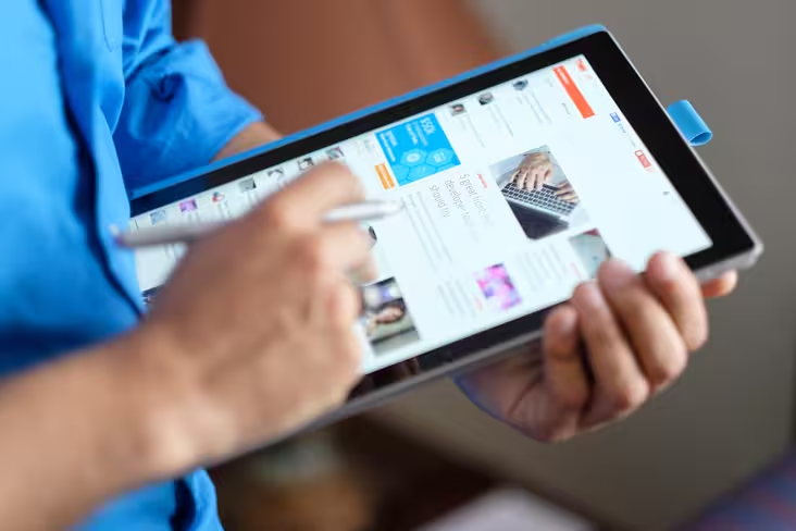
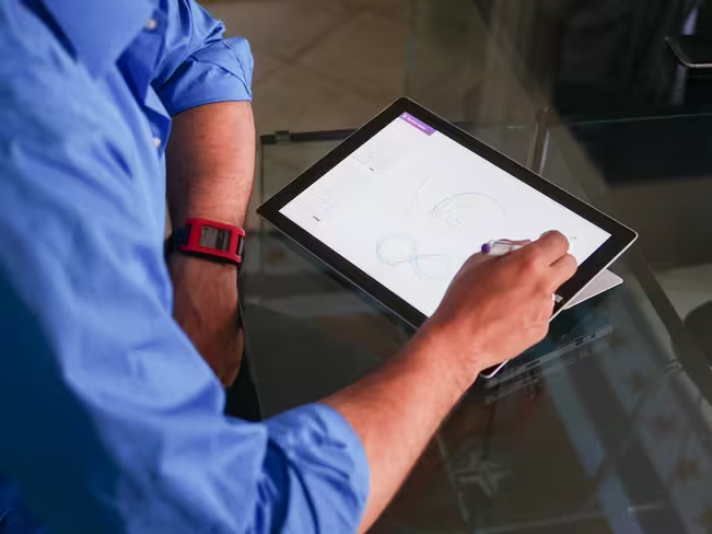
The new Surface Pen is an area where the Pro 3 can legitimately claim an edge over its competitors. While a trackpad or touchscreen works great for simple navigation like web browsing, they’re poor tools for precision work like image editing in Photoshop or creating graphics. I spend a lot of time in Photoshop and Lightroom, and the stylus makes it much easier to perform edits than any trackpad I’ve used.
Designers may decry the decrease in pressure sensitivity (from 1024 levels to 256) and the change in technology from Wacom to N-Trig, but the Pro 3 nevertheless has the best on-screen digitizer I’ve used (Microsoft also says it will release an update to enable customization of the pressure curve). The ultra-thin display stack and minimal latency make the stylus experience feel intriguingly close to pen on paper. The lowest kickstand position also provides a great angle for drawing and note-taking, but you do need to be wary of accidentally pressing the Start button with your palm.
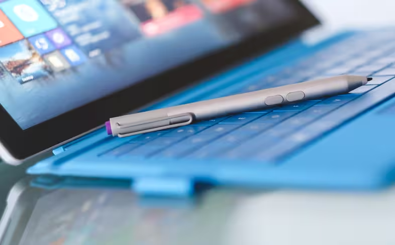
One feature I found to be surprisingly nifty is the OneNote button on the top of the stylus. Basically, it allows you to launch OneNote at any time, even if the screen is off. While I thought it’d be no more than a gimmick I’d soon forget about, I frequently found myself launching the app to jot down ideas and notes during my review period. As someone who prefers to work with pen and paper, I think it’s a great tool for brainstorming or recording thoughts as they come, although I still wish the buttons were customizable.
In practice, you end up using the Pro 3 with a mixture of its three pointing devices. This may sound overly complex, but I actually appreciate the flexibility – each method has its benefits. When you’re on the move or using apps that employ the latest Microsoft design language, you’re more likely to be pawing at the screen with your finger, whereas in desktop mode you’ll probably be using either the touchpad or stylus, depending on the sort of precision you need.
The stylus comes particularly in handy if you need precise control while using the tablet on the go – akin to writing on a large note pad. There’s something to be said about a device that can handle productivity tasks as well on the move as on a desk.
Verdict
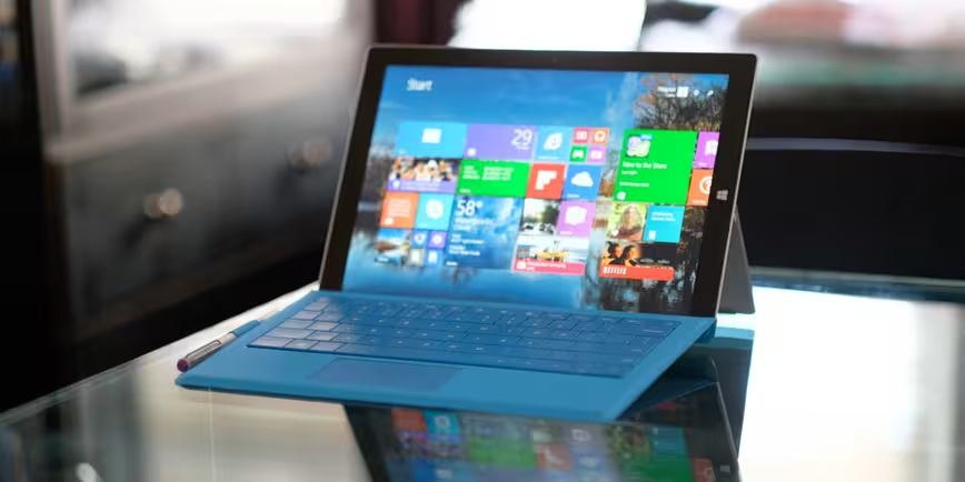
The Surface Pro has always been an exercise in compromise. This newest iteration sees that balance refined, and Microsoft deserves praise for improving it on both the laptop and tablet fronts. However, the fundamental question remains as to whether a tablet-with-a-keyboard is really the best approach for the company’s Windows 8 hardware. Throughout the review period, I often found myself thinking “the Pro is pretty good at this, but a dedicated laptop or tablet would probably do it better.”
And perhaps that mindset is Microsoft’s fault. Not for creating an in-between device, but for promoting it as one that tries to be great at everything. Making comparisons to a MacBook or iPad about thinness and weight means people will compare all other aspects of the computer as well, from the keyboard to the price.
Truthfully, the Surface Pro 3 makes most sense when you stop contrasting it spec-by-spec to either a tablet or laptop, and take it for what it is at its simplest level: a mobile computer, a device for content consumption and creation. There’s a lot of untapped potential here for future versions of Windows.
But as for right now, is the Surface Pro finally good enough to replace both your laptop and your tablet? Well, maybe. That sounds like the easy answer, but it really does depend on your needs; not everyone uses their devices the same way. Given its size, I still see it catering more towards productivity than the take-me-everywhere nature of a tablet. And with a $799 starting price that quickly ramps up with accessories and configurations, it’s also not the same impulse-buy value many tablets represent.
On the other end of the spectrum, the maximum configuration of $2,079 (if you include the Type Cover) is expensive enough to be considered against serious-business laptops, but the Surface does have a flexibility advantage for that premium. It gets difficult to compare its value against laptops and tablets when it doesn’t fully fit into either category.
In fact, even within TNW, the Pro 3 has been divisive. My colleague Natt noted significant misgivings in her initial hands-on about whether it could really take the place of her laptop, but conversely, I’m strongly considering a purchase. That said, I fall into an optimal user group for the Surface: I’ve been using a convertible tablet since before Windows 8, and I already use a stylus for much of my work on the go.
Ultimately, your thoughts on the Surface Pro 3 will most likely hinge on how you already use your laptop and/or tablet. If you need a paramount typing experience and more ports on the go, it could disappoint you. If you want something inexpensive that’ll fit in a purse, there are plenty of better options. But if you can live with some sacrifices for the added versatility of a hybrid, Microsoft presents its best contender yet. You’ll just have to weigh the compromises.
Don’t miss: Four things Microsoft can do to take Windows to the next level
Get the TNW newsletter
Get the most important tech news in your inbox each week.

