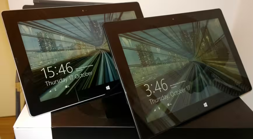
The introduction of the original Surface Pro pretty much came as a surprise to most people, and as such it was a bit of an unknown entity, at least in terms of expectations. Microsoft has a mixed bag of results when making hardware, ranging from the ever-popular XBox to the never-popular Kin, which went on sale for less than two months.
Second time around, however, we know better what to expect from Microsoft’s Surface Pro 2 tablet and what it delivers one year on is minor hardware tweaks and a noticeable software upgrade. But is it enough to straddle the line between a full-blown laptop and a tablet successfully with retail pricing starting at $899 and going up to $1,799 (£720 – £1439 in the UK) for the higher capacity variants?
Hardware and design
If you weren’t a fan of the original Surface Pro look away now, as the second iteration keeps a virtually identical design and overall chassis spec.
One of the notable upgrades is a change to using the newer fourth-generation Core i5 (Haswell) version of Intel’s 1.7GHz quad-core chip. In real terms, this means that you should get more use out of the Pro 2 before the battery is drained, and a little bump in the performance department.
Most hardware specs remain the same, but there has been an increase in RAM from 4GB to 8GB, although this only applies to the variants with 256GB/512GB of storage and not the smaller 64GB/128GB options.
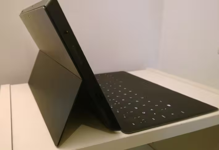
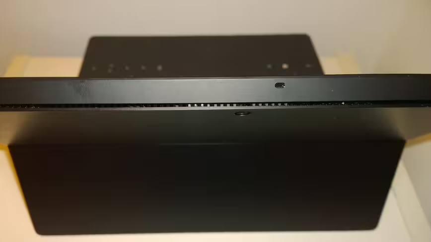
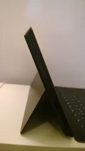
One of the other most noticeable, and perhaps most needed, changes to the overall design of the device is that the kickstand will now lock into two different positions, rather than just one which made using the original Pro a bit awkward at times.
The overall dimensions of the Pro 2 measure up at 10.81 x 6.81 x 0.53 inches and it weighs in at a not inconsiderable 2 pounds (just under 1KG). Ultimately, at around the weight of a bag of sugar, it’s not prohibitively heavy but if you’re considering it as a tablet, it’s definitely heavier than average. Conversely, it’s within Ultrabook weight-range if you’re thinking of it as a laptop.
It keeps the same 10.6-inch ClearType 1920 x 1080 display as its predecessor and also has the same HD front-and-rear facing cameras for stills, videos and calls. Why anyone would use a 10.6-inch tablet as a camera, particularly on a tablet as weighty as this still confuses me a bit, but I can only assume some people like to as the option remains. Neither camera is particularly noteworthy in terms of quality, which is a bit of a shame as Microsoft has revamped its core camera app for Windows 8.1. That said, if all you really use the camera for is a bit of Skype calling now and again, the on-board forward-facing 720p option will be fine.
The display itself performs well, with crisp text and sharp images – it also feels pretty slick in use when pawing at it as a touchscreen. If you were looking for an improvement over the original though, you’ll be disappointed.
The Surface Pro 2 actually has quite a few input options, although sadly not in the ‘ports’ sense of the word as all you’ll find there is one USB 3.0 slot, a microSD slot and and Mini DisplayPort for connecting to an external monitor.
Rather, there are lots of options for controlling the device, whether that’s using the screen, the included Pen stylus for precision control or for handwriting, or one of the various available keyboards with included touch pad.
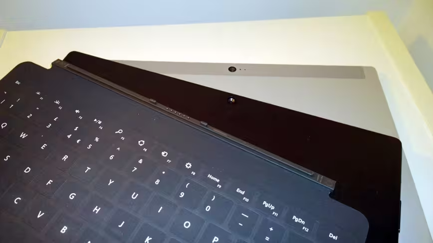
As before, the tablet itself docks with a variety of keyboards – although we only got to test out the new Touch Cover 2, which is now backlit and has a whole lot more sensors to support gesture control. Ultimately, while I like the convenience and (lack of) weight in using the Touch Cover 2, it still takes some getting used to there being no physical travel at all in the keys, they’re all flat. The addition of back-lighting to the Touch and Type Cover keyboards is a practical touch as well as an aesthetic one as it makes it easier to use in the dark and one that I fully approve of. Who isn’t a sucker for a backlit keyboard?
In testing, typing was plenty swift enough with a little practice, but I definitely made more errors (yes, than usual). In contrast, I rarely used the touch pad and instead found myself instinctively reaching to prod the screen, rather than navigate with a mouse. The new Touch Cover keyboard now also has a host of new sensors so you can also control the cursor simply by swiping left or right across the top of the keyboard. In reality, it wasn’t a feature I used much, though it worked, mostly. With more precise and quicker ways of achieving the same job, it’s a flourish I didn’t need.
Battery life is an area that Microsoft failed to give hard figures for when the Surface Pro 2 was announced, claiming instead that it would deliver an “up to 75 percent” boost.
As with all smartphones, laptops, tablets and anything similar, the settings and programmes you have running will greatly affect your battery life. If you want to conserve it, turn down the screen brightness and turn off anything you’re not using, like Bluetooth or WiFi – alternatively set-up a low-power mode to dial back the processor too. In our testing with standard settings enabled (indoors, mixed use – browsing, watching videos, writing, listening to music etc – Bluetooth and WiFi switched on) we got around six hours pretty much constant usage out of it before getting the ‘you really should plug it in now’ low-battery warning. About one-third of that was streaming HD content, while the rest was general usage with Spotify and a few other things running in the background.
As I said, exactly how long the battery will last isn’t an exact science, it really does depend on your usage and settings; I like the screen reasonably bright. Naturally, the claimed standby life of the Pro 2 is far longer (“7 – 15 days idle time”!) but we only had it for a short while, so couldn’t attest to that.
With so much of the Pro 2’s hardware remaining unchanged – at least externally – it’s hard not to think that perhaps it could have been refined a little more for its second-generation outing, that’s not to say it looks aged, but it’s definitely on the chunky side if you’re considering it primarily as a tablet.
Software
While Microsoft only made small tweaks to the Pro 2’s hardware, it put significant effort into Windows 8.1 – the first major update of its newest OS.
Released in its final form last week, Windows 8.1 brings a host of new features and some significant updates to the core apps and even though we brought you a full review of the OS, we’ll hit on some of the highlights here.
One of the most important (for some people, at least) changes between Windows 8 and Windows 8.1 sees a return of the Start button on the desktop view, although it does just throw you across into the Windows 8 Start screen. In order to quell some of the criticism that Windows 8 has a ‘split-personality’ as a result of its dual UIs. For example, you can now set your background to stretch across both the desktop and Windows 8 UI view which makes quickly and frequently switching between the two spaces far less jarring.
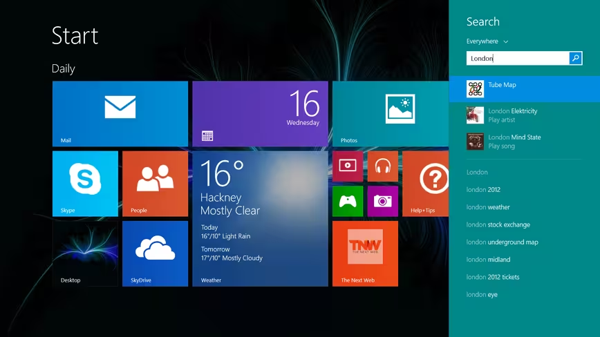
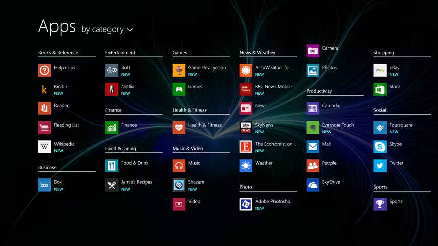
The Start screen is now easier to customize too (and yes, you can choose to boot to desktop, if you wish), with support for new color schemes and different sized Live Tiles. You’ll also now find all your installed apps just a swipe away from the Start screen, by swiping down, shown above.
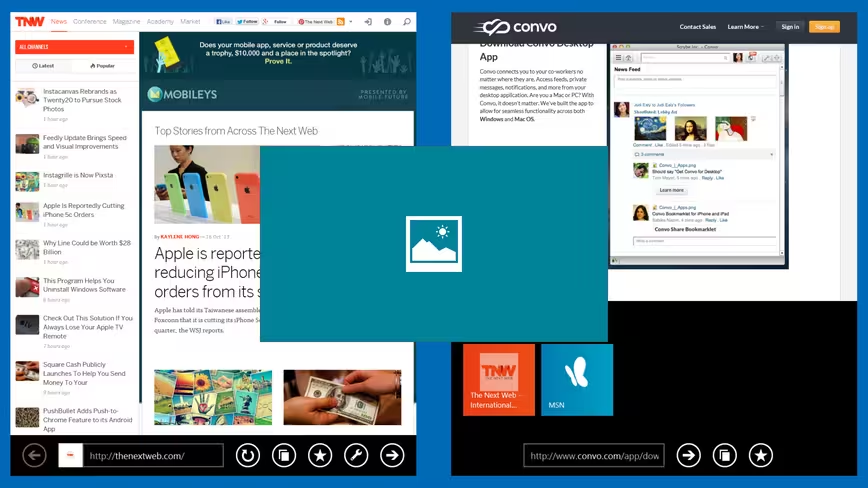
However, much more importantly than that (to me) is the new and improved multi-tasking. One of my biggest complaints of the first Surface Pro, and indeed Windows 8, was that you could only ‘snap’ two windows side-by-side, and only in a pre-sized way. Now, you’re free to resize either application however you’d like and it will support up to four running on the same screen if your display is big enough. Alas, the Surface 2 Pro’s is not but it’s worth bearing in mind if you’re connecting up to an external monitor.
Better than that, you can now multi-task with the desktop on one side and a Windows 8 app (shown above) on the other too.
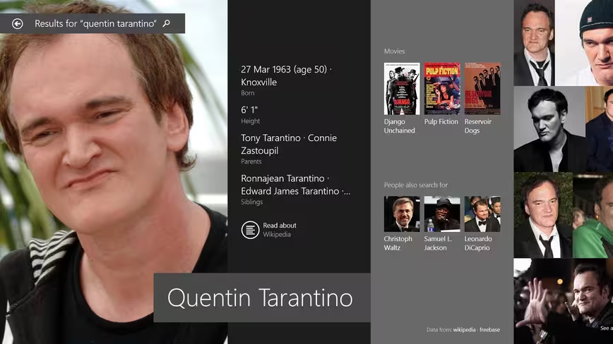
Search has also been radically changed for Windows 8.1 and now integrates Bing results directly with local on-device hits. The end result for some searches (shown above, a search for ‘Quentin Tarantino’) is pretty impressive.
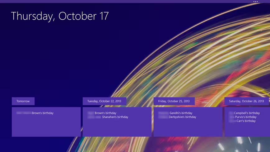
For Windows 8.1, Microsoft updated virtually all of its core apps like the Calendar, Contacts, Outlook Mail, Internet Explorer 11, XBox Music and more.
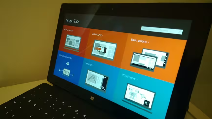
There’s also a few new ones too, like Help + Tips, and Health + Fitness. Pretty much the only one to have seemingly been skipped for now is Xbox Games, which remains the same.
As these aren’t features specific to the Surface Pro 2, we won’t dwell too long here, but it’s good to see Microsoft bringing some visual coherence to its core offering, which ultimately provides a slicker experience, provided it can convince people to use them in the first place.
Naturally, as it’s the full version of Windows 8.1, there’s also support for desktop apps.
In use
In reality, with such similar hardware, the overall experience of the Pro 2 is much the same as the original. However, it’s worth calling out that the combination of a newer generation processor and a bump in RAM (we tested an 8GB RAM-equipped model) meant that the whole experience was just a little bit smoother, and certainly a lot swifter to use in our testing. It’s not going to replace your main desktop machine as a video editor or for other heavy-duty tasks if that’s most of your workload, but it’s perfectly capable of carrying out multiple everyday tasks simultaneously and being used as a laptop stand-in.
However, while mostly a capable machine, my 24 hours using the Surface Pro 2 wasn’t without problems. None were major, but I’d prefer not to have it switch off and reboot within half an hour of receiving it with no warning whatsoever, and no explanation after the fact. On one other occasion, I was left with little choice but to hold the power button down to force a reboot as it was clearly struggling and became unresponsive.
One thing I was glad to see included was the additional viewing angle from that tweaked kickstand. Now, the Pro 2 is far easier to use when up close on a lap, like a laptop, as well as when it’s on a table or a desk. That’s a pretty essential requirement for a device claiming to be the best of the tablet and laptop worlds in one package, and I’m surprised it wasn’t an option on the original.
The digitizer Pen input was a useful addition when using the Pro 2 at max resolution in the desktop UI mode for carrying out more intricate operations, like navigating sub-menus. It simply clips on and is held in place magnetically where you plug the charger in.
If a stylus isn’t your style, there’s always the touch pad built into the Touch Cover 2 for more fiddly tasks. Thankfully connecting the keyboard is easy enough. It simply snaps into place and is locked in by magnets.
While it might sound like a bit of a flimsy connection, it actually makes for a pretty good overall experience – balancing portability with robustness and interoperability.
However, put simply, the touch pad sometimes just plainly refused to work. The rest of the keys were all fine and operational, but at least two or three times in 24 hours the touch pad just stopped working altogether. In honesty, I’m not sure if rebooting the device or disconnecting and reconnecting the cover fixed the issue, or it simply resolved itself each time.
As an unintended aside to my short time with the Pro 2, I also accidentally dropped it from about desk height onto a wooden floor – sorry, Microsoft! Thankfully, or this would have been a very short review indeed, it carried on without missing a beat. I’m not recommending a drop test of your own, though.
Verdict
The Surface Pro 2 wants to be everything to you. It wants to be your tablet, and it wants to be your every day laptop too. But it’s far more convincing at one of those things than the other.
I want my tablet to be light, to be convenient and easy to use for maybe just a few minutes at a time, or maybe a few hours. The problem with the Surface Pro 2 is that it doesn’t do very well in real life at these things. For example, it rarely, if ever occurred to me to use the Pro 2 in portrait mode – something I’d regularly do with other tablets. What if you’re just browsing the internet, who wants to do that with a 1KG weight in their hands? Or hand, depending on which keyboard configuration you’re using.
The flip side of that, however, is that 1KG is pretty light for a laptop. It’s pretty light for use on your lap, or to carry in your bag. And with a full version of Windows 8.1 and all the desktop/legacy goodness that brings, the Pro 2 is accomplished enough to be my workaday laptop, but then I’m not a big gamer and don’t do a lot of video editing.
Whether the Pro 2 represents good value for money or not depends on what you’re considering as its primary function. If you’re thinking of spending up to $1,700 for its tablet capabilities, you should probably look elsewhere. If however you’re looking at the base $900 model as a moderately well-specced laptop replacement, then the Pro 2 represents a very portable and premium-feeling piece hardware for the price-point.
In attempting to straddle both device categories, the Pro 2 makes compromises on weight and additional hardware (notably, ports – one USB 3.0 is a little lacking if considering it as a laptop replacement) support, though . While I can overlook the latter, or at least work around it, the Surface Pro 2 does less well at convincing me it should be my go-to tablet. It’s just too damn chunky for that.
Get the TNW newsletter
Get the most important tech news in your inbox each week.
