When was the last time you were really excited about a laptop – especially a Windows one?
For several years, hype in the tech world has largely revolved around phones, tablets and smartwatches, and there arguably hasn’t been a truly revolutionary laptop since Apple pulled a MacBook Air out of a manila envelope in 2008. Some spec bumps and crazy designs, sure, but nothing that really changed the way we used our devices.
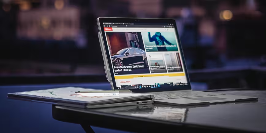
But then Microsoft surprised the world with the Surface Book a couple of weeks ago, and something special happened: we finally had an exciting laptop again. A device with great design, ultrabook dimensions, 12-hour battery life, dedicated graphics… and it could turn into a tablet?
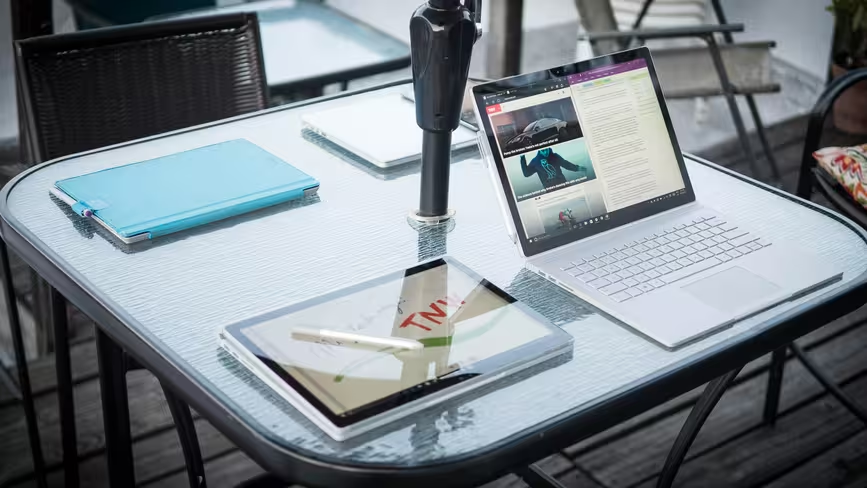
It almost sounded too good to be true, but after a couple of weeks using the Surface Book, I’m happy to report Microsoft not only built one of the best laptops you can buy right now, it also created one of the most forward-looking devices I’ve used in years.
It’s gorgeously engineered
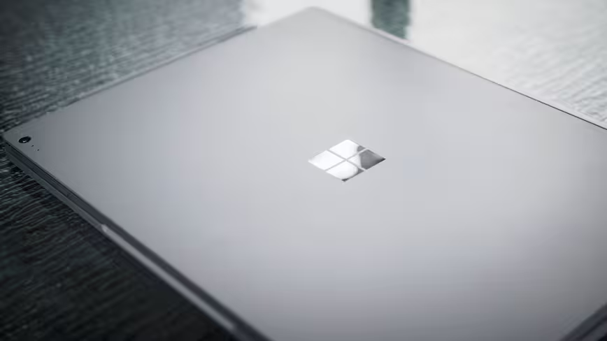
I’ve got to hand it to Microsoft; it’s somehow managed to build an all-metal laptop that doesn’t look like a Macbook. In the couple of weeks I’ve used it, I’ve had four completely random people approach me just to ask what laptop I was using.
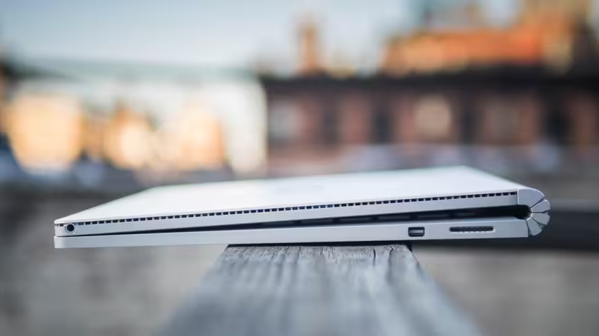
That’s largely thanks to the Surface Book’s zany ‘dynamic-fulcrum’ hinge, which kind of looks like an awesome cross between a scorpion tail and a bendy straw, but also helps keep the relatively top-heavy design (more on this in a bit) from toppling over by elongating the base when folded out. It stands out, and it makes a statement.
The hinge might initally look like it can to bend 360 degrees a-la Lenovo Yoga, but it actually has a relatively short range (also likely to help stop it from falling over). The screen is a little wobblier than some laptop hinges, but it never bothered me.
The Surface Book is built from a magnesium alloy chiseled into a chassis slightly larger than a 13-inch MacBook Pro. It’s thicker at the hinge due to the gap with the keyboard, but is slightly thinner on the other end. Microsoft’s laptop is actually lighter than the MBP in its base configuration, but with the GPU – which the Pro doesn’t offer – weighs an identical 3.48 pounds.
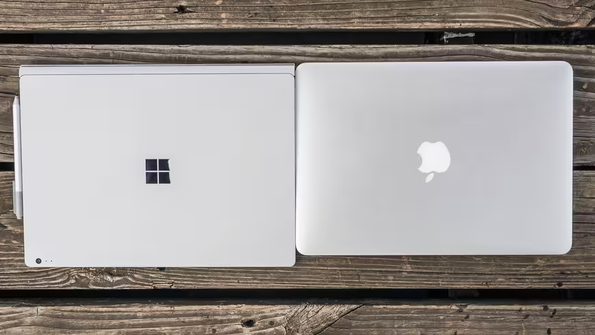
That is, until you detach the display. In something of a minor engineering miracle, Microsoft managed to fit all the basic computing components in just the top portion of the laptop – the keyboard base houses just a larger battery, ports and optional discrete graphics.
Press the eject key on the top right of the keyboard, and suddenly you have a really big – but really thin and light – tablet. Seriously, it weighs just 1.6 pounds (about the same as the original iPad, which had a 9.7 – inch display), and it’s almost exactly as thick as an iPad mini.
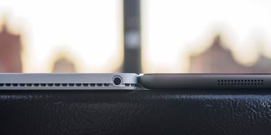
Impressive engineering aside, it also just looks really nice, striking a purposeful balance between retro and futuristic. For instance, the metal is whiter and more matte than most metal laptops; it’s clearly silver most of the time, but in some lighting it looks a bit like 90’s beige. Plus, the lines created by the hinge when open also remind me a bit of a Commodore 64, which is pretty sweet if you ask me.
The detachable tablet display is fantastic
13.5 inches might seem a little big for a tablet (though hey, Apple has a massive tablet of its own on the way), but you might feel a little different once you try out the display.
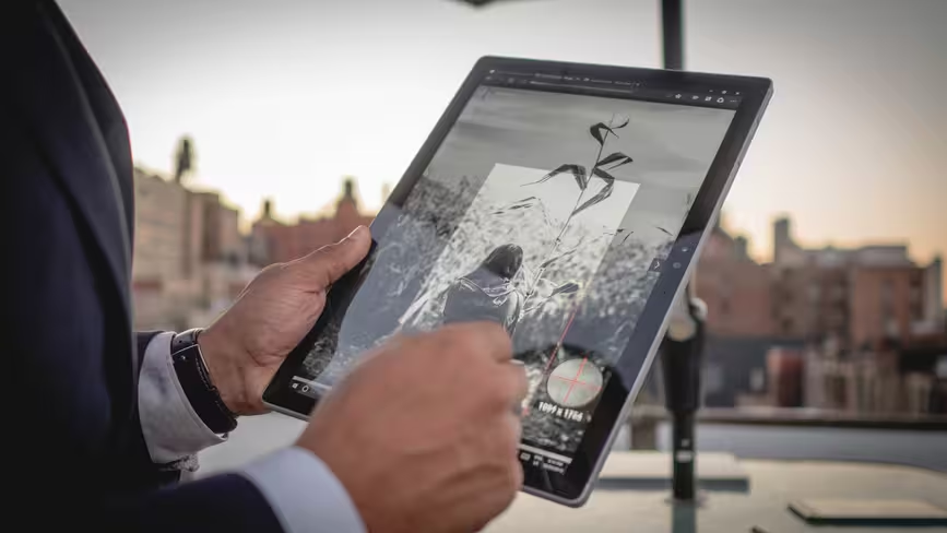
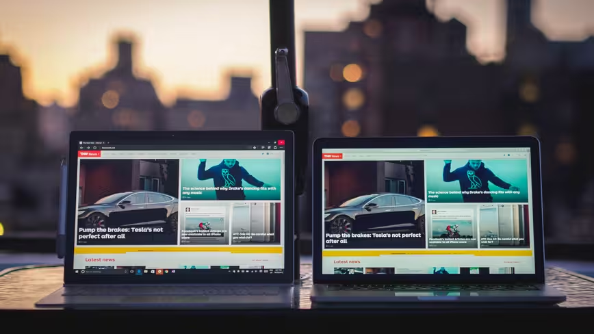
It’s possibly the best screen I’ve ever seen on a laptop, and it handily beats the Retina MacBook Pros – not to mention my old Surface Pro 3.
Most obviously, it’s a lot sharper. The 3000 x 2000 pixels display is a little under 4K, and comes in at 267 ppi (vs 227 on the MBP). Apple may dubiously claim that your eyes can’t resolve that many pixels at a typical viewing distance, but if you ever lean in to your screen to inspect images up close, the difference is readily apparent.

Colors are also more vibrant on the Surface Book. That’s helped out by an impressively claimed 1800:1 contrast ratio; indeed, despite being slightly brighter overall, the Surface Book actually has deeper blacks than the 13-inch MBP at their maximum output levels.
Couple all that with a 3:2 aspect ratio, and the Surface Book becomes something of a photographer’s dream laptop. Photos on the screen can come pretty darn close to looking like a physical print with the right brightness setting – especially if you’re using the Book in clipboard mode.
The most surprising thing about the display being detachable, however, is how often I actually use it. Don’t get me wrong: the Surface Book stays in laptop mode 75 percent of the time, but I honestly expected it to be something I’d largely forget about after a few days into the experience.
Instead, I find myself detaching the screen all the time. It’s a cool party trick, and aside from note-taking and photo-viewing, being able to detach and/or flip the screen around is really useful when watching video (it keeps the display closer to your eyes) or doing some image editing (the screen can be propped at a drawing angle).
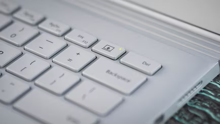
I also often went into tablet mode when I wanted to read something, as the tablet portion is so lightweight and the display so easy on the eyes that it’s somewhat reminiscent to holding up a magazine. And even if you leave it attached to the base in a flipped position, the fulcrum hinge gives you a good grip to cradle it in your arm.
Side note: The speakers are pretty fantastic too, with solid stereo imaging and more than enough volume to fill a room.
A better input experience
I’m not the pickiest person about my keyboards – I’ve used a Surface Pro 3 for a year and a half, after all – but I can confidently tell you the Surface Book checks all the boxes. Travel is better than with my MBP, the layout makes sense and the keys don’t wobble.
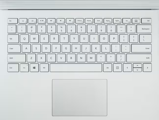
It’s not quite up there with the best Lenovo keyboards – the X1 Carbon comes to mind – but I can’t imagine anyone being unhappy with Microsoft’s.
The touchpad is also excellent. It’s approximately the same size as on Apple’s laptops and feels nearly as responsive to the touch. There’s also little more friction on Microsoft’s Touchpad, which you may or may not prefer.
That said, it’s a little wonky unless you disable or weaken palm rejection in the touchpad settings menu, as I found the default ‘long delay’ option it a little too aggressive for my tastes. Apple’s newest touchpads with Force Touch are also still better, mainly because they allow you to click anywhere on the pad, including the very top.
Of course, it wouldn’t be a Surface without the Surface Pen, and Microsoft’s made a several improvements that go a long way towards making it a more useful tool.
Firstly, Microsoft got rid of the annoying pen loop – thank goodness – and instead just made the pen magnetic so that it snaps onto the left of the display. The pen is also longer and has a flat side that provides better grip, while the eraser now sits more naturally at the top of the pen instead of being a second function button.
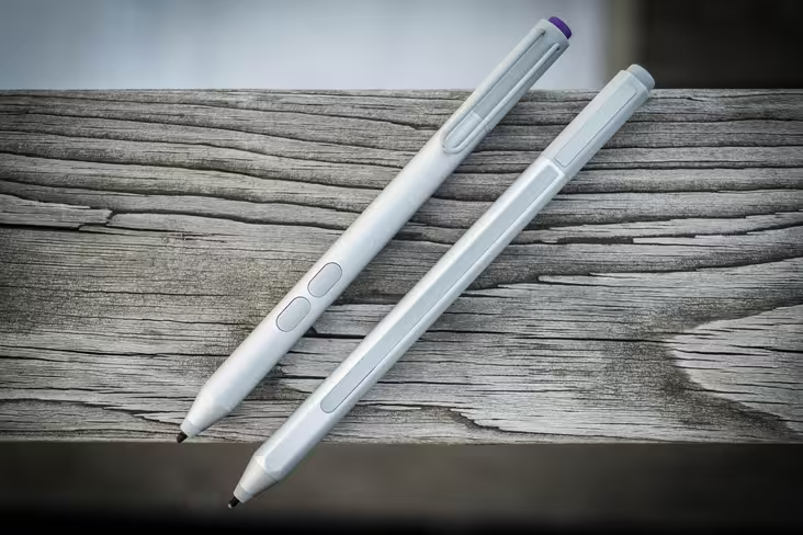
My favorite change is actually a bit more subtle – the Pen’s nib now uses a softer texture that feels more like pencil, and you can exchange it with other kinds to get the right feel. The new texture provides more friction and makes it a lot easier to select text and make fine edits.
Top-notch performance and reliable battery life
The Surface Book is all about performance, being Microsoft’s first product to support a dedicated graphics card (an undisclosed Nvidia chip that appears to be a super-powered 940M) and featuring Intel’s 6th-gen Skylake processors.
I was able to try out both a Core i5 model with 8GB of RAM and integrated graphics, as well as the top-end Core i7 with 16 GB of RAM and dedicated graphics. In everyday usage, I didn’t notice a significant difference between the two models. In fact, I’d say the biggest improvement compared to my Surface Pro 3 is the inclusion of a PCIe SSD, not the processor – photo editing in Lightroom is a breeze.
The obvious difference comes in terms of gaming. While the Intel HD 520 chip on the lower-end Surface Book is surprisingly capable for older titles – the relatively lightweight Portal 2 ran smoothly at medium settings – you’ll definitely want the Nvidia model if you play games more often.
I was able to run through 2013’s ‘Tomb Raider’ comfortably at medium settings and HD resolution on the higher-end device. Portal 2 hit 60fps easily at 1080p with maxed-out settings.
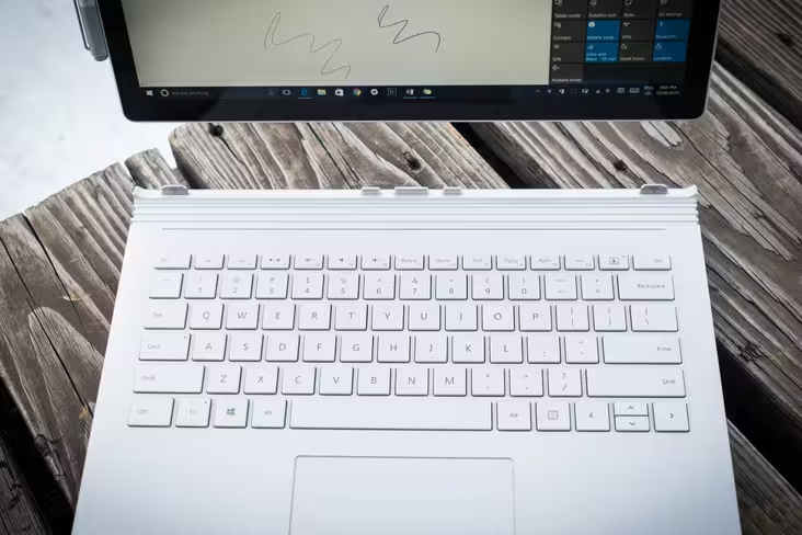
As you might expect, battery life is variable and won’t always hit Microsoft’s claimed 12 hours. I never went on a long enough Netflix binge to truly put that claim to the test, but watching a couple of Mad Max movies only depleted charge by about 30 percent, so the claim seems accurate for video.
Load it up with powerful software like Lightroom or Photoshop and high brightness, and you can expect that to drop down around six hours, which is still very solid.
If you’re doing light Web browsing, you’ll also want to stick to Firefox and Edge over Chrome (which is a well-documented battery-hog). Universal apps in general are also better optimized for power-efficiency.
Fun note: because both the screen and the keyboard have their own battery, you’ll actually see two percentages show up in your power settings. It’s also worth noting that the tablet portion only lasts about 3 hours on its own, though you can attach the charger directly to the display if you want to keep reading in bed. Impressively, I didn’t notice worse battery life on the GPU model.
Overall, it’s one of the longer-lasting laptops out there, with longevity comparable to my MacBook Pro. That’s saying a lot for a Windows device – just don’t expect any miracles if you’re a power user.
More than just a good laptop
The first few minutes of Microsoft’s Surface Book unveiling, I was worried the company had given up on the Surface concept by going the safe route with a traditional laptop. But then the screen detached, and I realized the company had built something more: the first true flagship Windows device.
And it’s got a price tag to match the title – prices start at $1,499 ($1,700 if you want the graphics card), and run up to $3,199 – but Microsoft is aiming squarely for the premium market. After all, it’s priced roughly between the 13-inch and 15-inch MacBook Pros, which is basically where the Surface Book lies spec-wise, and you can’t put a price on that detachable screen.
But then again, this is Windows, and you always have other options.
This is also not to say Windows hasn’t had a great laptop before; the XPS 13 and HP Spectre x360 come to mind. But what makes Apple’s laptops so popular is the unity of hardware and software – knowing that the next MacBook Pro will always show off the best OS X has to offer. It’s also what Google aims for with its Nexus phones.
Microsoft hasn’t been as successful. Previous Surfaces have been great devices in their own right, but the hardware was too polarizing to achieve the sort of popularity Apple commands. And though the tablet-with-a-keyboard design form has gained some traction of late, for the average user, Surface tablets always seemed like a bit of a gamble on a potential future.
The Surface Book, on the other hand, is both Microsoft’s MacBook and Nexus. Like the MacBook, it’s the best showcase for its own operating system; embodying Windows 10’s philosophy, it makes the old-school laptop truly touch-friendly without compromising on the traditional experience. And like the Nexus devices, it sets a high standard for third parties to aim for.
But for Microsoft as a company, it means something more: finally taking the future of Windows devices – and laptops in general – into its own hands. Right now, that future looks wonderful.
Get the TNW newsletter
Get the most important tech news in your inbox each week.
