There’s an old adage about Microsoft Windows: the good versions skip a generation.
Windows Vista was bad, Windows 7 was good and Windows 8 was bad again, so it’s not much of a spoiler to say that Windows 10 lands on the bright side of the cycle.
Microsoft knows it alienated a massive number of users with Windows 8 though, so it tries its darndest to undo the damage with Windows 10 – so much so that it skips an entire version number.
But more than just a repair job, Windows 10’s flexible design goes a long way in reimagining how we think about using our operating systems. It improves on its two predecessors in meaningful ways that affect how I use my computer on a daily basis; here are some of the best parts:
The Start Menu is finally back
You knew this part was coming, right? Replacing the versatile Start Menu with the full-screen Start Screen was easily one of the most aggravating of Window’s 8’s changes. Bringing back the Start Button alone with Windows 8.1 wasn’t enough, so this time around Microsoft mixes the best of Windows 7 and 8’s designs.
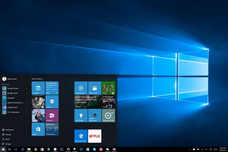
On the left you have a list of your more frequently used items and access to a list of all your apps, while on the right you have an array of Windows 8’s pinnable live tiles, which provide at-a-glance information about their respective apps. The menu is also resizable so you can fit as many of these tiles as you want (or even revert to a full-screen look via the Settings app).
Truth be told, it’s mostly just a visual change, but it’s a welcome one. The Start Screen was jarring to longtime desktop users, completely filling up your display with an alien interface. The new Start Menu helps ease the divide between the traditional Windows UI and Microsoft’s vision of touch-friendly future. And if you still hate the live tiles, you can just remove them all.
Modern apps are actually worth using now
With Windows 8, Microsoft forced modern apps to run full-screen instead of in, well, windows, causing them to feel artificially tacked onto the OS. Sure, you could snap one or two of them to the sides, but it simply wasn’t the same flexibility afforded by a full windowing system.
That all changes with Windows 10. All of your Windows 8 apps (well, if you used any) now run in good ol’ resizable windows. You can minimize them, maximize them, snap them to the side, or make them run full screen if you’re on a tablet or just feel like it. These apps will show a menu bar on the top left that allows you to access the legacy ‘charms‘ functions from Windows 8.
More interesting is Microsoft’s new software created under the universal app platform, designed to work on anything from phones to desktops. As if just to prove it could be done, Microsoft made pretty much all the new apps in Windows 10 using the new platform, including Mail, Calendar, Maps, Photos and the new Edge browser.
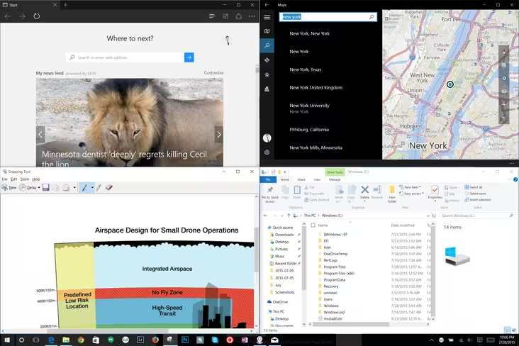
There are other benefits besides touch-friendliness too. Because universal apps are designed to run on mobile devices, my Surface Pro 3 consistently gets several hours more battery life with Edge than with Chrome (though that’s a notorious battery hog).
Importantly, this bodes well for Microsoft’s app ecosystem on both PCs and mobile devices. Because developers can create one piece of software that will run on a multitude of screen sizes and hardware configurations, there’s a good chance the Windows 10 ecosystem will grow more quickly than Windows 8 and Windows Phone 8 could ever muster separately.
The average user won’t notice the difference between modern and desktop apps, but that’s the best thing Microsoft can ask for.
Power users are cared for
More than just fix Windows 8’s mistakes, Windows 10 adds several new features directed at power users focused on productivity.
The single best new productivity feature is Task View, which presents a visual summary of all your open apps and finally allows you to create virtual desktops without requiring third-party software. You can access easily access it in three ways: A three finger swipe up on the trackpad, by pressing Win + Tab, or by dragging in from the left side of the display. There’s also an icon on your Taskbar, should you forget the shortcuts and gestures.
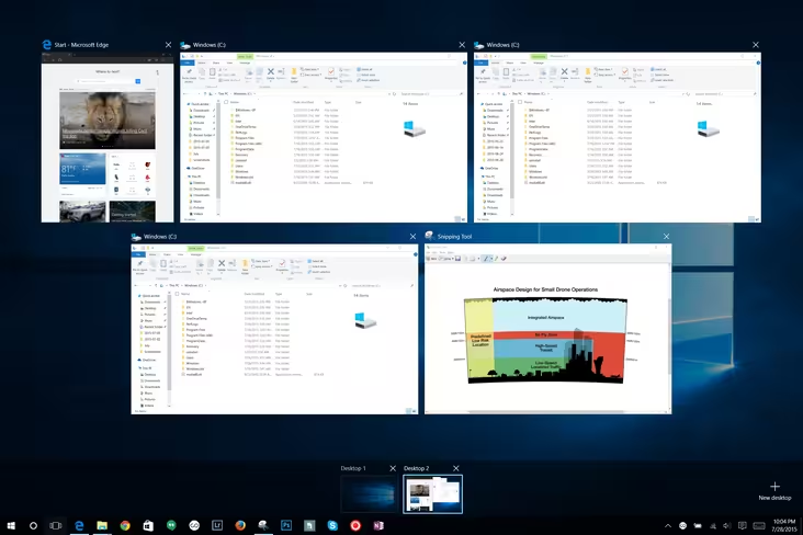
Having multiple ways of performing the same action is a recurring theme in Windows 10. While at first I took it to be superfluous, it turns out the redundancy is kind of great, and I found myself using each method depending on what was most convenient. In any case, the quick overview and virtual desktops go a long way in helping you organize your workspace and just get stuff done.
If you’re a Mac user, this may all sound very familiar to you – Mission Control (formerly known as Exposé) basically does the same thing. But hey, Apple copies features from Windows too, as seen in OS X El Capitan’s Split View.
Meanwhile, Microsoft’s made its own window snapping feature more powerful. Now when you pin a program to either side of the screen, Windows will line up suggestions to fill up the remaining space. You can even snap four windows at a time now by dragging a window into each corner of the display.
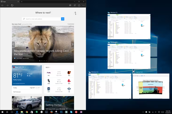
And if you’re more of a keyboard warrior, you’ll also love the barrage of new shortcuts in tow.
Continuum means convertible laptops finally make sense
It would’ve been easy for Microsoft to just completely drop the tablet interface on Windows 10 PCs, but instead it took a more versatile approach: only force the tablet UI when you need it (or want it).
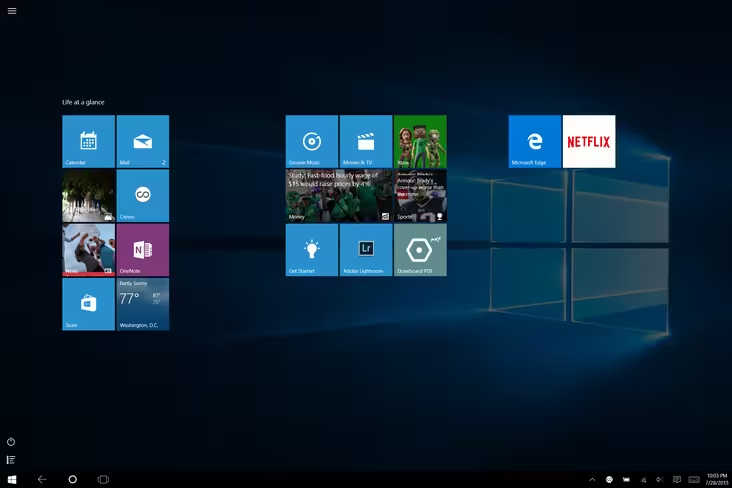
Continuum basically changes Windows 10’s UI to best fit how you’re using your computer. When I’m doing serious work and the keyboard is folded out on my Surface Pro 3 for instance, it’s basically a traditional Windows interface. Once I fold the keyboard back though, I’m prompted to switch to tablet mode.
In tablet mode, your Taskbar apps disappear, leaving only buttons for Start, Back, Cortana and Task View. Click on the Start menu and it’ll now occupy the whole screen. Like on Windows 8, you’re able to simply drag from the top of the screen downwards to exit an app.
When you get tired of poking at the screen, Windows will remember your desktop window setup, allowing you to resume your serious-business work seamlessly. It’s one of Windows 10’s best features if you have a convertible device, and it even works with dedicated tablets if you simply connect a mouse and keyboard.
You can also activate tablet mode at any time via the new Action Center, accessible by swiping in from the right of the screen or clicking on its respective icon on the Taskbar. It’s another great feature that works like the notification tray in Android and Windows Phone, allowing you to see and dismiss notifications, as well as access quick settings.
If you’re wondering why you’d ever want to activate Tablet Mode manually, it turns out it’s great for working without distractions. Since apps are automatically made full-screen and your Taskbar and tray icons disappear by default, I found myself frequently turning it on when I had to zone in on my writing with being tempted to open other apps.
It looks cool
Windows 8’s Modern UI, colloquially known as Metro, was one of the earliest and deepest manifestations of the flat design ethos that’s now virtually ubiquitous in the tech world. Microsoft wanted a “full-digital” look, but some would argue it took things a bit too far, especially when contrasted with legacy apps and a desktop interface that didn’t even bother to refresh its icons.
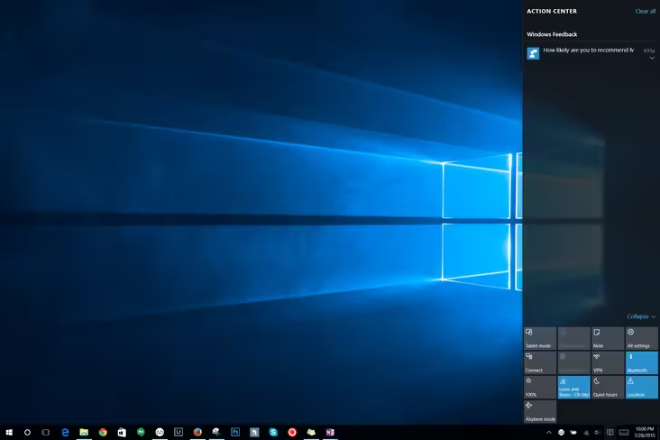
I like my transparencies, so it’s great to see Aero – the blurred glassy effect introduced with Vista – is back. Though subtle and frankly unnecessary, transparency helps add a layer of depth when navigating around the desktop interface. It’s not everywhere – Windows are still framed by opaque borders – but it adds a nice bit of refinement to the Start Menu and Action Center panels in particular.
But if the dark theme and glassy look aren’t quite your jam, you can colorize the UI or remove transparency via the Personalize menu.
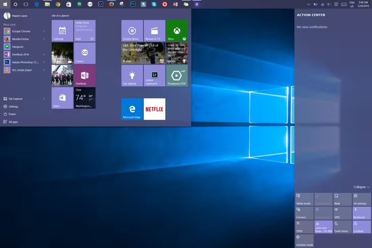
There’s a new set of icons strewn around the desktop UI too. They’re not exactly groundbreaking designs, but they fit the modern flat aesthetic much better than the kitschy old icons did on Windows 8.
Also, I really dig the new Tron-like default wallpaper.
Microsoft’s Internet Explorer replacement is a great everyday browser
Edge, Microsoft’s long-awaited replacement for Internet Explorer, nearly generated as much hype as Windows 10 itself when it was announced. While it’s not a paradigm shift in browser design, you finally won’t be compelled to immediately install another browser as soon as you boot up your next PC.
Performance is the most important part of the browsing experience to me, and Edge mostly delivers. Not just in benchmarks either, which we cover in another post, but how responsive an app feels when navigating both its UI and the Web.
Edge has the smoothest scrolling performance of any Windows browser I’ve tried. Whether using the trackpad or a touchscreen, motion is jitter-free. It also handles 4K video on YouTube with aplomb on my Core i5 device, compared to the stuttering performance on both Chrome and Firefox.
It’s not perfect though. Some seemingly basic settings – like changing your search provider – are buried deep in menus. Very occasionally I would get some rendering errors; Google Play Music not loading at all was the most egregious in my book.
Moreover, the lack of extension support could completely rule out Edge for some users, though Microsoft says it’s still on track to deliver extensions by the end of the year. Still, I found the smooth performance and battery life improvements alone to be worth making the switch from Chrome for most casual browsing.
Cortana is legitimately useful
Microsoft wants to make sure people use its new voice assistant, so she’s lodged in a large search bar on the lower-left corner of your display by default. Though you can minimize or hide the search bar, the prominent positioning is meant to encourage more people to use search. It’s a good thing too: Cortana is one of the most useful voice assistants around, with some key advantages over Google Now and Siri.
The expected features are there; you can ask her to define words, set alarms, or tell you a joke. Like Google Now, she’ll provide alerts and suggestions based on your calendar and email information. But what really differentiates her from other assistants is her Notebook – a hub for all the personal information Cortana knows about you.
The more you use Cortana, the better she understands your habits and tries to predict your actions. You can even fill out information she doesn’t yet know; you can program her to primarily suggest Asian or Italian restaurants for instance, or only find places within a certain distance from your home.
Conversely, the Notebook also helps you make sure make that Microsoft doesn’t know more about you than necessary.
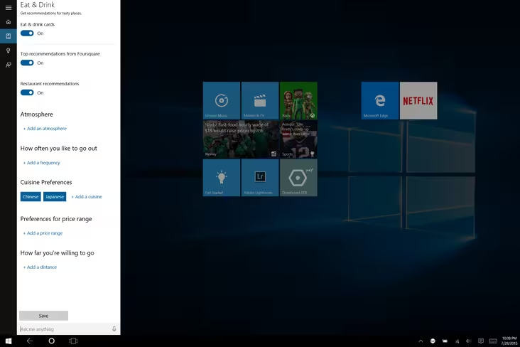
Though voice assistants have traditionally been the domain of mobile devices, in many ways Cortana actually makes more sense on your PC than on your phone.
When you’re at home, your computer is likely to be on pretty much all the time, especially if you’re on a desktop; just say “hey Cortana” and she’ll start listening. You’re also less likely to have strangers around you, so talking to a chunk of metal and silicone is a little bit less awkward. I found myself asking her questions about random facts and information more often than I ever did with Google Now on my Android phone.
It’s free!
For most people anyway. If you own a Windows 7 or 8 PC, chances are you’ll be able to upgrade without spending a dime.
Better yet, Microsoft says it has no plans to eventually charge for Windows upgrades, which will now come in smaller batches led by user feedback instead of the major releases every few years we’ve become accustomed to. That can always change of course, but Microsoft assured me a subscription fee is not on the roadmap.
The upgrade requirements are minimal too – on desktops, you just need a 1 GHz processor, 2GB of RAM and 20GB of free storage for the installation (1 GB and 16GB for the 32-bit install, respectively). For what it’s worth, I noticed no significant performance difference between the two operating systems.
If by any chance you do need a physical copy – say, if you’re building your own gaming rig – it’ll cost $119 for the Home edition of the OS.
For everyone else, it should arrive via a simple update in the coming days, provided you reserved a copy. The updates are rolling out in waves – Microsoft staggered the release it’s so its able to fix any kinks that pop up before they spread- so be patient if you don’t receive your update exactly on the 29th.
It makes everything better
Though Windows 8 will soon be banished to the same tech Hades inhabited by Vista and Millennium Edition, Windows 10 at least allows us to understand what its predecessor aimed to achieve.
For all its shortcomings, Windows 8 incited manufacturers to experiment with new device form factors and rethink the ways we can interact with our computers. But where Windows 8 clumsily imposed its unfamiliar vision of the operating system upon you, Windows 10 both welcomes you to engage with your devices in news ways and respects that some people may not want to change anything at all. With Windows 10, you choose how the operating system behaves.
In that regard, Microsoft has managed a pretty amazing feat: creating a shape-shifting OS that can run on a multitude of form factors without majorly sacrificing functionality on any of them. Pretty much any device designed for Windows 8 or 7 is enhanced by Windows 10.
It may not be perfect, but Windows 10 is a vast improvement over its unfortunate predecessor. I recommend you upgrade without reservation.
Get the TNW newsletter
Get the most important tech news in your inbox each week.
