Most mobile browsers are shrunken versions of their desktop counterparts. You type in a site with the traditional ad bar at the top of the screen and either go back or switch between tabs by tapping tiny icons. It works, but it rarely feels like an experience built from the group up for smartphones and tablets.
MAZ, known for its digital publishing platform that shares the same name, recently launched an app called Stream Web to tackle the problem. It’s a mobile browser that places considerable emphasis on gesture-based controls and a unique screenshot sharing mechanism.
How it works
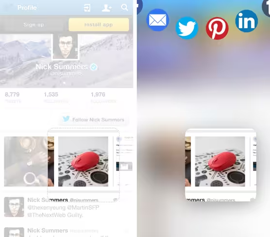
Whenever you’re looking at a site, you can tap with two fingers to cut out part of the webpage and share it with someone else. It’s a basic crop tool, but instantly you’ll see a range of supported apps at the top of the screen including Facebook, Twitter, Tumblr, Pinterest, LinkedIn and Evernote. In some cases, including Facebook and email, the image itself acts as a link for the original webpage, removing the need to share a traditional URL.
It’s an unusual method of sharing content, but it could be an effective means of either capturing cropped screenshots or leading the intended recipient to a specific part of a webpage. Stream Web also offers a simple feed where you can easily review all of your previous web cuttings.
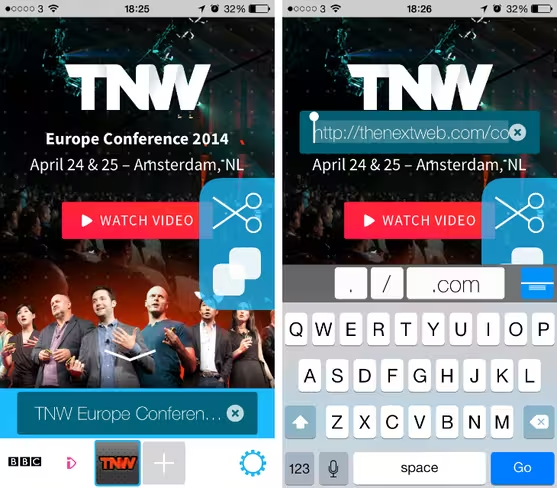
Of greater interest, however, is its approach to design and the overall experience of browsing the web. A search bar resides near the bottom of the screen; here you can enter a known URL or submit a few keywords for Google to make sense of. Once you hit enter though, all of the on-screen assets disappear immediately. While other iOS browsers behave in a similar fashion, Stream Web excels because it rarely brings those UI elements back into the frame.
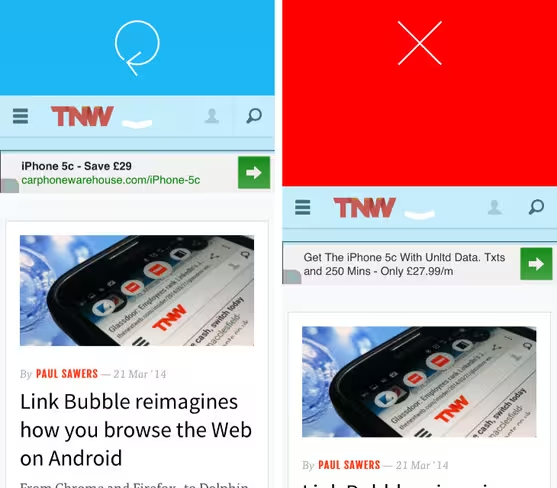
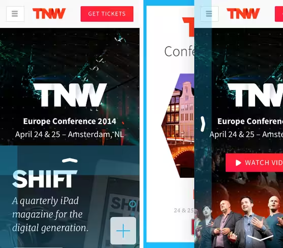
To refresh a page, you just swipe down from the top of the screen. To close a tab, you pull down a little further until a red cross appears. Need the page you were looking at a moment ago? Slide your finger to the left. Then once you’re ready to jump back again, simply slide your digit in the opposite direction.
These gestures are common in a plethora of app categories, but in a browser they feel oddly original again. To access the search field again, you need only pull up from the bottom of the screen. It unfolds like a piece of paper and shows active tabs as small, square icons. Tapping any of these will launch the page in question, or you can slide your finger horizontally at the bottom of the screen to quickly move between them.
Unlike other browsers, it’s also possible to view two separate tabs simultaneously. If you long-press on a link, you can either save it in a separate tab or open it just underneath the current page. It’s a horizontal 50/50 split, and you can alter how much space the bottom tab takes up by dragging it vertically. In addition, you’ll see the same icon appear if you have a tab open and type a URL into the search bar.
Wrap-up
At this stage, I doubt many people will want to switch from Chrome, Safari or Firefox on mobile. All of them are backed by huge development teams and the variety of tweaks, preferences and syncing options are difficult to ignore.
Even so, Stream Web proves that mobile browsers have become stale. While powerful, they’re not mobile-first and rarely experiment with design and user-interface. The gestures in Stream Web are simple and intuitive – you’ll have all of them memerized within a few minutes – and most of the time you can move around with just your thumb.
The cropping and sharing aspect doesn’t appeal to me, but I would recommend this app if only for its unique design and feature set. Mobile browsers are ripe for innovation and this is an early trailblazer that deserves recognition.
➤ Stream Web | App Store
Get the TNW newsletter
Get the most important tech news in your inbox each week.


