Early this year, Apple’s former user experience evangelist and UI designer Mark Kawano launched an iPad storytelling app Storehouse. Now a new app has surfaced that has pretty much the same concept as Storehouse, but is available instead for your iPhone and iPod Touch.
Steller is a free storytelling app developed by Mombo Labs, which lets you create photo and video stories with an emphasis on design. It has been in beta for several months but has just launched on Apple’s App Store today in North America, Europe, Australia and New Zealand.
The brother and sister design team behind the app, Brian McAniff and Karen Poole, set out on a mobile-first perspective when coming up with Steller. Poole says: “Everything out there was Web first and mobile second… We wanted to create an app that was specifically designed for mobile, enabling real-time, authentic and on-the-go storytelling.”
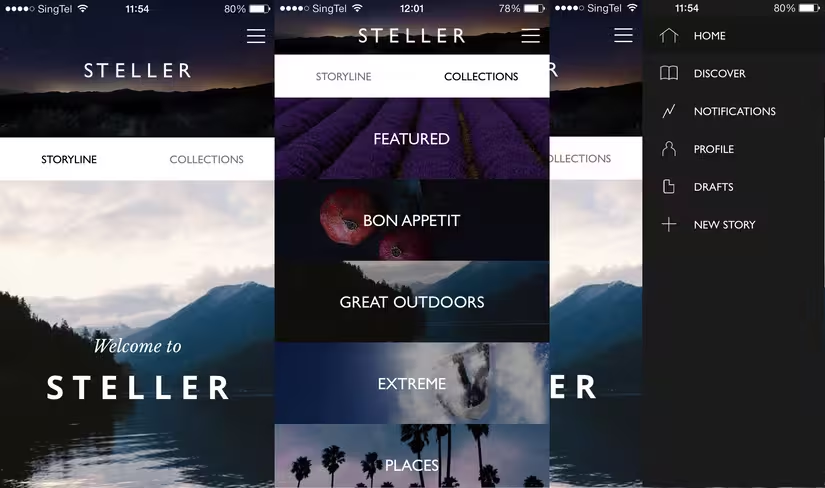
Steller features a minimalistic design that comes across as elegant and sleek. When you first open the app, you’re greeted with a ‘Storyline’ that features stories from whoever you follow — sort of like a Facebook newsfeed. The other tab features ‘Collections’ — categories of stories which you can also follow.
Steller lets you create stories by simply combining photos, videos and text directly from your iPhone or iPod Touch. However, it isn’t instantly noticeable where you can tap to create a new story — you have to access it via a dropdown menu.
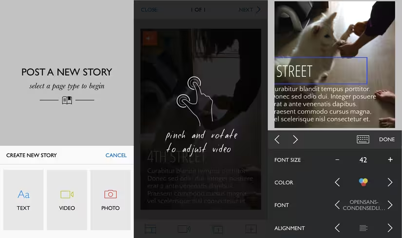
Once you manage to find that though, creating a story is extremely easy. Similar to Storehouse, Steller also relies heavily on gestures to let you move around your media and text.
After choosing whether to first post text, a video or a photo, you can select a layout and then adjust your photo or video. What’s nifty is that Steller gives you options to change the way your font and text-box look. To move the textbox, simply tap and drag. Once you’re done with the first page, adding another page is as simple as tapping on the icon at the bottom right corner.
When you hit publish, the story goes out on Steller’s own network and you can share it both inside the app, as well as on other social networking sites including Twitter and Facebook. To edit a published story or add a new page requires a process that isn’t as straightforward — you have to navigate to your profile then tap on the pencil icon. (Note: I couldn’t find out how to edit my story at first and erroneously stated that you can’t do so once it’s been posted.)
I put together a couple of sample pieces and was pleased with what I saw — using a combination of text, photos and videos really made my story come alive. In particular, browsing through a piece is like literally flipping the pages of a storybook, and it gave me quite a cheap thrill to feel like I’d just published a book.
All in all, Steller is a stellar (pardon the pun) app that looks gorgeous, and with its emphasis on mobile devices, it solves a concern I raised in a review of Storehouse — that is, the fear that it could alienate layman content creators as it seemed to feature more professionally-taken media.
On the other hand, Steller squarely targets those who frequently use their mobile devices to capture images on the go, just like me — and it therefore looks set to appeal to a wider audience. All that remains is for it to launch on Android devices.
➤ Steller for iPhone
Headline image via Shutterstock
Get the TNW newsletter
Get the most important tech news in your inbox each week.


