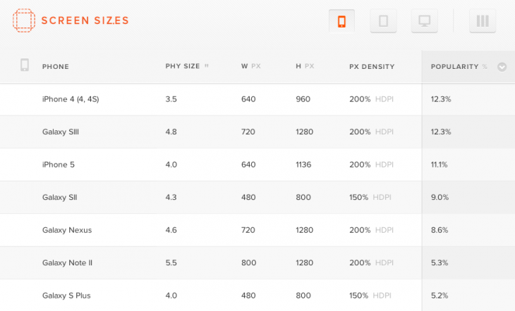
Type/Code, the interaction design studio behind Google’s Currents app, has launched Screensiz.es, a deceptively simple database of (…you guessed it!) screen sizes.
This free service lets you view smartphone, tablet, laptop and desktop screen sizes by pixel dimension, physical size and pixel density. It’s also able to order by demand, using “average monthly Google queries, and some fuzzy math.” No, the popularity sorting isn’t scientific, “but it’s better than nothing,” Type/Code says — we agree.
Nice subtle touches to the site include the ability to show and hide extra columns of data, allowing responsive-design obsessed developers to zero in on exactly what they need.

As we’ve said before, we’re big fans of single-purpose tools and resources that make your life easier. This is especially true when it comes to design, because sometimes a simple, straight-forward solution can solve the worst headaches. We’ve given plenty of attention to apps of this category in the past, including services like SnapRuler, Sip, Icon Strike and Red Pen.
To give Screensiz.es a try, check it out via the link below.
Get the TNW newsletter
Get the most important tech news in your inbox each week.


