Microsoft has a preview of its coming homepage redesign live that anyone can take a peek at. We recommend that you give it a full tour. As far as corporate homepages go, this one is aces.
TNW’s own Matthew Panzarino noted its heavy ‘Metro’ influence, Microsoft’s current design aesthetic that rules all its products, calling the entire effect ‘great.’ Daring Fireball agrees, noting that “they should just ship it. [This is r]eally nice design work.”
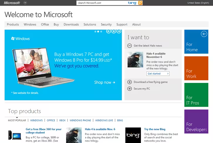
Here’s the current site, for context:
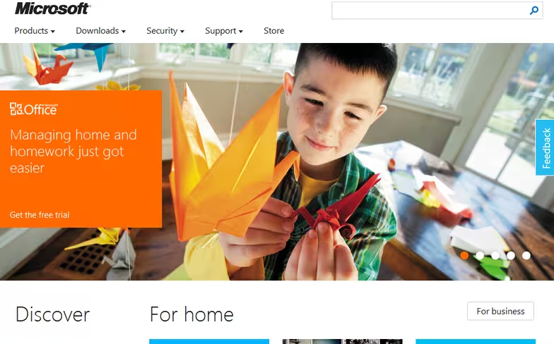
And here’s the preview version:
It hits on all the major design requirements for a Metro-theme’d page: big, sweeping images, blocks of colors with white text standing on top, and of course, rectangles to form its other UI components.
Metro can trace its heritage far back at Microsoft, even to the first major Zune player software refresh. That’s how long Microsoft has been baking this particular bun. Now, sound off in the comments with your take on the design. After all, from Windows 8, to Windows Phone 8, to Xbox, and even to Office, Metro is king. This is simply another restatement of that fact.
Microsoft is all in on squares. Let’s hope consumers are on board.
Top Image Credit: Robert Scoble
Get the TNW newsletter
Get the most important tech news in your inbox each week.
