Instagram has been pretty busy over the past few weeks. First it launched profile pages that finally gave users the chance to view someone’s entire photo set. Then it got even bolder when it announced that Twitter would no longer be displaying Instagram photos in the tweets. And to top things off, it has now released a brand new version of its application, now with a redesigned news feed, brand new filter, and other improvements.
Calling it one of the “largest upgrades” to the Instagram iOS camera since it was revamped just a year ago, the key to the success of this service is the camera. Is anyone surprised? The camera is the bread and butter of the application — and with this update, it’s being brought up to par with the rest of the features.
Not just your smartphone camera anymore
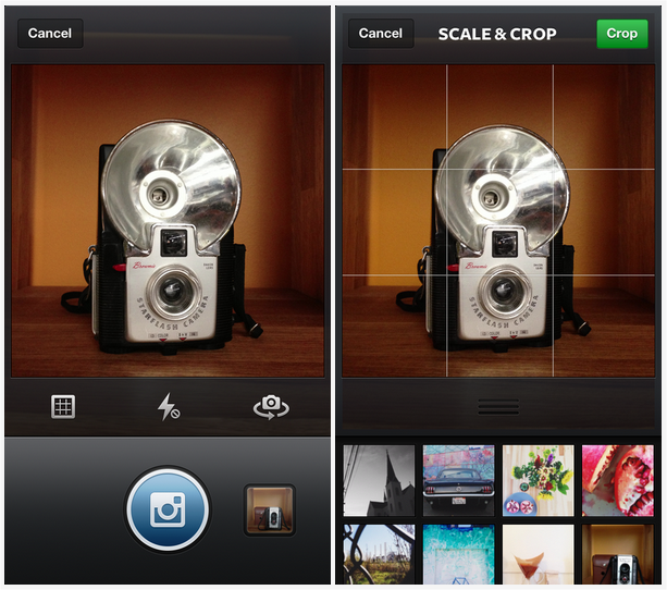
In version 3.2, it will now have an Instagram-themed shutter and shutter release button (it’s all about branding), the ability to preview your most recent photo on your camera roll, optional gride lines for live photos along with a more permanent one for scaling and cropping, and now the application is supposedly faster and more reliable. For those with an iPhone 5, your Instagram version will contain a Camera Roll image selector that allows quick access to the most recent photograph.
Interestingly enough, if you look at the new camera, the styling of how it’s designed almost resembles that of a more vintage device — it doesn’t seem like you’re using a smartphone, perhaps tying back to Instagram’s logo of being more vintage than modern. The previous version had a camera that seemed to lack some personal feel to it while this design harps back to the days of old when families didn’t have sophisticated dSLR cameras or fancy point & shoots — instead, it might make people nostalgic for when they had those disposable cameras or even the ones that required 35mm film (remember those?).
Meet the newest filter to the Instagram family
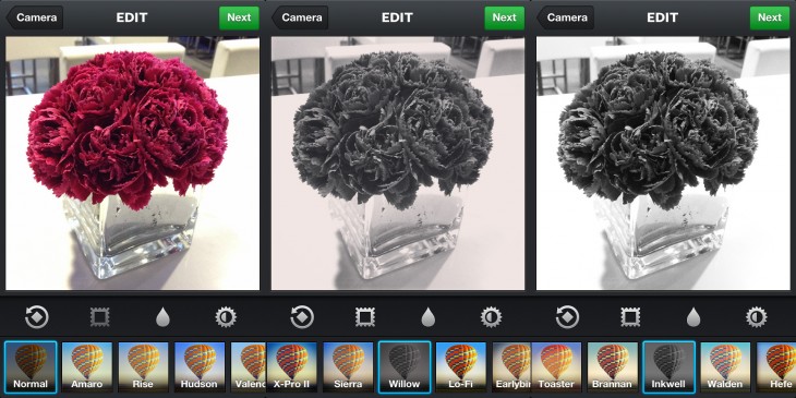
In addition to the improved camera, Instagram has released a new filter that can be applied to any photo you please. It’s available now for both iOS and Android devices and is called Willow. The company describes it as a “monochrome filter with subtle purple tones and a translucent glowing white border”. You might say it’s best paired up with portraits, still life, and architecture photographs that have some contrast to it.
Remember when you look through old albums of photos or happen to be in a museum or gallery that have older photographs on display? There’s a bit of a purple’ish tone to it that makes it look like a classic, but not quite black and white. If you look at the above screenshot that we tested, you can see that the one on the left is what the camera recorded while the middle one is with the Willow filter and the one on the right is a black and white photo created with the Inkwell filter. Willow gives a bit of discoloration without going the full distance with the black and white photograph.
Other updates
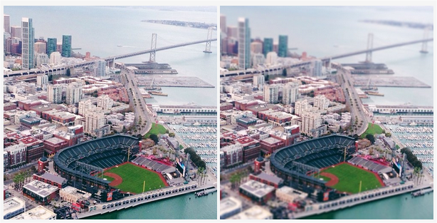
There are several more additions to this update — like Instagram said, this is it’s “largest update” in over a year. The tilt-shift, always a favorite feature for many, has been improved so that the effective strength of the blur generated in the preview screen is displayed in the final output. Instagram has updated its “blur algorithm” (yes, there is one), that now increases quality and accuracy.
For those that may not have used tilt-shift before, it gives photos a “realistic rendering of depth of field” — almost like looking at miniature models. Take a look at the above as an example. The one on the left shows no tilt-shift, while the one on the right has it enabled. As you can tell, it helps to add a bit more focus on what the photographer wishes to emphasize.
More improvements include:
 Better news feed that displays larger images: users are going to find that in their news feed, their profile photos are enlarged slightly to help others better find which photo belongs with whom. The height of each Instagram photo is taller now. Previously, the height of each photo was approximately 550 pixels, but now, it’s around 612 pixels, taking up more of the screen for better viewing.
- Has a better welcome screen design
- Infinite scrolling on user profiles and other grid views, saving them to an “Instagram” album in your camera roll
- Addition of a Foursquare button on the location page that gives you more information about where you’re at
These updates are being rolled out now so that means you can expect your iOS device to notify you soon. For those with Android devices, don’t fear, because these changes are also available for you as well (it’s called Instagram 3.3) and can be downloaded from Google Play.
Photo credit: Justin Sullivan/Getty Images
Disclosure: This article contains an affiliate link. While we only ever write about products we think deserve to be on the pages of our site, The Next Web may earn a small commission if you click through and buy the product in question. For more information, please see our Terms of Service.
Get the TNW newsletter
Get the most important tech news in your inbox each week.


