Not to our surprise, Instagram is finally rolling out Web profiles — the next logical step beyond the service’s rather basic “photo pages” which first debuted back in June.
Conceptually, the logic of this release is sound. Although Instagram flourished early on as a restricted, iPhone-only network, moving to Android was a major success. After giving the Web a taste, Instagram’s full profiles are sure to help bring the service further into the forefront.
As new profiles roll out, the photo-focused network’s Web presence gains significant potential, and down the road, it’s not hard to imagine additional, mobile-only features like Photo Maps appearing online as well.

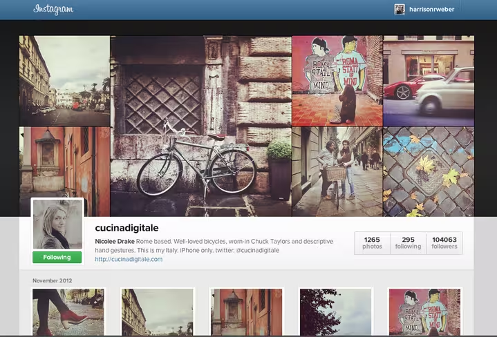
But beyond concept, there’s something curious happening with Instagram’s new design (shown above). As soon as you land on a profile, you’re met with a filtered, mosaic-style cover photo, an oddly familiar profile picture/username combination and even right-aligned stats.
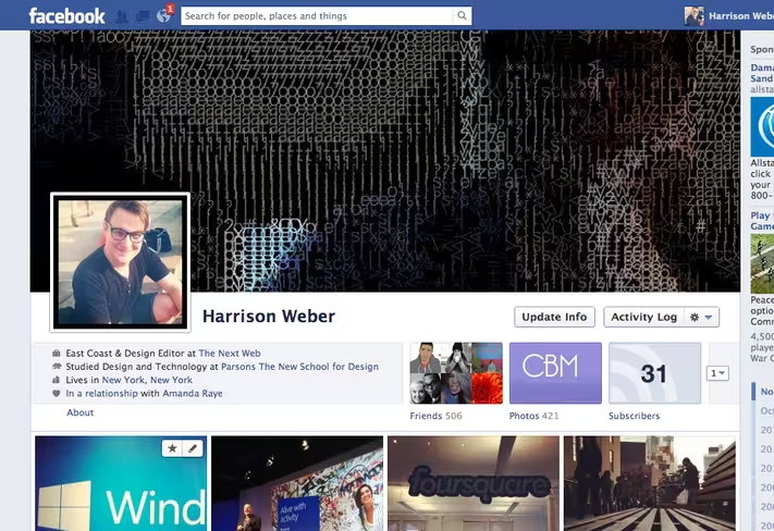
The new Instagram Web profile feels just like Facebook’s own profile design. In fact, if you tacked Facebook’s photo viewer right where your status updates normally go, you might end up confused as to which service you’re using.
Actually, let’s do that right now:

Compare that to Instagram’s brand new Web profiles and the similarities are obvious (even the profile link and logos line up), but given that Instagram has likely been soaking up Facebook’s DNA since the acquisition, the similarities make complete sense. Especially as more and more Facebook users try Instagram, maintaining a similar experience means users wont have to learn how to navigate the service. They’ll be able to jump right in.
The problem with this, of course, is what happens as Facebook and Instagram form overlapping purposes. What use is a Facebook photo album for Instagram photos shared on Facebook, when a complete Instagram photo gallery is ready and waiting? Keeping the two services separate is key to prevent the alienation of many of Instagram’s users, but mirroring Facebook on Instagram doesn’t feel quite right.
The similarities don’t stop there, either.
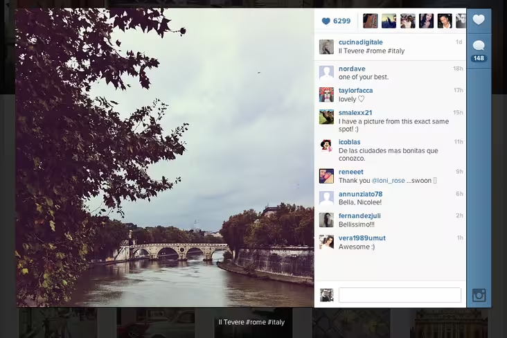
Below the cover photo and profile details, Instagram’s Web profiles logically lay out all of your past photos in grid format. On click, an enlarged photo pops up on the left, with comments and details on the right.
 Note how Instagram didn’t include an “x” for closing the window #usabilityfail
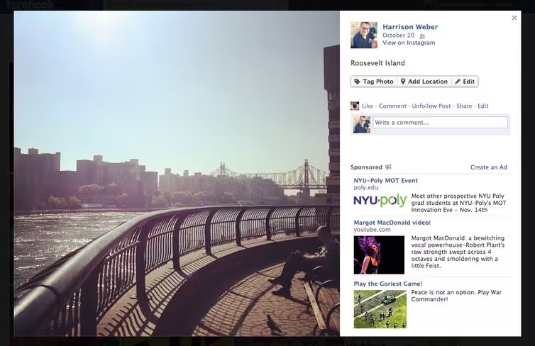
Look familiar?

Some of these similarities are just common design patterns, but placing the two services side-by-side reveals that Instagram made a majority of these decisions intentionally. Whether or not Instagram will slowly be folded into Facebook.com is completely unknown, but moving Instagram under the same FB umbrella would only take a few visual tweaks.
Takeaway
Beyond the aforementioned usability mishap and a few other issues (like the fact that Instagram’s continuous scrolling makes it difficult to use the site’s footer navigation), Instagram’s new profiles feel very well designed, with a strong attention to detail. Even hovering over Instagram’s thumbnail grid yields a pleasing, subtle animation. Nearly everything was considered.
I’m eager to see what’s next, largely because Instagram holds a very promising position. It’s being used by millions to tell stories through photos like no service has ever been before, and with photo maps, Instagram could even be Facebook’s ticket to rivaling Foursquare’s stronghold on location-based checkins. No matter what’s planned, today’s release encourages growth — almost ensures it, but the future of the independent platform is still murky at best.
For more on today’s release, head here.
Get the TNW newsletter
Get the most important tech news in your inbox each week.


