LG showed off its engineering muscles with the original G Flex, but didn’t quite succeed at showing us why the world needs a curved phone.
While we saw some boons to the curve, the unwieldly size, low resolution, middling software and disappointing camera meant it wasn’t the holistic tour-de-force it could have been. It was more marketing gimmick and cool tech demo than something you’d want to call your everyday phone.
A year and half later, enter the G Flex 2. Not to spoil the review, but it’s better in every way. It’s smaller, looks better and has a much better camera. Where the G Flex was an interesting tech demo, the G Flex 2 is just a good phone – one that may just stand up to the best of the Android contenders.
Design
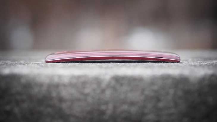
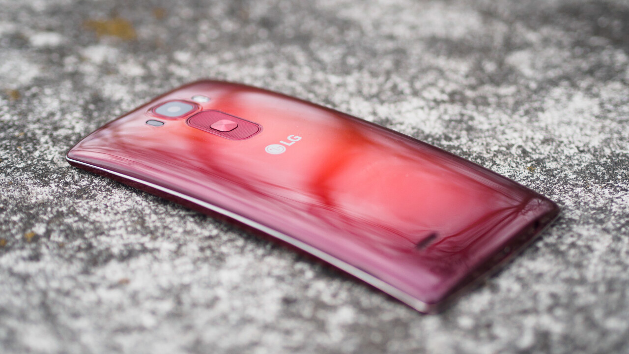
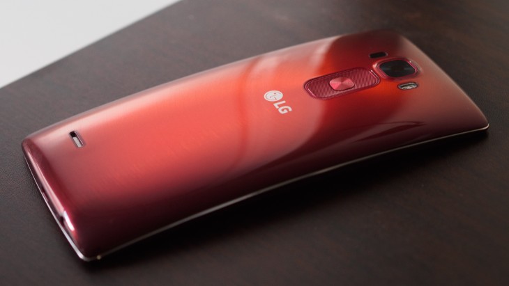
It’s curved. Yeah, that much is obvious, but it’s also just a pretty darn attractive device regardless. Our review unit is a deep red, but I saw a silver one at CES that was equally good-looking.
The G Flex 2 strikes a great balance of being eye-catching without being kitschy. I couldn’t help but notice people looking in my direction when walking around Manhattan, and while I don’t normally like red phones, the quasi-ceramic sheen on the Flex 2 is quite stunning. It’s a refreshing change of pace from the sea of metal-and-glass designs out there.
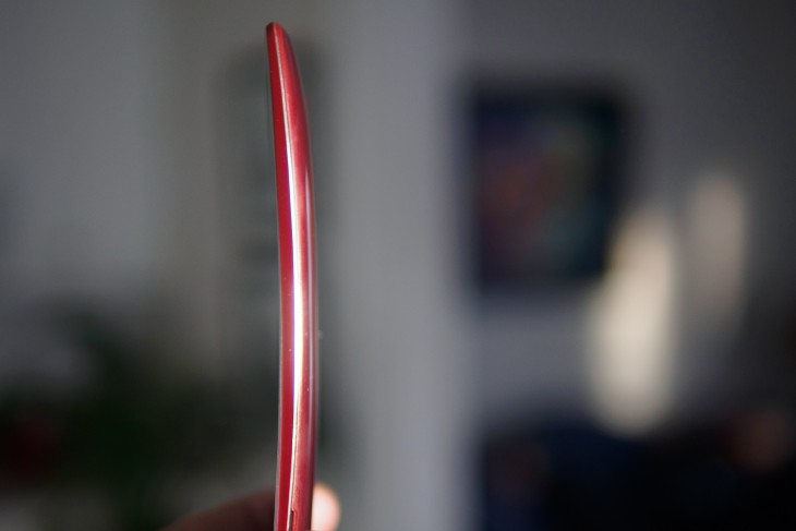
It’ll also prompt a lot of “is it supposed to be curved…?” questions. Thankfully that curve serves a higher purpose than just showing off LG’s P-OLED technology: it legitimately improves the phone’s handling. LG may make focus its marketing on an immersive viewing experience (more on that later), but my favorite thing is how the curve makes the phone somehow feel smaller than it actually is.
The curve means that when you’re reaching for the top of the notification bar, the top edge of the screen is closer to your finger than it would be on a flat device. It means the volume buttons on the back feel perfectly placed, and it even makes it feel smaller in your pocket, as the phone follows the contours of your thigh naturally.
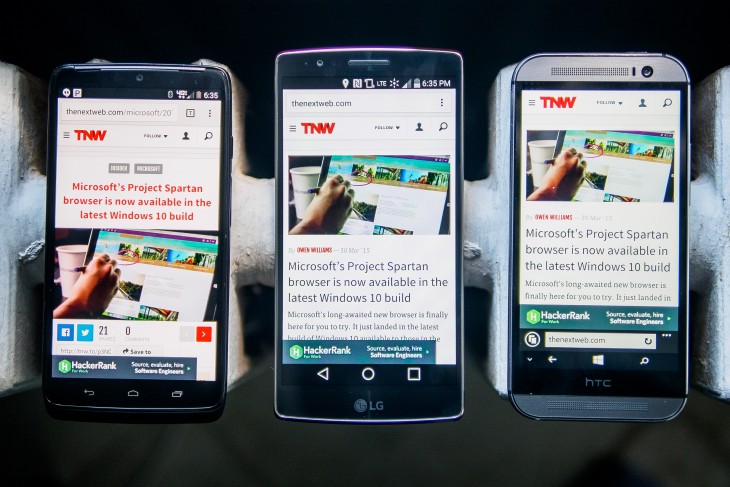
I have small hands, so this added accessibility makes a world of difference. Coupled with the small bezels, and despite having a screen as big as on the iPhone 6 Plus, the G Flex 2 manages to almost be a one-handed device, which is kind of amazing.
It also provides a more solid grip than you might expect. It fits better in the curvature of your palm, so more of your hand is making contact with the device at any given time, keeping it from ever threatening to fall out of your hand despite the smooth, glossy back.
Speaking of the back, LG is pretty much the only manufacturer to still let you remove the back cover on one of its flagship devices now that Samsung has abandoned that feature in favor of a more solid construction with the S6.
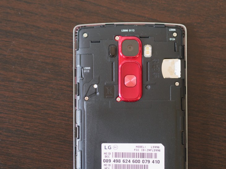
You can’t replace the battery this time around though, so it’s a lot less useful. It’s nice that you can switch the cover should you damage it to oblivion, but without the extra utility of a replaceable battery, I can’t help but wonder what the Flex 2 would feel like with unibody construction, even in full plastic.
While the lightweight design does allow the phone to stay true to its ‘Flex’ name and bend under pressure without damage, the build as-is feels just a notch below ‘premium.’ In its defense, the removable back does have some self-healing properties, but don’t expect any miracles – I managed to scratch mine on the first day, although you can only see it at certain angles.
Still, the G Flex 2 manages to be one of the best looking phones out there without imitating any competition; for a device I haven’t been able to stop looking at, that’s a rare feat.
Display
The G Flex 2 uses a 1080p 5.5-inch OLED display, but you won’t find any garish colors here. If you’re used to other AMOLED displays, you might even find the Flex 2 to be a little muted.
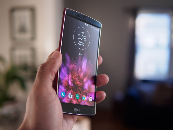
LG provides three saturation options in the display menu, however, so you can set things up to your liking; the ‘Vivid’ option is vibrant without making your photos look like cheap Warhols, but I actually preferred the ‘Standard’ setting for color accuracy.
Viewing angles are great, with hardly any of the color shifting when looking at the device from odd angles like you’ll find on other devices. And of course, the trademark pure blacks of OLED are still here.
The 1080p resolution (about 400 ppi on the 5.5 inch screen, similar to the iPhone 6 Plus ) is a notch below the QuadHD displays many flagship sports now, but anything above 1080p is nitpicky. I’m used to QuadHD phones, so I noticed the softer text fairly easily, but I’ll take a slightly less sharp screen if it means better battery life and performance. You’ll only really notice a difference if you’re looking for it.
Of course, you’ll want to know what curve does for watching viewing content. I almost can’t believe I’m saying this, but it actually does feel more immersive, even compared directly against other 5.5-inch devices like the Oppo N3. In some conditions at least; there’s nary a difference when used vertically or from arm’s length, but if you tend to watch Netflix late at night with your phone three inches from your face like I do, it’s almost like a mini IMAX screen.
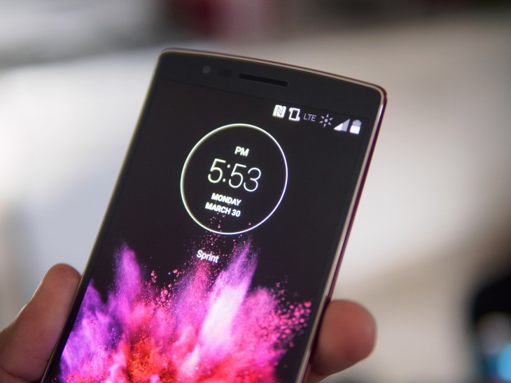
I suspect not everyone will note a difference, but even if you don’t find the display more captivating than a flat panel, it at least has the more tangible benefit of reducing glare and reflections when used in direct sunlight. Combined with tasteful auto-brightness, the G Flex 2 has some of the best outdoor visibility I’ve seen from an AMOLED panel.
Basically, LG isn’t fooling anyone into thinking the curve makes watching movies on the phone dramatically better, but it does help. It’s just better to think of the curve as a subtle display enhancement, in the vein of laminated screens or anti-reflective coating, than a mobile display revolution.
Software
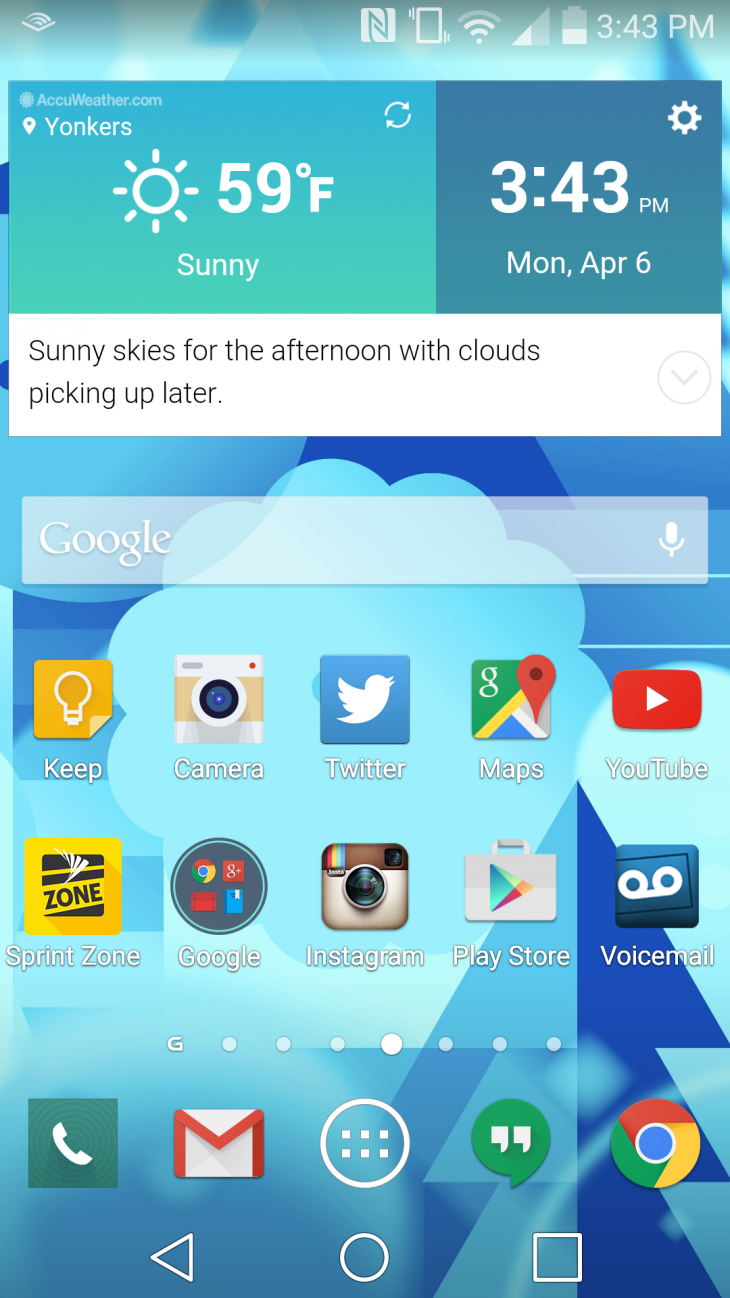
The G Flex 2 runs Lollipop 5.0.1 under LG’s custom UX. Despite my love for stock Android, I have to admit LG adds some useful features without overwhelming the user.
Like Samsung, it takes advantage of the large screen so you can use two apps side-by-side or open them up in a floating window, which can actually come in handy when copying text between apps or need to use a calculator.
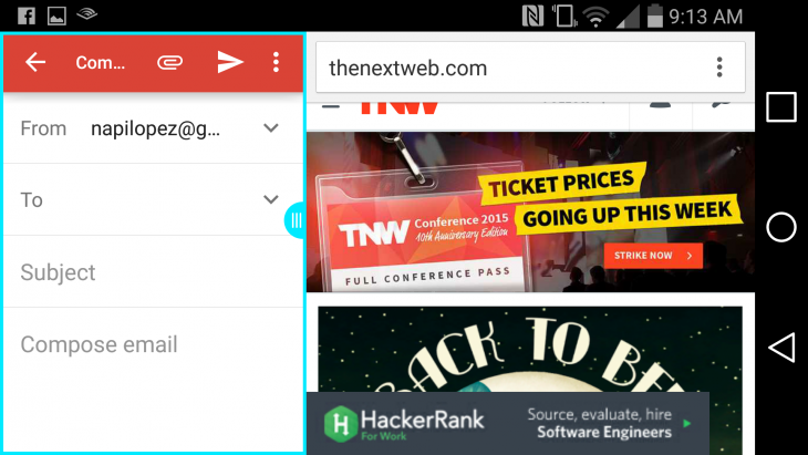
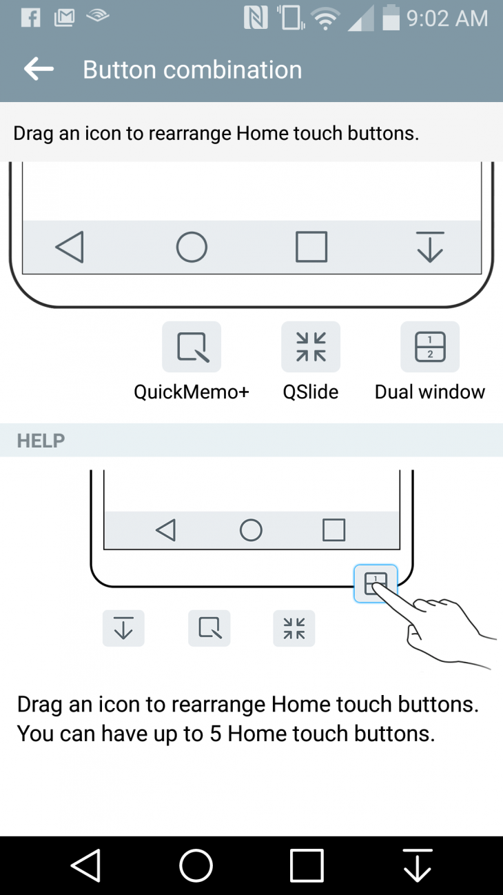
Another nifty feature is the ability to customize the navigation bar icons (LG calls them “home touch buttons”). You can add quick access to the above split-screen view or your notifications bar, for example, or you can just rearrange the icons to your preferred placement.
Then there are a ton of smaller additions. You can change your default font, customize the sensitivity of auto-brightness, adjust the screen’s color saturation or even invert the display colors to save battery life when reading text. LG’s stock keyboard is also one of the better manufacturer keyboards I’ve tried; it didn’t immediately make me want to switch to Google Keyboard or SwiftKey.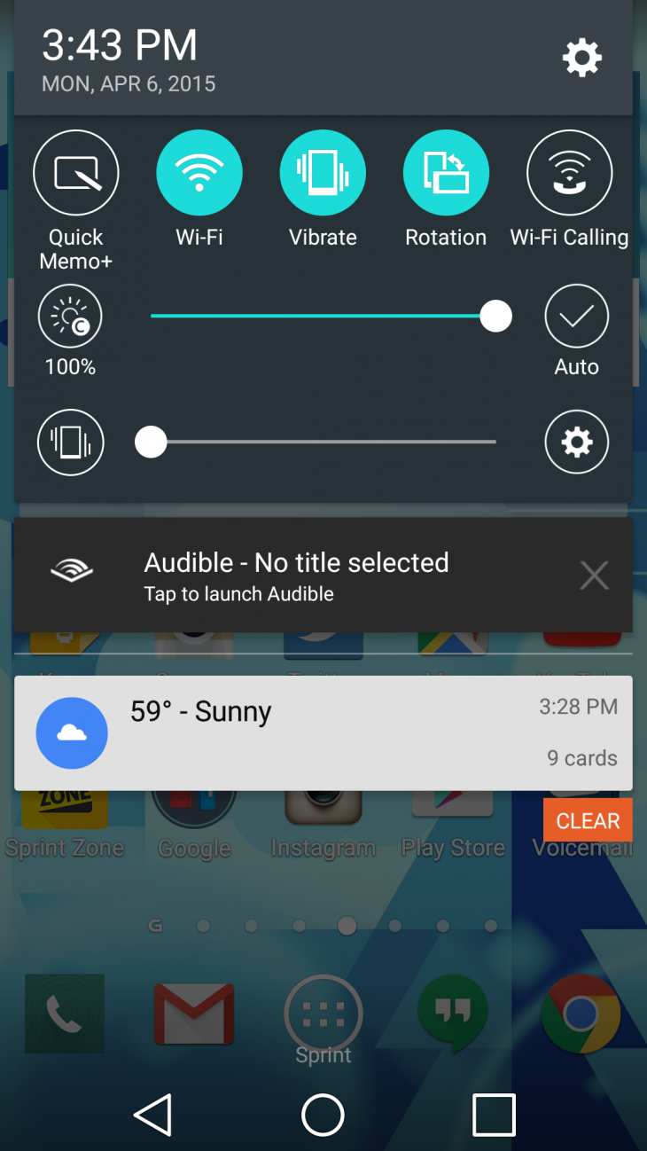
The UI fits Lollipop’s aesthetic fairly well, too. It’s bright and relatively flat, although it misses out on some of Material Design’s vibrant colors.
There are some superfluous additions – LG’s VoiceMate is a bad Google Now clone, and my review unit arrived with a fair amount of Sprint bloatware, but its good to see Android manufacturers taking a restrained approach to their customizations.
Performance
Unfortunately, that software may take a toll on performance.
The Flex 2 is spec’d with Qualcomm’s newest Snapdragon 810 processor (same as on the One M9) and 32GB or 64GB of storage (expandable via microSD). You’ll also get 2GB or 3GB of RAM depending on what storage option you choose.
Those are mostly top-of-the-line specs. Unfortunately it doesn’t feel all that fast.
Don’t get me wrong, the phone isn’t slow, but whether because of LG’s interface or the new Qualcomm processor, it doesn’t feel significantly snappier than my 2014 HTC One M8 was. Occasionally, it even seems a little slower – especially when switching through apps.
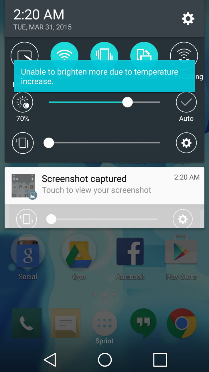
The Qualcomm 810 has been subject to some controversy about overheating with the HTC One M9. LG has also admitted that the CPU will autoregulate its clock speed when overheating; sometimes while charging, the phone would prevent me from setting the brightness above 70 to 90 percent due to a “temperature increase,” which isn’t exactly reassuring. For what it’s worth though, the phone never felt uncomfortably hot.
Other times performance is silky. GPU-based activities seem to work the best; games perform as well or better than any Android device I’ve tried, and scrolling through Google Maps is particularly smooth.
It’s nevertheless a little disappointing that a 2015 flagship feels no faster than one from last year for general use. LG just teased the newest version of its custom UI though, so hopefully a software update can sort these kinks out.
Battery Life
The G Flex 2 comes with a 3,000 mAh battery, and it uses it economically. Over the course of a week, I never had trouble getting through a full day with the phone, even with loads of Netflix.
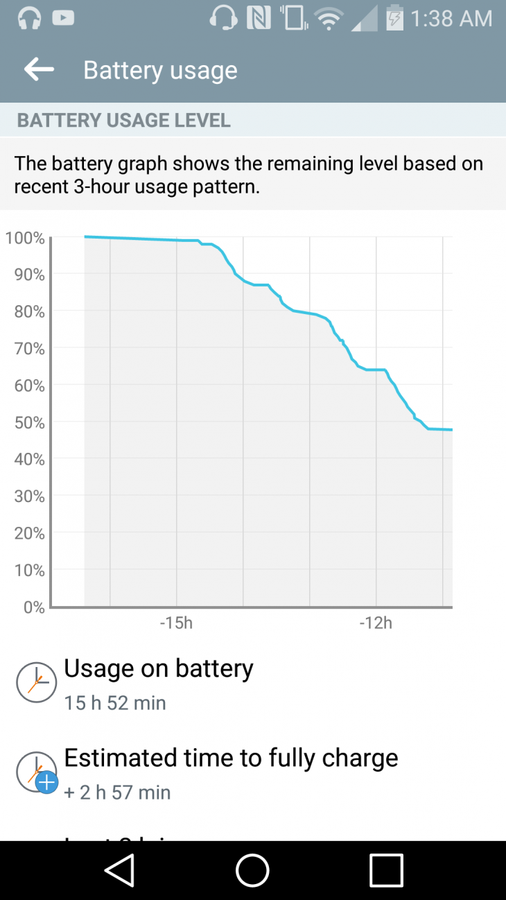
There are a couple of power saving features too, including a performance throttling battery saver mode at low percentages, and a display feature that work in conjunction with the ambient light sensor to adjusts brightness based on the type of content you’re viewing. I generally left those features off and still managed to get approximately a day and a half on a charge.
As with the Droid Turbo or the Oppo N3, the strong battery life is aided by an included high-power charger, which can charge the battery to about 50% in 40 minutes. It’s also not as much of a brick as some higher power adapters, which is appreciated.
Camera
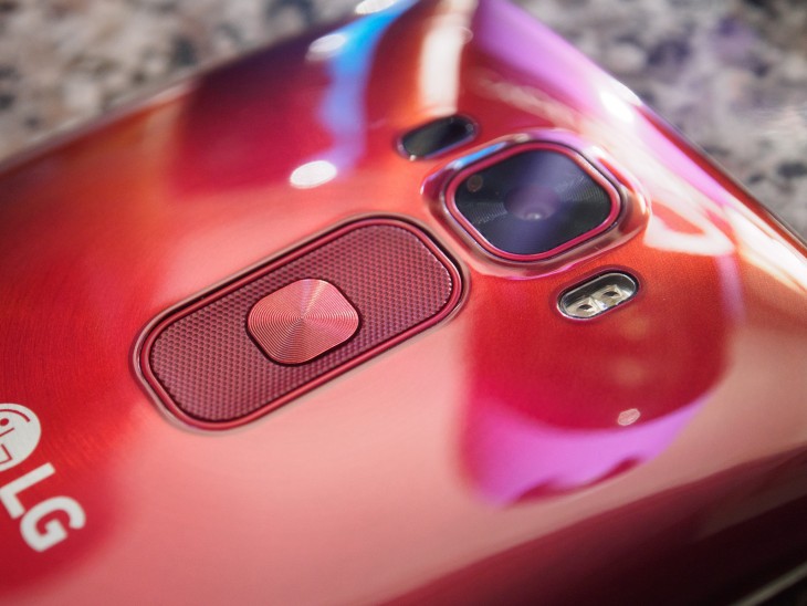
One of our biggest complaints about the original G Flex was its lackluster camera. That worry can be set aside here; the G Flex 2 borrows the same great stabilized camera setup from the G3.
In good light, the 13MP camera provides vibrant, detailed photos. And although most of my time shooting with it was under shoddy cloudy lighting, I was still able to manage some pleasing colors.

Although LG detects its phase detection autofocus (which is really fast), the best thing about the camera is its automatic HDR mode – LG’s implementation is one of the quickest and most tasteful I’ve seen on a mobile device. The sensor’s dynamic range isn’t spectacular on its own, but the HDR mode almost always managed to add extra details in the shadows and highlights without looking artificial or introducing nasty artifacts. The software also does a good job of choosing when to use HDR.


The camera also does an admirable job in low light. The optical image stabilizer helps the shutter remain open for longer, which essentially translates to lower image noise, and the flash maintains natural skin tones. Leaving HDR on during night-time shots does tend to introduce a bit of extra shadow noise though.

It’s a good thing the camera is so well automated, because it hardly allows you to make any manual adjustments. You can’t set white balance or exposure compensation manually, for instance, so you’re stuck trusting the camera to get it right. It does most of the time, but it would have been nice to see some standard photography adjustments as advanced options.
Conversely, front-facing camera is only okay. The 2.5MP shooter does well enough for your Snapchats in decent light – LG’s processing at least provides clean skin tones – but noise reduction in low light will obliterate any detail.

There are some fairly useful software features for the selfie crowd though. You can take a picture by saying “cheese,” “whiskey” or “LG,” for instance, or set up a timer by closing your fist on camera. The app will also automatically play back your selfie if you bring the phone up to your face after an image, a feature that works surprisingly well. There’s an integrated ‘beautify’ slider, but you’re better off avoiding it altogether if you don’t want your skin to look plastic.
As far as ‘point-and-shoot’ cameras go on Android, the G Flex 2 pulls in impressive work. Feel free to look through the gallery below for some more images.
Sound and Call Quality
It turns out you can still use smartphones to make phone calls, and the G3 is quite good at it. My review unit was running on Sprint, and calls generally came in loud and clear. The curve once again helps here; the phone fits the contours of your face more snugly than most phablets would, keeping the speaker and microphone closer to your ear and mouth. LG says this contributes to raising the volume by 3 decibels.
I was wary of the rear-facing speaker, but it’s better than expected. Volume is good enough to pass my navigation-while-driving-with-the-windows-down test, and it avoids sounding tinny in most scenarios. I would still rather have front facing speakers given how good the Flex 2 is for watching videos, but I’m glad LG didn’t skimp on clarity.
Wrap-up
LG is once again flexing its technical muscle, but this time around it’s actually gone and made a great phone as well. This isn’t a tech demo, it’s a phone that can compete with the One M9 and Galaxy S6 on several points.
Perhaps the most impressive thing about the G Flex 2 is that it actually does a good job of convincing me that a curved phones make sense. It makes the phone more comfortable to hold, more secure to grip and even just a little more immersive. And even if you ignore the curve, LG has gotten right the basic necessities of good design, a great camera and strong battery life.
If the G Flex made me wonder why the world needed a curved phone, the G Flex 2 makes me wonder why there aren’t more of them. Retailing for $504 off-contract from Sprint (and coming to AT&T soon), it’s a fair deal against the $600 M9 and S6 . It’s just a shame the performance isn’t as lightning quick as I’d hoped, but here’s to hoping a software update will fix that.
Read next: LG G3 Review
Get the TNW newsletter
Get the most important tech news in your inbox each week.

