We’re long past the days when processor, RAM and storage specs were the only way of deciding which smartphone to buy. Good riddance, I say; today’s software is ‘good enough’ that most devices can run smoothly without worry, so standout hardware and features get to shine instead.
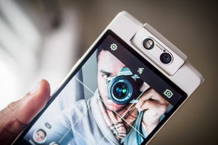
Apple sways you with its OS and design. Samsung’s Note series entices you with their screens and styluses. For Oppo’s N3, in the footsteps of last year’s N1, the hook is the crazy, swiveling 16-megapixel camera that ensures your selfies are just as good as the rest of your photos.
The camera certainly impresses – we’ll get to that soon enough – but how does the rest of the phone stack up? Read on to find out.
Design
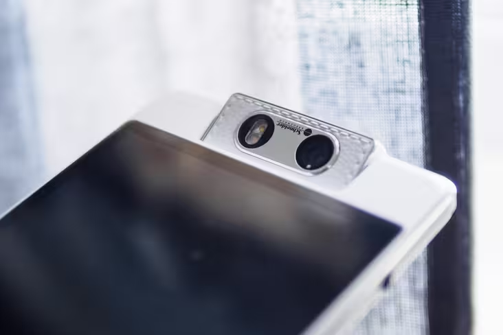
Nothing on the market looks quite like the N3. First off, there’s that zany somersaulting camera it borrows from its predecessor. Aside from improved specs, it also gets a new a trick – it’s now motorized, should flipping over the camera with your fingers prove too much trouble. Sarcasm aside, it does actually allow for some neat functionality (more on this later).
With more mechanical parts in the mix, we naturally worry about the longevity of the swivelling design, but Oppo assures us they’ve tested the motor to 100,000 rotations without issue.
The other design bullet point here is an interesting take on the notification light. Instead of your standard blinking LED, Oppo has adopted something they call ‘Skyline Notifcation 2.0,’ (version 1.0 was on the 7a). It’s a diffused beam of white light that reflects off of a gap in the metal frame around the phone. A bit hard to explain, so I’ll let a photo do the talking.
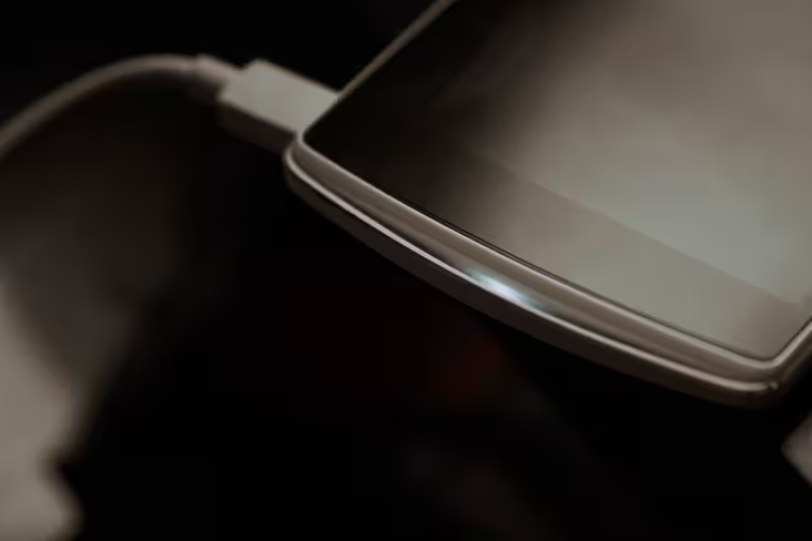
Oppo says the Skyline isn’t as distracting as your typical LED lights – it softly pulses instead of blinking annoyingly – and the design lets you see the notifications whether your phone is facing down or up.
This is all neat and true, but I wish they’d taken the concept further. Given the Skyline’s design adds a few millimeters to an already large phone, Oppo could have at least implemented a few more colors or pulsing rhythms to help you tell different types of notifications apart. I mean, my old Nexus 4 could do that.
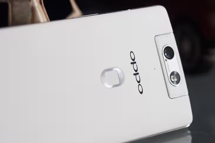
There’s a fingerprint reader on the back to take on Apple’s TouchID, but otherwise the phone is pretty standard, if well-built fare for a phablet. The device is just a teensy bit bigger than the iPhone 6 Plus, so you can forget about using it one handed regularly, but that’s to be expected (there’s a useful one-handed mode, however). A chamfered metal frame forms the phone’s perimeter, helping it feel very solidly put together.
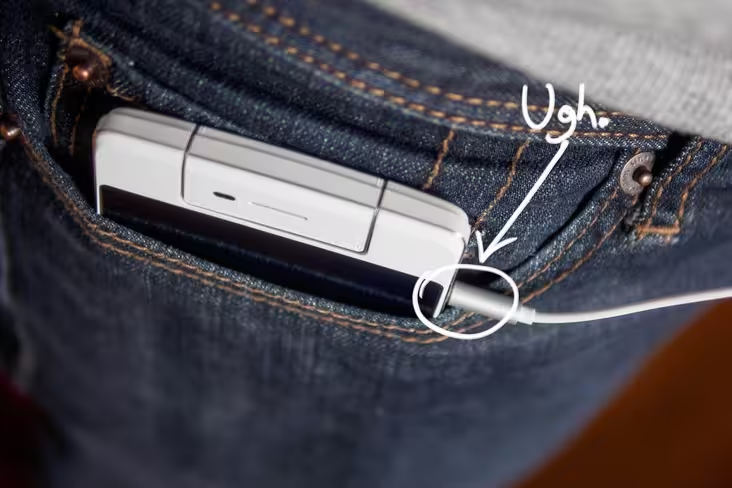
There are a few questionable design choices here though. The power and headphone jacks are located on the sides of the device, and the latter is particularly annoying. The Oppo already takes up enough pocket space; having your headphones jutting out its side does not help.
Overall, I think the phone has too many disparate parts to take on the beauty queens in the category, but it wins points for uniqueness at least.
Display
The N3 has a 5.5-inch screen, which, believe it or not, fights the bigger-is-better trend to actually be smaller than the N1. After all, 5.9 inches was really stretching it on a device with such large bezels.
The 1920×1080 resolution comes in at 403 PPI, which is plenty sharp enough. You’ll notice the difference if you look at it really close next to a Quad HD display like on the Droid Turbo (a ridiculous 565 ppi) – aliasing around text is always a telltale sign – but you’d be hard pressed to complain about sharpness during regular usage.
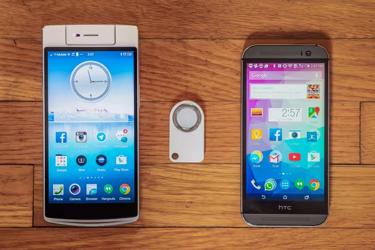
The color rendition, on the other hand, disappoints. Don’t get me wrong, it’s completely serviceable, but almost every flagship phone I’ve tried recently looks better, including Oppo’s own R5 I’m reviewing concurrently.
Besides being a shade or so too cool, colors are relatively dull. It’s a shame given the N3 takes excellent images; your photos shouldn’t look distinctly better on another phone. I’ll take dull over too-saturated any day, but even traditionally gaudy AMOLED displays are now striking an excellent balance between vibrancy and accuracy.
On the plus side, the screen gets very bright and has pretty good contrast, so I found it decent in sunlight. The brightness setting also has a neat trick: not only can you set a fixed or automatic brightness, you can also change the sensitivity of the auto-brightness. It’s useful if you keep your phone brighter than most, like me.
If reading text is paramount, you’ll be happy. But if images and videos are more important, it’s unfortunate the screen isn’t a bit better. After all, this phone’s sales pitch is predicated on its camera.
Sound and Call Quality
We thought the N1 had a pretty underwhelming loudspeaker – the N3 thankfully undoes this wrong. While it’s not stereo like HTC’s awesome-but-silly-named BoomSound, the speaker gets surprisingly loud and maintains good clarity even at high volumes. I had no trouble holding speakerphone conversations while driving, which is more than I can say for most phones.
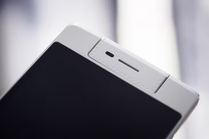
Calls came in loud through the earpiece too, which is located on the rotating camera. Neat detail: the camera will automatically rotate if the earpiece is facing the wrong direction once you initiate a call.
Headphone output is powerful and clean – it sounded great using RHA’s T10i headphones. There is a customizable sound tool called MaxxAudio which is surprisingly tasteful; the default ‘Music’ preset lightly boosts treble and adds only a touch of bass to make sound more engaging. It’s one of the few times I’ve left a default equalizer setting on.
An even nicer surprise: the included in-ear phones actually sound pretty great, once you get the fit right (I had to wear mine over-the-ear for that). I wouldn’t normally even bother commenting on included earbuds, but these are notable for their sound signature that shies away from neither bass nor detail but somehow manages to remain very pleasingly balanced. On the sound criterion alone, I don’t think the average user would feel a need to upgrade.
If you do want to upgrade, however, keep in mind one annoying quirk – the R3 isn’t compatible with the microphones on 3-button headsets designed for iPhones. Most Android phones aren’t fully compatible either, but the microphone and play/pause button will at least work. For some reason, the Oppo only works microphones accompanied by a single button, rendering my favorite headphones useless for calls on the go.
Software
The N3 is running Oppo’s custom Color OS 2.0, based on Android KitKat 4.4; there’s no word on Lollipop yet. And sorry CyanogenMod fans: Oppo has foregone an option to get the custom ROM pre-installed this time around.
Color OS’s interface has a few nice touches over stock Android, such as a couple of additions to the Quick Settings menu; the ‘end all’ function comes in handy. The menus are also slightly rejigged in sensible ways here and there, such as dividing general, sound and display settings into different tabs. The UI looks dated a few years with its gloss galore, but so do most custom Android skins.
There are customizable gestures too, which let you wake the phone or open apps with a swipe or two. My favorite one is easily the one-handed mode, which, like on Samsung phones, will shrink down the display to around the size of a credit card – just small enough that anyone should be able to reach the farthest corner with one hand. I prefer it to the iOS implementation and think more manufacturers should follow suit.
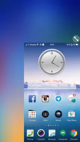
Much less pleasant: switching between apps. For some reason only Oppo understands, the N3 has a capacative button for launching menus instead of recent apps. Android’s design guidelines have now long required menu/settings options to be integrated into the app’s UI, so this button is nearly always redundant
Instead, you need to long-press the menu button to switch between running apps, and there’s no way to change the default behavior. To make matters worse, the app switcher occasionally stutters – odd given the phone runs so smoothly otherwise. There’s at least one nice touch to the switcher though: you can ‘lock’ apps you don’t want to close should you press ‘end all’.
I also wasn’t a fan of the Color OS Launcher. It takes an iPhone-like approach of setting all your apps on your homescreens instead of an app drawer. It’s confusing and messy if you’re a long time Android user and can get very disorganized if you have as many apps installed as I do; an option to sort alphabetically would be nice, at least. Thankfully, this is Android, so I went straight back to the Google Now Launcher after a few days.
Also iPhone-like: the fingerprint reader on the back. It’s a few notches below the accuracy of TouchID from my experience (the sensor itself is pretty small compared to Apple’s large home button), but generally fares well and unlocks very quickly once it recognizes you. It’s positioning on the back limits its usefulness slightly though; you can’t use it to quickly unlock your phone while its on your on your desk.
As is par for the course, Oppo’s thrown in some custom basic apps like a calendar and SMS client. These aren’t particularly bad, but I prefer Google’s offerings (perhaps simply out of familiarity).
O-Click
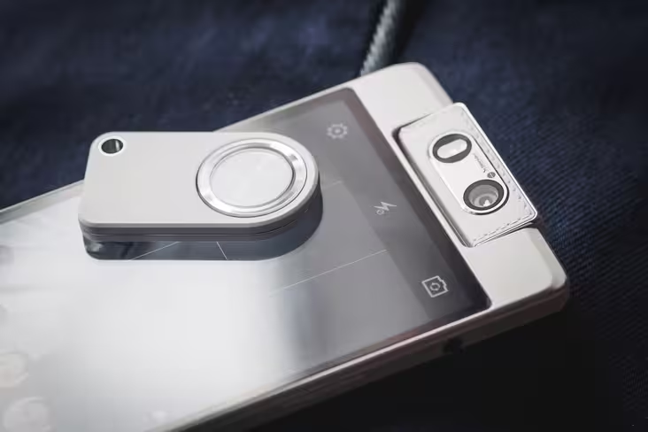
Another way Oppo is trying to differentiate the N3 is with a tiny remote called an ‘O-Click’. It’s included in-box and covers a few mildly useful functions.
First off, you can control music playback. This is nice and all, but it only controls local music played through the native app. I only have one song actually loaded on the phone, and that’s the jingle the N3 came pre-installed with. And it’s not even that catchy a jingle. You can’t even pause/play on Spotify or Google Play Music.
At least the volume control works fine, I guess.
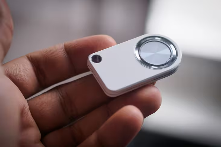
Befitting the phone’s selfie-loving nature, the camera controls are much more useful. You can long-press the center button to launch the camera, then press left or right on the four-way ring to flip the camera over completely, or use the up and down directions to adjust the camera in small increments. Then just press the center button again and your photo will be snapped.
There’s also a find-my-phone feature that I’ve already used a couple of times. Note that when I went out of the Bluetooth’s coverage radius, the device would sometimes not reconnect to the N3 automatically. This hasn’t happened since a recent firmware update, however.
Execution here could be better, but it could come in handy here occasionally as a functional keychain. And hey, it’s free!
Performance and Battery Life
The N3 is running on a 2.3 GHz quad-core processor and 2GB of RAM. These aren’t the highest specs around – about the same as the half year-older HTC One M8 – but its more than enough for Android to run smoothly.
In fact, my experience with Color OS was one of the smoothest I’ve had on a phone that wasn’t running near stock Android, other than the aforementioned occasional sluggishness loading the app switcher. Even after installing my usual plethora of apps, the phone operated with no noticeable slowdowns.
The device comes with 32 GB of storage. That’s just okay on its own, but mercifully is expandable via a micro SD card if you load a ton of content onto your phone like I do. The Nano SIM slot in the dual-SIM tray doubles as the microSD holder.
Battery life was solid. Although the 3,000 mAh battery is smaller than the 3,610 mAh one on the N1, the smaller screen meant I never had an issue going through a full day of regular usage, which typically includes lots of browsing, playing music for hours a day, tons of Twitter and watching a few YouTube videos. I generally netted 5-6 hours of screen on time had some battery left over well into the next day.
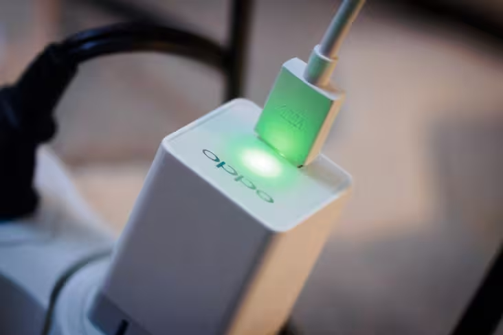
The phone also comes with rapid charging using the included high-amperage adapter, which is really useful if you’re running on fumes and need a quick battery boost before heading out. In my experience it charged the phone up to around an impressive 70% in just half an hour.
In all, it won’t outperform the very best, but the N3 worked as expected with few hiccups, as every phone should.
About that camera…
So this is the part you’ve been waiting for: how does the camera fare?
The N3 could have had the N1’s camera and still been great by today’s standards, but instead it leapfrogs its predecessor with new features, added convenience and better image quality.
The motorized camera is legitimately useful. Yes, you can take high quality selfies even more easily now, but the motor also allows for some neat tricks, like rotating automatically to track subjects during video if they leave the frame.
I suspect many people’s favorite feature, however, will be the auto-panorama mode, which works amazingly well. Basically, you only need to hold the camera still and the motor will do the panning for you. It also lets you be a part of your own panoramas, if you’re feeling narcissistic.
More importantly, the camera here is just good overall. The sensor size – arguably the most important determinant of image quality on phones – has been bumped up to include about 50% more surface area than the N1 and competitors like the iPhone 6.
That chip is backed up by a Schneider Kreznauch certified lens. Those optics provide a very detailed image from the 16MP sensor; your selfies will be clearer than ever.
Of course, good hardware is often marred by poor software, which is mercifully not the case here. The N3 nailed white balance and exposure in most instances and avoided obnoxious sharpening in good light or excessive noise reduction in low light.
In fact, low light was a highlight (pun intended). I’d worried about the lack of optical image-stabilization, but the camera rarely struggled with indoor lighting, consistently presenting usable results.
Notably, Oppo’s camera app has its own mini-market of free add-ons for hardcore photographers. Standout among them is the ability to shoot RAW.
If you’re not familiar, the format essentially takes the image straight off of the camera sensor without processing or compressing it, which allows the serious photographer a lot more flexibility for edits, particularly for recovering overblown highlights or fixing poor white balance.
Here’s a JPEG straight out of the phone:

In this contrasty scene, the highs are blown out and the shadows are crushed.
Here’s the RAW file after 30 seconds in Adobe Lightroom:
The extra quality shows in the file sizes too: RAW photos are about 30MB instead of the usual 3-4MB. This feature is coming to Android natively in an update to Lollipop, but right now there are very few devices that support the format.
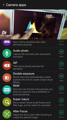
Some of the other tools available include an ‘expert mode,’ which allows you to set focus, exposure and white balance manually; a mode to change the focus point after a shot’s been taken; and, my personal favorite, a GIF maker.
Unfortunately, you can’t combine these tools, to for example use expert mode to set focus manually, and then shoot RAW.
Video-wise, the camera is less impressive, mainly due to a low bitrate. You also can’t shoot in 4K – though perhaps this could come with a firmware update – but the sensor at least provides a good base image.
One niggle: the selfie position defaults to a beautify mode that over-smooths skin and kills detail every time I open the camera. My skin is quite nice on its own, thank you very much.
Usefulness aside though, flipping over the camera with a swipe is just darn fun.
Some more images for your viewing pleasure:
Wrap Up
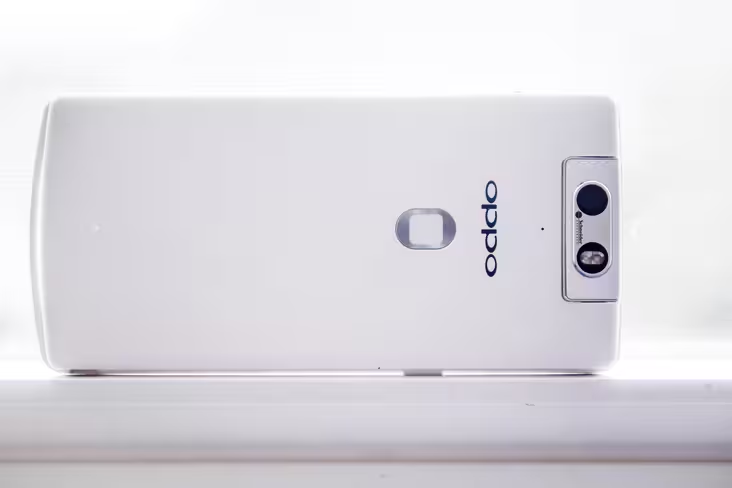
The Oppo N3 may be gimmicky on paper, but it ends up feeling surprisingly practical. Its rotating camera has legitimate benefits, the Skyline notification does what it’s supposed to do and the O-click remote occasionally comes in handy. I was satisfied using it as my daily driver, nitpicks notwithstanding.
Even if you don’t care for these features, they don’t command a price or performance premium. The core experience of using the N3 remains a pleasant one: a well-designed, large-screen phone with solid performance and some of the best image quality around – for landscapes and self-portraits alike. If that sounds enticing to you, it should definitely be on your radar.
The N3 is already on sale in China for 3,999 CNY, and it should arrive in Europe and the US in the new year. The unlocked price will be €549 in Europe and $649 in the US, which undercuts several flagship competitors.
➤ Oppo N3
Get the TNW newsletter
Get the most important tech news in your inbox each week.

