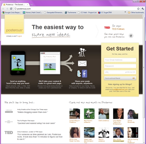
Posterous has rolled out a new homepage design where it focuses less on sharing through email and more on, well, being like Posterous – i.e. an easy way to share just about anything.
Posterous has unfortunately faced a number of malicious denial of service attacks over the last few weeks, but that seems to be behind the popular blogging/sharing service. Also, Posterous recently launched its somewhat controversial two weeks of going after more established services, where it made it simpler for users to make the switch from those other services to Posterous.
The platform has also matured with recent features that include Pages and comment control and moderation. Here’s what the new homepage looks like (the text/user under “The easiest way to” changes while you’re on the homepage, and the suggested users at the bottom changes on refresh):

Get the TNW newsletter
Get the most important tech news in your inbox each week.


