The simple poll taking service Polar set up a series of queries about Apple’s new iOS 7 icon designs and the results are fairly surprising, given the outrage. Out of 289,895 votes on the set of polls, 66% of all votes were for the new versions of the icons over the ones from iOS 6.
I’m actually a fan of the new direction that the icons are taking for a variety of reasons that I’ll go into detail more later, and have already talked about a bit here on TNW. They’re a new language for a new era of iOS that probably won’t coalesce until one or two versions in, just like the original.
But even in these early days, where there is so much intense (and valid) criticism of the icons, it is interesting to see that a straw poll is showing a fairly positive general vibe. I’m of the opinion that the majority of folks will actually quite like iOS 7, and that Apple’s core target crowd of young buyers will especially take to it.

The 💜 of EU tech
The latest rumblings from the EU tech scene, a story from our wise ol' founder Boris, and some questionable AI art. It's free, every week, in your inbox. Sign up now!
I saw some interesting trends in the polling though, so it’s worth clicking over and taking the ‘quiz’ yourself. For one, the new designs stack up very well against the old ones, which are almost universally lower rated. But there are a couple of interesting exceptions like Game Center, where people like the old design better. Interestingly, with just a little tweak a ‘redesigned’ Game Center icon with the shine removed got higher votes than the new version.
Among the biggest iOS 7 winners:
- Clock 84%
- Phone 81%
- Music 75%
- Messages 83%
- Weather 77%
- Calendar 73%
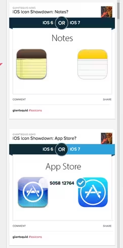
- App Store 74%
- iTunes 78%
- Videos 75%
- Facetime 71%
- Compass 80%
- Mail 72%
The larger iOS 6 percentages:
- Safari 62%
- Game Center 56%
- Camera 61%
That trend continues through a lot of the new icons when they’re presented alongside a slightly rejiggered version. People seem to like the new direction, but the consensus is that a bit of work tweaking them would go a long way.
Which isn’t too surprising as I reported during WWDC that this is one of the least finished versions of iOS since the original iPhone in 2007. Work continues unabated in Cupertino, and this is very much a mid-stride snapshot that we’re seeing now. Whether the icons will see any changes though…I don’t know. I’d love to see some nips and tucks here and there (and many apps feel very, very rough) but the overall shift is a positive one and I think it will do well on the next generation of Apple hardware.
Get the TNW newsletter
Get the most important tech news in your inbox each week.