Yesterday, Nintendo announced a new Switch, the OLED model. There’s a problem though: this isn’t the Pro version of the console that many people were after.
This puts lots of us in the strange situation of being unsure whether to be excited or not. Is the OLED model worth it? Just how different is it to the original Nintendo Switch?
Luckily for you, we’re here to solve those questions… with math. And graphs. Math and graphs. Graphs and math. HERE WE GO.
Specs battle: Nintendo Switch vs. OLED model
Let’s get the most obvious improvement out the way first: the screen. Let’s have a look at the different sizes:
Nothing too odd here. The Nintendo Switch has a 6.2-inch LCD, while the OLED model has a 7-inch, uh, OLED screen. This is a 12.9% increase in the diagonal screen size between the two models.
But what about the screen area? Well, the OG Nintendo with the 6.2-inch has a display area of 106cm². The 7-inch OLED screen clocks in at 136cm². That then, is a 27.3% increase in the display area between the two models. Which is quite a lot tbh.
The resolution of both displays on the console has stayed the same though: 1280 x 720. Or 720p. This means that while the OLED model will have better contrast, higher brightness, and a wider color range, it won’t have more detail than the original Switch.
Which is a crying shame.
But let’s look at something else in the Nintendo Switch vs. OLED model fight. Specifically, weight:
As you can see, the OLED model is 23 grams heavier than the original Nintendo Switch. That’s roughly the same weight as an AA battery, or a 7.7% weight increase.
But here’s where we bump into something strange.
Both the original Switch and OLED model have the same CPU/GPU (a NVIDIA customised Tegra processor) and the same capacity battery (4,310mAh). This suggests that most of that extra weight is down to the screen.
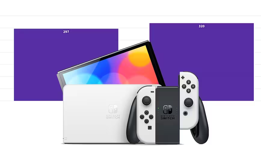
While we’re doing a Nintendo Switch vs. OLED model battle, we can also approximate the volumes of each device. The regular Switch clocks in at 338cm³, while the OLED model has a volume of 343cm³.
That’s a 1.3% increase in volume between the models. Not a huge amount, but enough that some of Nintendo’s LABO hardware may not fit as snugly as users like.
Let’s finish this comparison of the Nintendo Switch and OLED model with a final graph. This one is looking at the system memory of both models:
Woo! Look at that! An honest-to-god improvement! A 100% increase from the original Switch to the OLED model!
Even though, I’d say the average size of a AAA game is around 10GB — meaning you can only get around 6 of them on the new OLED model. Still, that’s better than a kick in the teeth.
Methodology
All the data in this article was pulled from Nintendo’s official site.

What have we learned in the Nintendo Switch vs. OLED model battle?
The most important element is this: the OLED model is not a Pro Switch. Not even close. It’s barely an upgrade from the original console, with only the screen being a substantial departure.
While the increased internal storage of the OLED model is a positive step, it feels strange that Nintendo hasn’t even increased the battery size or allowed for 4K output while docked.
I understand that it’s probably holding back some of these features for the Pro, but it would’ve been nice to see a Nintendo Switch V2. Instead, it feels the OLED model is a V1.1 — which is a bit of a shame considering the console is now 4 years old.
Thanks, math and graphs, you’ve made me sad.
Get the TNW newsletter
Get the most important tech news in your inbox each week.


