Updated: Scroll down to view updates to this post.
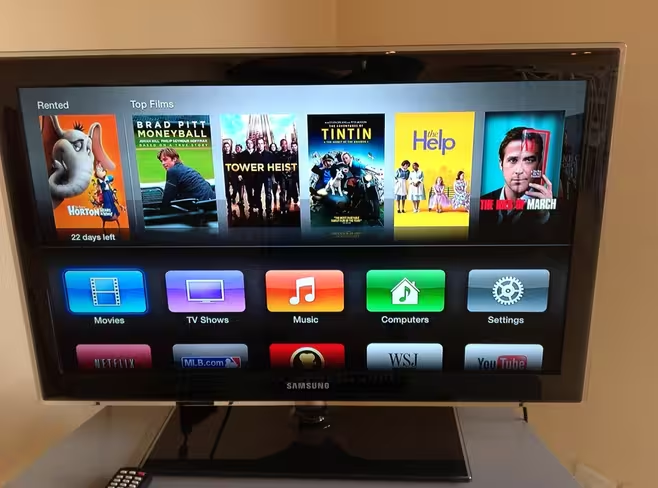
Launching earlier in March, the new Apple TV brought with it new movie purchases in iCloud, 1080p video support, genius recommendations, screensaver photos and on-device signup for video streaming services like Netflix.
It was all wrapped in a new user interface, which Apple said would provide “fast, visual access to all content choices.”
According to former Apple TV engineer Michael Margolis, the new Apple TV update (version 5.0) actually uses designs that were “tossed out 5 years ago because Steve Jobs didn’t like them.” He also suggested that since the Apple co-founder lost his battle with pancreatic cancer, “there is nobody to say ‘no’ to bad design”:
@aral Fun fact – those new designs were tossed out 5 years ago because SJ didn’t like them. Now there is nobody to say “no” to bad design.
— Michael Margolis ッ (@yipe) March 24, 2012
The comments were made on Twitter, where Margolis was engaging with designer and entrepreneur Aral Balkan over the design choices for the new Apple TV.
Having initially responded to a question on Apple’s choice of UI for the new homescreen, Margolis stated that many elements within the Apple TV user interface were still in place from when he was involved in the project.
He also remarked that it was the work of “just one visual designer in the consumer apps team,” and that the “whole team [had] left or been replaced,” from when he was at the company.
The new Apple TV user interface has seen contrasting responses from device owners, with many liking the new design and others (like Balkan and Margolis) believing that the design has taken a step backward from where it once was.
Margolis provides an insight into the design choices made by Apple for the new update, one that simplifies navigation and draws close comparisons to how apps are displayed on Apple’s smartphones and tablets now, which may have been a little ahead of Jobs’ plans five years ago.
Are Apple’s design standards slipping? Maybe not. The company charts a new course with Tim Cook at the helm, one that has seen the company continue to go from strength to strength. It may just mean that now was the right time to unveil it.
Update: In a comment, Michael Margolis clarified the UI and the elements Steve Jobs took issue with:
The new UI shouldn’t come as a surprise to anyone. There is a clear effort at Apple to make everything match the look and feel of their popular iOS products – starting with Lion and increasing momentum with Mountain Lion.
To be clear – he didn’t like the original grid. This was before the iPhone was popular and before the iPad even existed.
Given that the iPad is far more successful than the AppleTV, migrating the AppleTV to look more like the iPad was probably a very smart move – even if some of the users of the old UI don’t prefer the new one.
Don’t miss: First look and image gallery for the 2012 Apple TV.
Get the TNW newsletter
Get the most important tech news in your inbox each week.


