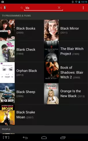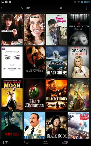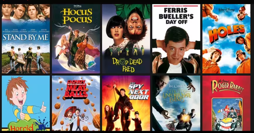
Netflix has given its Android mobile and tablet app a bit of a refresh this weekend, as the streaming giant rolls out a more visually-focused layout for search results. This move echos its existing interface on the Web, TVs and game consoles, and Netflix adds that the iPhone incarnation will be included in this update shortly.
As you can see from the before-and-after shots here, a new grid-style wall of cover art (right) replaces the old column approach (left), which means they’ve also removed the production year from the first-glance information. But this new approach does mean they can squeeze more titles in to each screen.
“Presenting the results in a grid of cover art allows the user to see more results at once on touch screen devices such as mobile phones and tablets,” explains Netflix’s Roelof van Zwol and Chris Jaffe in a blog post. “This visual presentation reduces the cognitive load, making it easier to find what you’re looking for.”
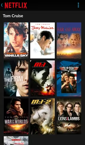
Netflix also revealed that iPhone users will soon be able to search by people, including actors, directors and creators. This feature is already available on its iPad version and on other platforms – including Android (screenshots below) – and is useful if, for example, you want to search for all films starring Tom Cruise using just his name in the search box.
The updated Android app is live now, but Netflix hasn’t indicated when the refreshed version for iPhone users will be landing.
➤ Netflix [Android]
Get the TNW newsletter
Get the most important tech news in your inbox each week.
