Mozilla is planning a major design overhaul of its flagship browser with the release of Firefox 25, slated to arrive in October. The company makes a point to discuss its plans for changes openly, and this upcoming new version is by no means an exception.
In fact, even though Firefox 22 is in the Beta channel, Firefox 23 is in the Aurora channel, and Firefox 24 is in the Nightly channel, Mozilla has set up a special Nightly UX channel for Firefox 25. Naturally, we went out and grabbed it; the latest Firefox release is on top and the new user interface is at the bottom:
The biggest change comes down to the new look for tabs or the complete revamp of the main Firefox menu. Actually, we’d probably side with the latter since the menu is being moved from the left to the right, and it will be apparently accessed via a button that looks nearly identical to Google Chrome’s hot dog icon.
There’s more; here are the major changes that are slated for this release:
- Curved tabs.
- Remove tab affordance from background tabs.
- Separate Bookmark Star from locationBar and merge with Bookmarks Menu item.
- Updated Panel Based Application Menu and Customization Mode.
- Windows (All): Draw entire window frame including Caption Buttons.
- Windows XP: Custom window frame style for all default themes.
Other changes that Mozilla has planned include updating in-content user interface styles, refining “all aspects” of the existing user interface, and finally a unified interface for consistent border-radii, dimensions, spacing, margins, icons, and color palette. In other words, it will feel like a brand new Firefox.
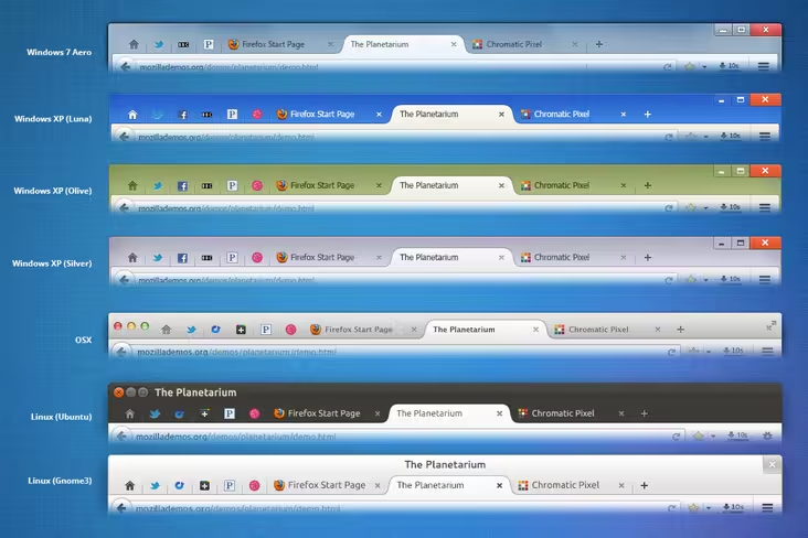
Here’s a more detailed comparison across the various desktop platforms Firefox is available on:
On its Add-ons blog, Mozilla last week discussed “Australis” – a major theme revamp with an objective to simplify the user interface. In this vein, there is a discussion of removing the Add-on Bar completely, killing user-created custom toolbars, and having the main toolbar feature a dedicated area for add-on buttons and widgets instead.
Mozilla warned Firefox add-on developers of the following:
Overall, you should plan for a minimalistic toolbar UI. While most add-ons do this already, it’s possible that the API to add toolbar buttons will be very different, and there will be changes to be made for all of them.
Firefox 21 may have arrived just last month, but the company has already scheduled all the versions it plans to release through March 2014 (Firefox 31). The news surrounding Firefox 25 thus shouldn’t be too surprising, though Mozilla did say why it is waiting so long before making these changes: Firefox 24 is an Extended Support Release (ESR), so major changes have been pushed after it to minimize any potential impact.
For those who don’t know, ESR is aimed at organizations such as schools, universities, and businesses that require extended support for mass deployments. The last Firefox ESR was version 17.0.
If these types of design changes float your boat, you can check out plans for Firefox 25 on various platforms here: Windows 7 – Aero, Windows XP (Luna Blue, Olive, Silver), OS X, and Linux.
Top Image Credit: Leon Neal/AFP/Getty Images
Get the TNW newsletter
Get the most important tech news in your inbox each week.


