Motorola G and E-series have long been affordable stalwarts of the smartphone market, but their design often betrayed their budget nature. This time around Motorola is cranking things up a notch with the G6 and E5, refreshing its value-priced phones with an attractive glass-sandwich design in addition to the usual spec bump.
The company is announcing four models, so let’s break down the key specs first:
Moto G6:
- 5.7-inch, 1080p+ display
- 18:9 aspect ratio (smallish bezels)
- Snapdragon 450
- 3/4 GB RAM
- 32/64 GB expandable storage
- 12MP (F1.8 aperture) and 5MP dual rear cameras
- 3000mAh battery with USB-C quick-charging
- $249+
Moto G6 Play:
- 5.7-inch 720p+ display
- 18:9 aspect ratio (smallish bezels)
- Snapdragon 427
- 2/3 GB RAM
- 16/32 GB expandable storage
- 13MP single camera (f2.0)
- 4000 mAh battery with micro USB charging (sighs)
- $199+

Moto E5 Plus (US Only):
- 6-inch 720p display
- Snapdragon 435
- 3 GB RAM
- 32 GB expandable storage
- 12MP F2.0 camera
- 5000(!) mAh battery with fast charging (micro USB)
- Price is carrier-dependent
Moto E5 Play:
- 5.2-inch 72op display
- Snapdragon 425 or 427 processor
- 2GB RAM
- 16 GB expansable storage
- 8MP F2.0 camera
- 2800 mAh replaceable battery (micro USB)
- Price is carrier dependent
Got all that? And yeah, they all have a headphone jack.
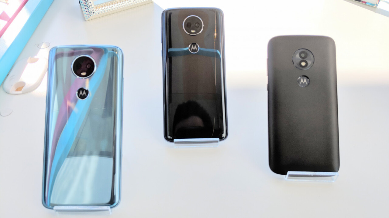
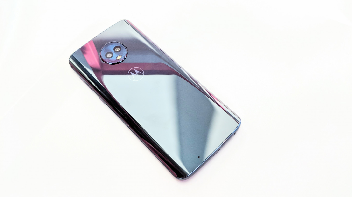
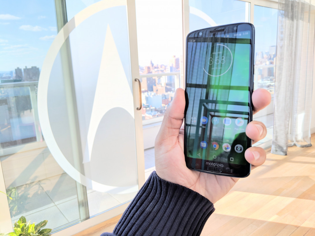
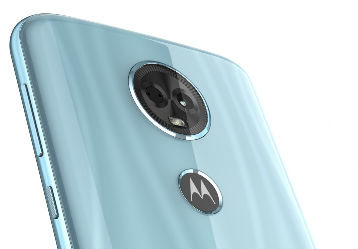
Visually, every phone except the E5 Play has a Samsung-esque reflective back. On the G6, this is Corning Gorilla glass, while on the G6 Play and E5 Plus, its a transparent polycarbonate. The G6 has a fingerprint sensor on the front, while the other models keep it on the back.

From my brief time with the devices, they all look and feel well built, with a metal frame and look that isn’t too far off from more expensive devixes. Quite frankly, I couldn’t even feel much of a difference between the glass and polycarbonate, so I wish Motorola had chosen the latter for the G6 as well. While it would be more prone to scratches, I’ll take that over glass’ far greater odds of cracking when dropped.
I don’t like how the G6 Play and E5 Plus prominently display their PDAF sensor in a circular frame. It might be purely a design choice, but it also seems like a cheep way to trick people into thinking those phones have dual cameras. The E5 Play, meanwhile, gets a more boring textured black plastic, but it’s the only one with a removable battery.

On the software side of things, the main difference is the redesigned camera app, which takes on more of an iPhone like aesthetic, with quick access to common features like portrait mode on the G6. The phone is also using AI to do things like detect landmarks and let you copy and paste text from images you’ve taken. There’s also a range of built-in face masks, if you’re into that kind of thing.
While the specs are nothing crazy, previous Moto G and E phones have offered surprisingly good performance thanks to near-stock Android and minimal bloatware. We’ll be spending more time with the devices soon, so stay tuned for our full reviews.
Get the TNW newsletter
Get the most important tech news in your inbox each week.


