When Microsoft announced Windows 10 way back in 2015, expected the OS to be on 1 billion devices within 3 years. That did not happen, in large part due to the OS’s failure to take on Android and iOS in the mobile sector.
But now, nearly five years later, the company has hit that goal — as it announced earlier this week. To celebrate, Surface head honcho Panos Panay shared a video that teases a cleaner look for the OS, adopting more of the Fluent-UI touches the company has slowly been rolling out.
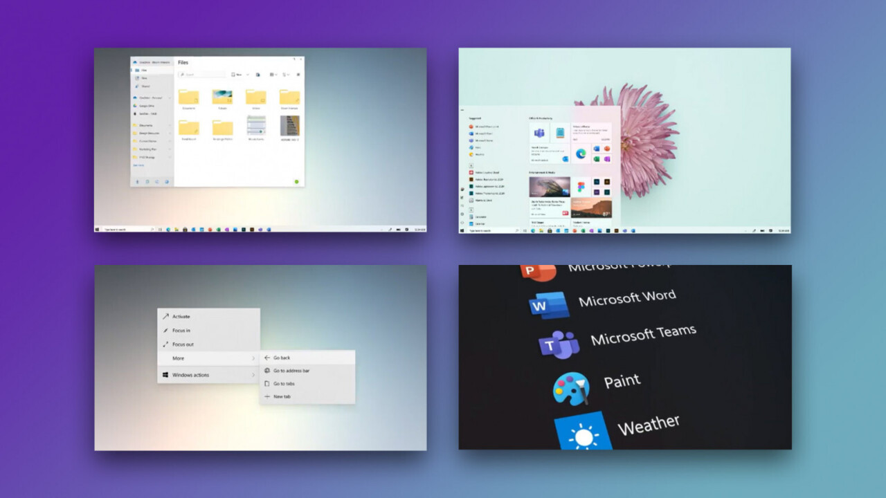
Though the video is low resolution, we catch a few glimpses at aesthetic changes. There’s a new take on the File Explorer, including some nifty new icons and a more minimalist design. The Start Menue is cleaner as well, with Live Tiles that now have a background to match your light or dark theme. And at long last, Microsoft is updating its right-click menus to match Fluent UI.
While the changes seem superficially small, they help pull together the various changes Microsoft has been implementing since announcing Windows 10, and especially since revealing the Fluent UI design goals in 2017.
Microsoft is holding a virtual event on March 30, which is expected to focus on Office related-news, such as a new subscription service for everyday users that combines Office, Teams, a new password manager, and more. I would expect to hear more about the upcoming UI changes during its Build 2020 event, which is being held online due to, you guessed it, coronavirus.
Via The Verge
Get the TNW newsletter
Get the most important tech news in your inbox each week.


