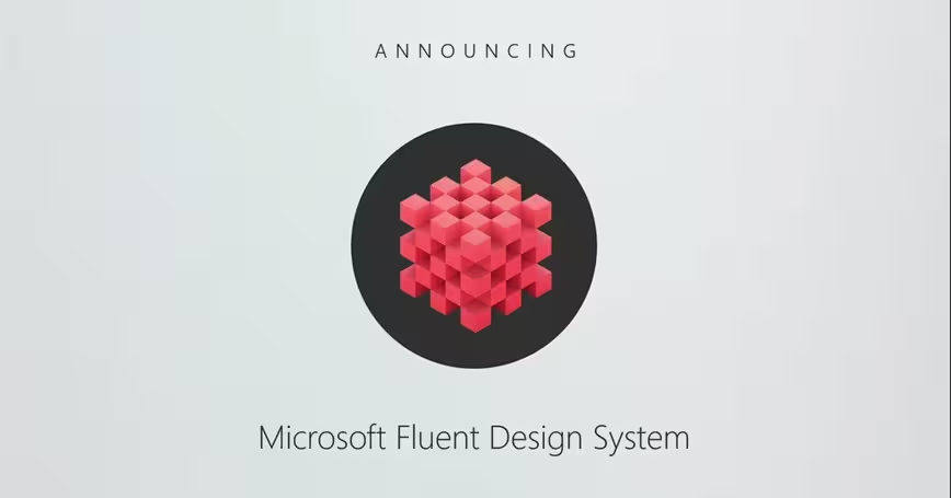
Just as expected, Microsoft has revealed the long-rumored Project Neon – Windows 10’s big UI refresh – at its Build conference in Seattle. Except, it has a new name: The Microsoft Fluent Design System. Given that’s a mouthful, lets all just go ahead and call it ‘Fluent’ for short.
If you’re expecting a dramatic and immediate overhaul of what Windows 10 looks like, you’re going to be a bit disappointed; Fluent is something of a gradual shift in Microsoft’s design language. But that doesn’t mean it’s not pretty cool.
Microsoft’s video should give you a rough idea of what to expect:
The gist is that Fluent adds a variety of UI properties that manifest themselves differently depending on platform and user interactions:
- Light: Controls how the UI interacts with illumination – particularly useful for mixed reality, but you’ll also see some elements start to glow as you hover over them.
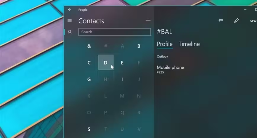
- Depth: Adds depth information to the UI for things like parallax effects and some extra pizzazz in mixed and virtual experiences. An app may appear relatively flat in a still image, but the depth information means a prettier experience for animations
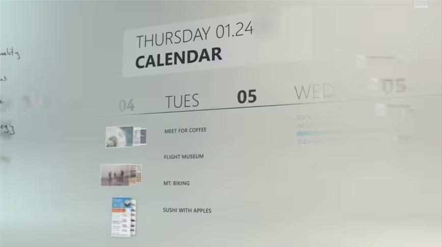
- Motion: Basically revamps animations throughout the OS and apps, and even for individual elements within a single app.
- Material: Controls the textures of UI elements (for example, a frosted glass look for some apps), as well as things like how elements can “bend, stretch, or bounce” as you interact with them.
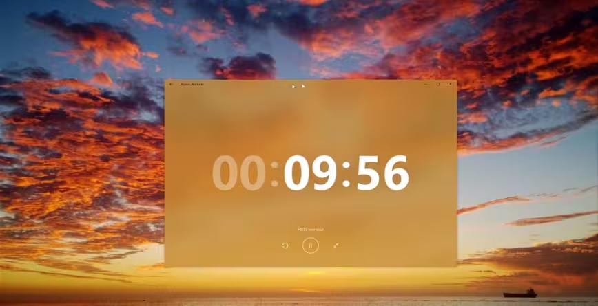
- Scale: How apps scale to be used on different devices.
Right now, Fluent is still in the relatively early stages. Microsoft says it’s looking to have a conversation of sorts with developers to see what best works to create apps that are able to shift between form factors as variegated as phones, tablets, desktops, and mixed reality, and interactions like touch, ink, voice, gaze or gestures.
So no, you’re not going to see a radical UI overhaul right away, but it will show up in bits and pieces as the Fall Creators Update approaches. Expect the Windows shell and Microsoft’s own apps to become just a bit prettier, with frosted transparencies, smooth animations and a bit more pizzazz overall. Third party apps will follow as Microsoft makes Fluent resources available to developers.
As Microsoft describes it, Fluent is an evolution of Metro as Windows grows to embrace our increasingly mixed reality – these apps have to work with HoloLens, after all. It’s going to be a slow transition, but Windows will look better for it. Now if Microsoft could just fix some of those ugly old icons….
Follow all our coverage of Microsoft’s Build conference here.
Get the TNW newsletter
Get the most important tech news in your inbox each week.
