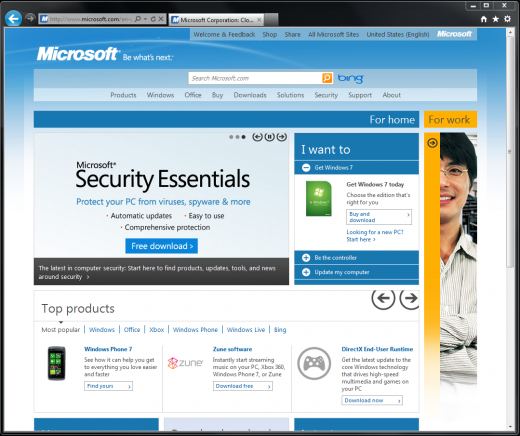
The new Microsoft.com is now live. The refreshed design was shown off earlier in the year, and draws heavily from the popular Microsoft design ethos called ‘Metro.’
Metro can also be found on and in Windows Phone 7 and Zune products, two parts of the Microsoft empire that have always received plaudits for their strong UI design.
The new design also features integration with the ‘pinning’ functionality of Internet Explorer 9, something that the company has been touting recently to developers as a way to boost site engagement. This is what the new Microsoft.com looks like at the time of writing:

If you access the website, scrolling through sections can be done by clicking on the arrow that is visible under the text “For work.” As with Windows Phone 7, this will slide you to the next page, an animation that is rarely seen online.
Microsoft.com is the 27th largest website in the United States, and 25th in the world, according to Alexa, making this redesign quite impactful.
While we have not heard word, we anticipate this design to slowly roll out to other Microsoft web properties over the coming months. Sound off in the comments, do you like it?
Get the TNW newsletter
Get the most important tech news in your inbox each week.


