You know what sets a design portfolio apart these days? It’s not a designer’s experience, beautiful visuals or the number of clients. It’s the way you communicate those things.
Your portfolio should first demonstrate how you get things done rather than showcase a bunch of visuals out of context. It should tell a story that articulates your personality, work ethics, process and goals you achieve with your work.
As people become increasingly resistant to all those titles, names and beautiful visuals, it’s time to make portfolios more personal and interactive, and have at least a few great customer stories to tell when marketing yourself in 2015.
Here I provide some tips on how to do that along with a few great examples I’ve come across.
Tell a compelling story
As a marketer, I’m more than aware that when it comes to marketing yourself today, people don’t trust nothing but stories. This story-telling thing is so powerful that it’s currently disturbing the whole marketing industry, and can be well applied even to building a design portfolio.
To convince the customer today, it’s not enough just to show your work. You need to put it in context; wrap it in a story that tells how you get things done: how you handle and what is your role in projects, how you manage to deal with challenges, what results you achieve and whatnot. That’s how you earn trust and set yourself apart.
A briliant example is Ben Barry, a former designer at Facebook, who writes about his projects on his personal website in minute detail. Every project has a story on how everything has started, how he came up with ideas, how the design has evolved over a number of iterations etc.
In this way, Ben not only shows his end product, but also reveals his design process, attitude to work, values, and many other aspects of his work, which can play a decisive role for the customer when selecting a designer.
Show your personality
Connecting with your potential customers on a more personal level can often be a deal breaker — and it’s not a surprise to anyone. Given that most of the time the client forms a first impression of you while browsing across your portfolio, why not add a personal touch to it?
I don’t mean you should write down your whole biography or stories about first kisses in high school, but adding a few sentences on what are your outside interests can really set your portfolio apart from others.
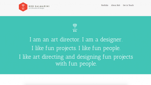
Here’s the portfolio website of Bob Galmarini:
A few sentences about who he is and what he likes written in a funny and primitive way: that’s how he grabs attention and connects with a potential customer in a simple yet effective way.
Besides, on the ‘About Bob’ page he tells a few facts not only about his studio and design career, but also on his wife, hobbies and other activities not related to design. That really builds trust, and lets the customer get to know the designer better even without contacting him.
Make it more interactive
Web design is becoming more interactive and animated than ever before, though I have come across only few portfolios that stand out with some distinctive interaction. As a result, working on interaction design that can draw your potential customer in ahead of time can be a way to distinguish yourself in 2015.
A good example of a superb interactive personal website is Robby Leonardi’s resume:
He made a game-like environment where you go through levels while learning about his skills and experience. In the end, you rise to the contact form with the hot air ballon. Cool, right? Though it’s not a portfolio, this resume can be a great source of inspiration when making one.
Show the process — with photos
The way you get things done plays a critical role in landing a great design gig. We have already discussed the power of stories in your portfolio, but here’s an idea from Ben Blumentfield, Co-Director of Designer Fund, on how to make them even more powerful: add photos (not illustrations) of your design process.
“If you are a user researcher, show beautiful photos of your user research sessions, your findings, and how you present those to your team. It is worth spending the time to select and present the right images to tell a compelling story,” advices Ben Blumenfiend on Co.Design
Francine Lee, a UI/UX designer who has done research and design for Dropbox, Uber and Asana, and her blog post on one of her latest projects can be a great example of how photos can liven up your stories — read the post here.
This blog post got covered in Smashing Magazine, Fast.co Design, and made it to the Top 100 Medium Posts. Not that bad, right?
In a nutshell
So when you update your portfolio next time, try to wrap your work in stories, and so not only show your end product, but also reveal your design process, values and other things you think have a positive impact on your work.
Plus, don’t afraid to show your personality. Connect with your customers on a more personal level and do so in a more interactive way. That can really make your portfolio stand out.
Read Next: The guide to crafting an amazing online portfolio
Image credit: Shutterstock
This post first appeared on TrackDuck
Get the TNW newsletter
Get the most important tech news in your inbox each week.


