
Are you working on designing your new portfolio site or personal website? Unsure of where to start or how to make it look professional? What type of design elements should you focus on when you are working on your site? Designing your online portfolio should best highlight on your portfolio pieces so your work speak for themselves.
How do you create a portfolio site in a way that the design isn’t really the first thing that is seen? Below, let’s talk about some of the major design decisions that need to be made as you work through designing your new online portfolio to help make sure the focus is always on your work.
Logo
For your online portfolio, you should consider adding a logo or some graphic mark that signifies who you are and the type of work you do. While this often is a no-brainer for companies or design firms, for individuals and freelancers this may not seem as important.
When visitors come to any site, the first thing they look for is a logo or name of the site. This element shouldn’t be skipped simply because you want to place all the focus on your work. If you want a clean, simple logo for your site and haven’t created one, services like Squarespace offers a free professional logo maker with your site.
Having a nice logo or graphic mark on your portfolio tells your visiting audience several things: that you are professional, that you know how to take care of the details and that you are stable. Your logo will give you a nice professional and polished look while showing visitors that you are offering professional services.

The 💜 of EU tech
The latest rumblings from the EU tech scene, a story from our wise ol' founder Boris, and some questionable AI art. It's free, every week, in your inbox. Sign up now!
Designing the small details like your logo shows visitors that you pay attention and make sure even the tiniest of details are taken care of. Finally, those with a logo often appear more stable as they have taken the time to develop a logo because they plan to stick around.
All of these good vibes are what you want to convey as visitors move down from your logo to the rest of your site.
Typography
For your portfolio website, the type of typography you use will go a long way. Since portfolios are more about the work than your words, you should keep your words at a minimum and where they don’t take focus off of your work.
If you must use some copy on your website, make sure that it is used to describe your work or yourself and keep it short and sweet.

Clean, easy to read and unobtrusive typography works best for your online portfolio. Things to consider when choosing a typeface and using it on your site include: simple and clean letterform (no decorative fonts), colors you choose (more below), spacing around the typography and the font size.
Look into using san-serif fonts, keeping the color a neutral color (grays and blacks work well), and keeping the font size small but where it can be easily read.
While on the subject of content, make sure you don’t cram your portfolio site with a lot of copy. It is great to have some description of your work for each portfolio piece, but keep it descriptive and at a minimum.
Also, be sure to include information about yourself as well, but this is often best on its own page and limited to about two to three paragraphs.
Color
The psychology behind colors in design will help you discover the perfect color palette for your portfolio site. Keeping in mind that the design of your portfolio website itself is to aid in the viewing of your work, selecting colors so that they fade into the background and bring forward your work is the key.
Often, portfolio sites work best when the work is displayed on a white or light gray, or dark gray or black background. Using bright colors tend to distract viewers from seeing your work, so reserve any bright colors to selected areas such as headings.
Many portfolio sites stick to neutral color schemes since they are the cleanest and most effective backdrop for just about any type of work you want to showcase.
Make sure the colors you choose contrast well with your work. If your work is very bright in color, your site should have muted colors. If your work is very muted, using selected bright colors will help draw attention to your work.
If you use similar color scheme for your portfolio site as you do for your work, then it will cause a competition visually between your work and the site itself, and this is often very visually jarring for visitors.
Layout
Your work on your portfolio site should be laid out in a clean and easy-to-follow format. Think about how art galleries showcase work on the walls. Are the pieces crammed together or spread apart? Is the entirety of the space well laid out or does it feel like it was put together last minute?
Organize your pieces on your portfolio in a way that allows each piece to breath and have its own space. Avoid cramming lots of pieces onto your portfolio page, as this tends to feel very chaotic and unprofessional.
Often, portfolio sites have work laid out in a grid with works spanning two or three images across and how ever many rows needed to show all the work.
In planning the layout of your site, pay attention to the size of your portfolio images. Visitors are coming to see your work, and they may linger and stay on one or two pieces for a long time.
To help aid in their viewing, present images are are large enough for them to see the details, but not so large as to be overwhelming and daunting.
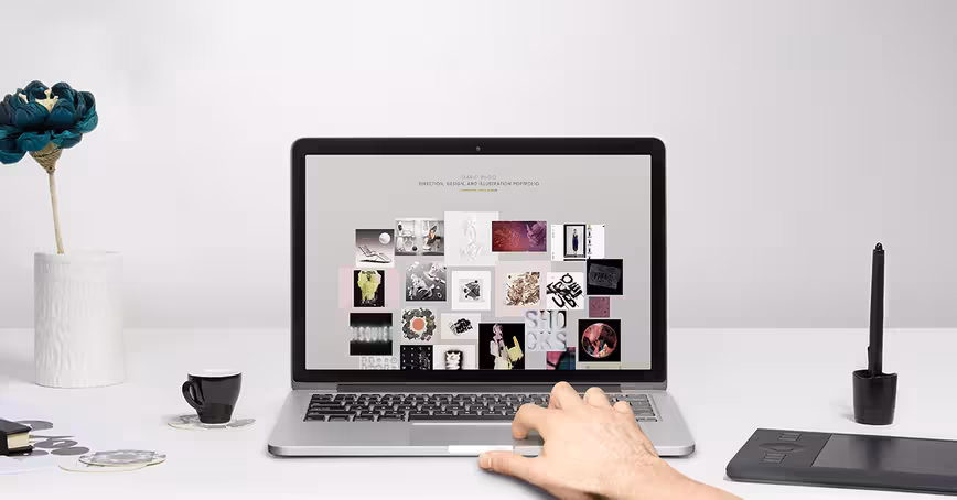
Photos/Graphics

Finally, for your portfolio website, your photos and/or graphics you use on your site to showcase your work need to planned and created keeping in mind their purpose. Visitors want to see your work, so they will often spend time viewing each piece you have. The types of photos and graphics you use should be created in a way that showcases your work in the best possible way.
For physical pieces, look to take the best photographs you can of your work, using the best camera you have available to you. Take multiple pictures and at multiple angles so you can see which will work best later on.
When you go to edit your pictures, feel free to adjust the exposure, contrast, lightness and brightness to help showcase your work in the best light – just don’t go overboard as you don’t want to misrepresent your work.
For your digital pieces, figure out the best way to showcase the entirety of your work for a project in one image (meaning a thumbnail – you can always have visitors click to see more about that project and more images as you see fit). Layout, crop, and adjust so that visitors understand what they are looking at but also allows the work to be showcased in the best way possible.
Conclusion
Taking your logo, typography, colors, layout and photo/graphic treatment in mind when designing your new portfolio site will help you make sure that your online portfolio is serving its purpose: to place all the focus on your work. Your portfolio site will be the most successful when every design decision made is in favor of showcasing your work.
If you need help getting started, services like Squarespace can make the setup process easy so you can focus on crafting quality content.
Read next: The psychology of Web design: How colors, typefaces and spacing affect your mood and Designers’ dream giveaway: Win a Sony Alpha a5100, $300 in MOO supplies or a FiftyThree stylus
Interested in Squarespace? Use code THENEXTWEB for 10 percent off.
Get the TNW newsletter
Get the most important tech news in your inbox each week.
This is the third of a series on "The Guide to Your Online Portfolio," and has been brought to you by Squarespace. Create exceptional websites, blogs, portfolios and online stores.