Today Mailbox, the quite popular email client that landed first on iPhone, announced the release of an iPad version of its app.
The move is hardly surprising, but it does continue the Mailbox story, one that saw the firm launch to mass impact, and then exit to Dropbox for a reportedly nine-figure sum.
TNW met with Mailbox at its new home in the Dropbox offices – try the bacon, it’s excellent – to see the new app. What will become immediately apparent to you provided that you are familiar with the iPhone version of the service is that the iPad build is remarkably similar.
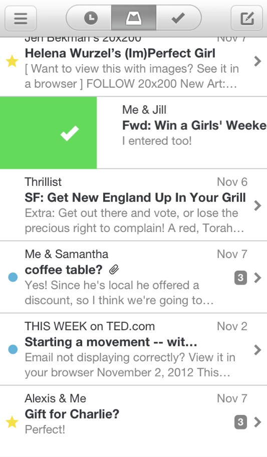
For reference, here’s Mailbox on your phone:

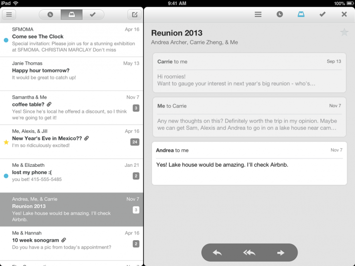
And here is the iPad application:

It’s the same app, with a reading screen appended to the right side. Other visual effects present in the iPhone version persist in the iPad edition, such as swiping to sort emails, and the color scheme.
Frankly, it’s a great move. The core reason that Mailbox took off as it did was that its design, and user experience were incredible. Those success are repeated in the iPad app by not changing them. In testing, it takes under a minute to become fully comfortable on the new app if you are already a Mailbox user.
It is in fact so stripped down, that you cannot use it in any view but landscape. I suspect the app will be both well received, and highly used.
Mailbox: What’s Next
While I had their ear, I walked with Mailbox’s co-founder Gentry Underwood about its future plans, current growth, and the move to Dropbox. Regarding when it will arrive on the Android platform, the company demurred to comment, stating that it doesn’t comment on release schedules. Though the line was delivered with a knowing smile; they have heard that question before.
How has growth been since it was acquired? The service says that it is “excited” by the rate that new people are singing up, and by “the frequency that they stick around.” No hard numbers, however, it will share.
The reason is actually somewhat interesting: Underwood told me that it doesn’t want to get into a position in which it is optimizing for user numbers, and not user experience. The company, instead of trumpeting user levels, merely wants to “build a great user experience,” and then “get that to as many people as possible.”
If you are a fan of priority inbox, or Gmail’s labels, the company knows that you want that support inside of its product. When? No comment. Underwood did inform me that it is not complete; more, at some point, is coming.
How well has Mailbox fit into the Dropbox family? The fair analogy it seems is that Mailbox fits inside of Dropbox as Instagram has slotted into Facebook. Not too much product pressure, but instead a focus on keeping up what made the service so popular to begin with.
In Underwood’s words, both Dropbox and Mailbox both want to “take the friction out of work.”
Finally, and just for fun: Mailbox brought a mere 14 people to Dropbox. It’s core team is now 16. Now you know.
Top Image Credit: Joe Raedle/Getty Images
Get the TNW newsletter
Get the most important tech news in your inbox each week.


