Sierra sits in a strange place in the pantheon of Apple’s desktop software builds. It’s fair to consider Sierra the second iteration on Yosemite (after the impressive El Capitan), but it’s also the first build of macOS, which supplants OS X.
It’s also reasonable to think Apple would avoid rebranding its desktop operating system while saddling it with an iterative take on its desktop software.
To my mind, they haven’t; though Sierra and Yosemite are sometimes used interchangeably when discussing Northern California geography, what Apple has given us with its own Sierra build is — like the geography itself — so much bigger and bolder than Yosemite.
Siri
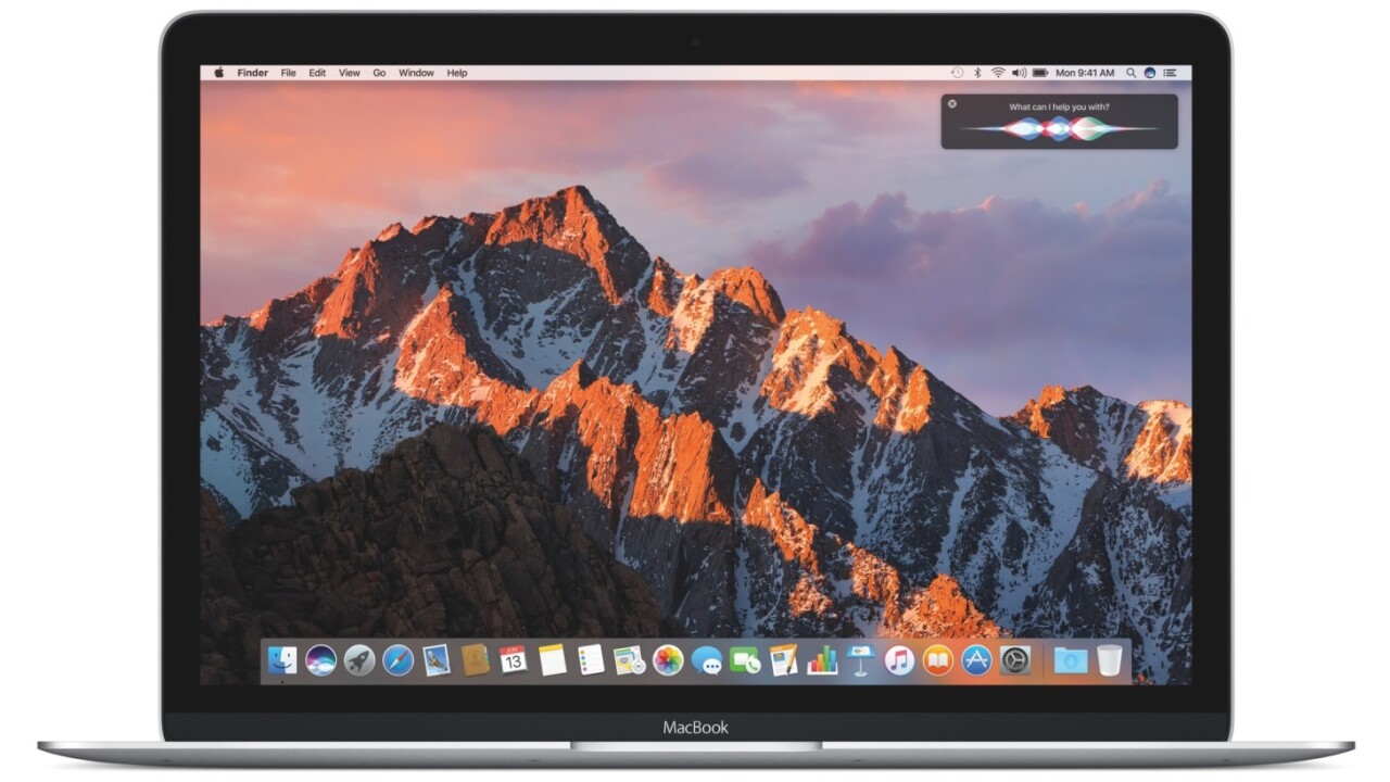
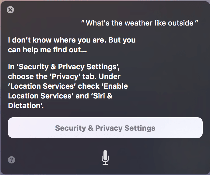
The most substantial attraction for macOS Sierra will be Siri, which makes a home on the desktop for the first time. Yes, she’s found in two different places — the dock and menu bar — which is meant for convenience.
At least as I write this, Siri can also be launched with a function>space bar keyboard command. Apple tells me they’re toying with a keyboard quick-launch for Siri, so that may not make it to the final build. Logically, it seems Apple is considering a ‘some key and the space bar’ for launching services; Spotlight is launched with command>space bar.
When you launch Siri, she stays in a persistent window in the top right of your screen. She even follows you if you migrate to a full-screen app; you have to dismiss her. There’s good reason for that, though.
Because this is the desktop, Siri also has some attention from AppKit, Apple’s underlying framework for creating apps for the desktop. You can do things like drag-and-drop photos or Web links away from the Siri window, or save your search to the notifications pane, which will update in the background. It’s a handy way to keep track of the weather in a location you may be traveling to next week, or seeing just how bad LeBron was beating up on the Warriors while you wrote a review for macOS.
In use, the Siri you get for desktop is the same Siri you’ll get with iOS 9. More often than not, she’ll default to a Web search for queries like ‘what’s the score of the Giants game?’
But Siri can also peer into your system to open a file, much like Spotlight, and is conversational. Asking her to show you all of the files you worked on last week might bring up a list longer than you realized. From there, you could say something like ‘just show me the Pages documents’ and Siri would keep in context that you’re still looking for documents from last week, but you want to distill your search to just Pages documents.
Siri can also create reminders, and looking up locations will surface a nice Maps view within the Siri window. Apple says Siri will be able to adjust settings on your Mac, too, but it’s still a work in progress.
The Apple Watch
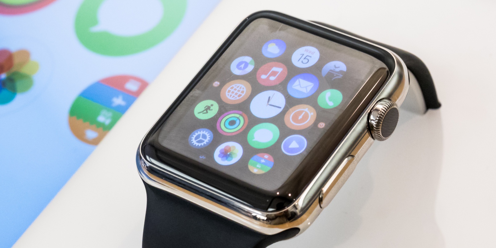
You read that right — we’re going to talk Apple Watch, because it’s now an authentication device for macOS via something Apple calls Auto Unlock (or will be in the Fall, rather).
When wearing an Apple Watch and approaching your MacBook, macOS knows it’s you based on the fact you’re wearing a device authenticated and linked to your Apple ID.
All you have to do is flip the lid open; instead of seeing a password entry field, you’ll find an ‘authenticating with Apple Watch’ spinner. From there, you simply jump into work as you normally would.
It’s not biometrics via TouchID, but it’s the closest Apple has come to officially authenticating your device via two-factor authentication. Unfortunately, it requires an Apple Watch, which many are still not buying into. I think watchOS 3 will change some minds, there, but this is a feature for the true believers, if you will.
Auto Unlock is designed to be secure. You have to be wearing your Apple Watch (and have it authenticated via your password), and it won’t work unless you’re within three meters of your MacBook. The thinking there is that Bluetooth and Wi-Fi are a bit too range-y; limiting it to a space about as large as a small office logically means you’re right there and ready to use your MacBook.
Activating Auto Unlock is as simple as making sure all of your devices are using the same iCloud account, and that you’ve got the feature activated in Settings.
Photos
During WWDC, I cheekily noted Apple Maps was going to be more usable because it was a lot more like Google Maps. The same can be said for Photos, but with one major benefit.
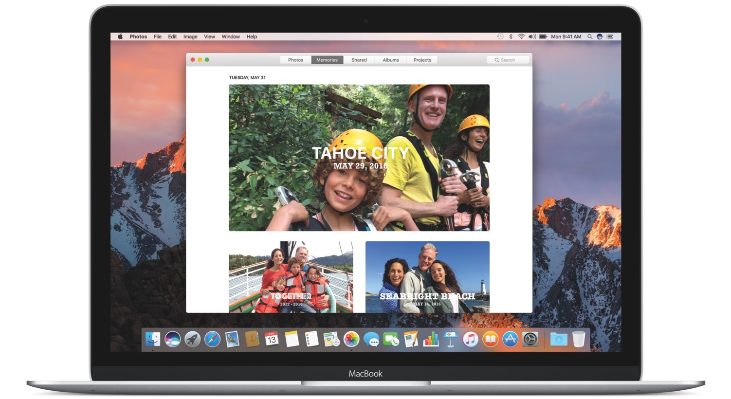
The new Photos build has a section called Memories, which takes similar photo features like mountains, your location and people in the photo to create a slideshow for you. When an event spans multiple days, Memories will break them up within the same slideshow to keep a bit of context of your trip.
Memories also has a map view so you can see where in the world you’ve snapped photos, and shows you some related photos.
If you were to take a hike with a few friends in Canada (and snap some pictures, of course), Memories would likely compile them into a tidy little package, and show you other pictures from hikes or with similar friends in them.
You could leverage that to create a larger hiking Memory, or simply compile a bigger slideshow involving a particular friend for a party or celebration.
Memories can also be tagged as favorites, which keeps them handy in a separate album.
Photos isn’t done there, though. A new People album replaces Faces and adds some automation. Rather than having to manually select who you you want to have a folder of, People does it automatically using the same facial recognition algorithm as Faces.
There’s a new editing feature called Brilliance, which applies light to darker regions of a photo and adds contrast. In use, it’s like Photos’ ‘enhance’ feature with a custom slider.
You’ll also be able to markup images directly within Photos, and edit Live Photos.
Editing Live Photos won’t break the ‘live’ aspect of them, either. All edits apply to both stills and moving images. You can enhance, crop or use filters and adjustments as you see fit. Third-party extensions will also be able to take advantage of the new Live Photos Editing API.
Elsewhere, a Places album keeps a larger view of where in the world you took pictures, and the overall layout and view has changed. Albums now have larger thumbnails with rounded corners, and a preview of the photos in the album as you roll your cursor over it; that’s an iPhotos feature Apple is bringing back.
Search is also better inside of Photos. Images that Photos scan now have searchable features; if your hiking images have mountains in the background, you can now search for ‘mountains’ and get some results.
There was also a bit of a layout change; you now have the option of a sidebar or top row of icons.
One thing to note is that Photos isn’t using your image for its machine learning for use in Faces or Memories. Apple tells me that it licenses larger image galleried available publicly for scanning. It then takes what’s learned and applies the knowledge to your photos; it knows a mountain is not a building, and is smart enough to discern different faces without being sketchy.
It’s all the benefits of Google Photos, except without the crowdsourced privacy invasion. All of the features that now make Photos smart an contextual were learned elsewhere so you can feel comfortable knowing your images are still very much your own.
Messages
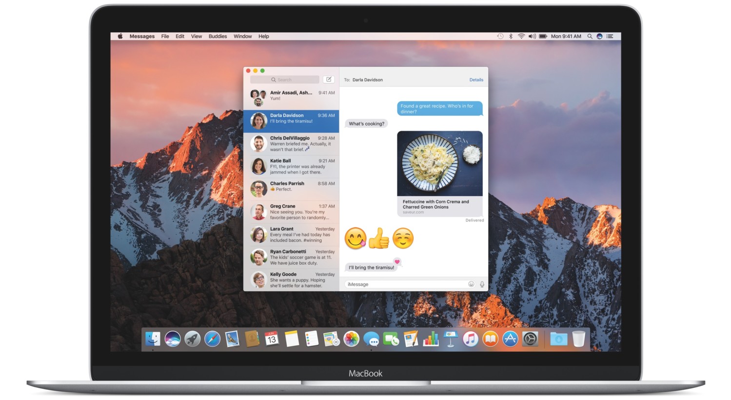
A lot of the cool stuff coming to iMessage in iOS 10 will also hit macOS Sierra.
Specifically, you’ll see rich links to Webpages, and links to YouTube videos can now play in-line. Tapbacks, Apple’s method for quickly responding to a message using icons, is also hitting the desktop version of Messages.
And hey, emoji are also larger when shared without text. You’re welcome, world.

Apple Pay
As expected, Apple Pay is hitting the Web at large this Fall as well. Wisely, Apple made purchase authentication part of Continuity, so you’ll be able to confirm purchases on your Apple Watch or iPhone.
Websites who wish to utilize Apple Pay in Safari will have to use an API and plug a button into their sites, but that’s about all it takes on their end. For consumers, simply tapping the Apple Pay button on the Webpage routes confirmation to a second device.
Once you click the ‘buy’ button on a Webpage, Apple’s Continuity feature kicks it over to your iPhone for a fingerprint or a double-tap on the Watch to complete the transaction.
Apple says that’s for security; all of your cards are kept in Wallet on your iPhone (and Apple Watch), which has no macOS counterpart. Apple Pay also uses a dedicated NFC chip on your mobile devices to adjudicate sales.
All communication between your mobile devices and Safari on macOS are encrypted, and Safari won’t save a history of your transactions.
iCloud
Apple’s iCloud has never been the forward-facing product a Google Drive is, and many (myself included) have been frustrated by that. With macOS Sierra, Apple is making its first move toward realizing what iCloud should be for users — and it’s actually very nice.
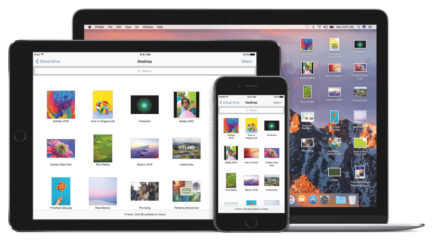
In short, your Desktop and Downloads folders are now synced with iCloud Drive. If you save a file to either location on your desktop, they’ll also be saved in a ‘desktop’ or ‘downloads’ folder in iCloud. That leaves them available to all of your devices, no matter where you go.
Apple told me its reasoning for that was simple: those two locations are where most people save files. Turns out, we’re just not clever about how we manage our documents.
It works for folders, too. If you create a folder on the desktop, that change is recursive to iCloud Drive. You can also access those files from any Apple device you have, or on iCloud.com.
What iCloud doesn’t do is write to multiple desktops. If your iMac at work has a ton of spreadsheets on the desktop, they’ll simply be available to your MacBook at home; you won’t suddenly see a bunch of new icons on your home computer.
Note: It’s come to my attention that complete convergence is how the new iCloud features are designed — that just wasn’t my experience in this developer’s beta build. On release, all files should sync seamlessly to two folders in iCloud, and desktop thumbnails will sync to your actual desktop in multiple locations.
See?! Betas are fun.
Optimized Storage
If you’ve ever run out of storage on your Mac, you know how tedious it can be to dig through your email and documents and decide which stuff you can live without. With macOS Sierra, you no longer have to.
Optimized Storage will help offload some files to iCloud automatically, based on how often you access them or how old they are. It basically moves old, untouched files into the cloud as a type of cold storage; you can always access them, but they require a download and are not as immediately available as the downloads and desktop sync option in iCloud.
You also have more granular control over how to manage some of your data. Things like older iTunes backups can be deleted piecemeal, now.
Most will likely enjoy the automated management of the trash folder, which can now be set to delete files over 30 days old. If you’re a Mail user, attachments can be kept on the email server rather than downloaded to your device.
Duplicates are also a thing of the past. If you download the same thing twice from Safari, Optimized Storage identifies that and deletes the second download. It’s a nice compliment to APFS, which lets you duplicate files and access the same document.
Tabs, Videos, Clipboard and iTunes
All apps on macOS Sierra that support multi-window can now be tabbed. If you’d rather have tabs than a bunch of separate frames, this will please you greatly — especially with full-screen apps.
Videos can now be displayed as picture-in-picture, and follow you everywhere you go (like Siri). In Safari and iTunes, a new icon lets you move them out of a dedicated window and into a layer that sits over your screen. Those videos can be resized, moved and have full audio and playback controls.
A new Universal Clipboard feature lets you copy something from an iPhone and paste it on a Mac — or vice versa. It even uses the same copy/paste features you’re used to, so there’s no learning curve. Apple says it’s a bit like AirDrop, but they’d heard from users that the process was a bit tedious when there was something simple they wanted to move from one place to another. Instead, a simple Handoff workaround helps you accomplish the feat.
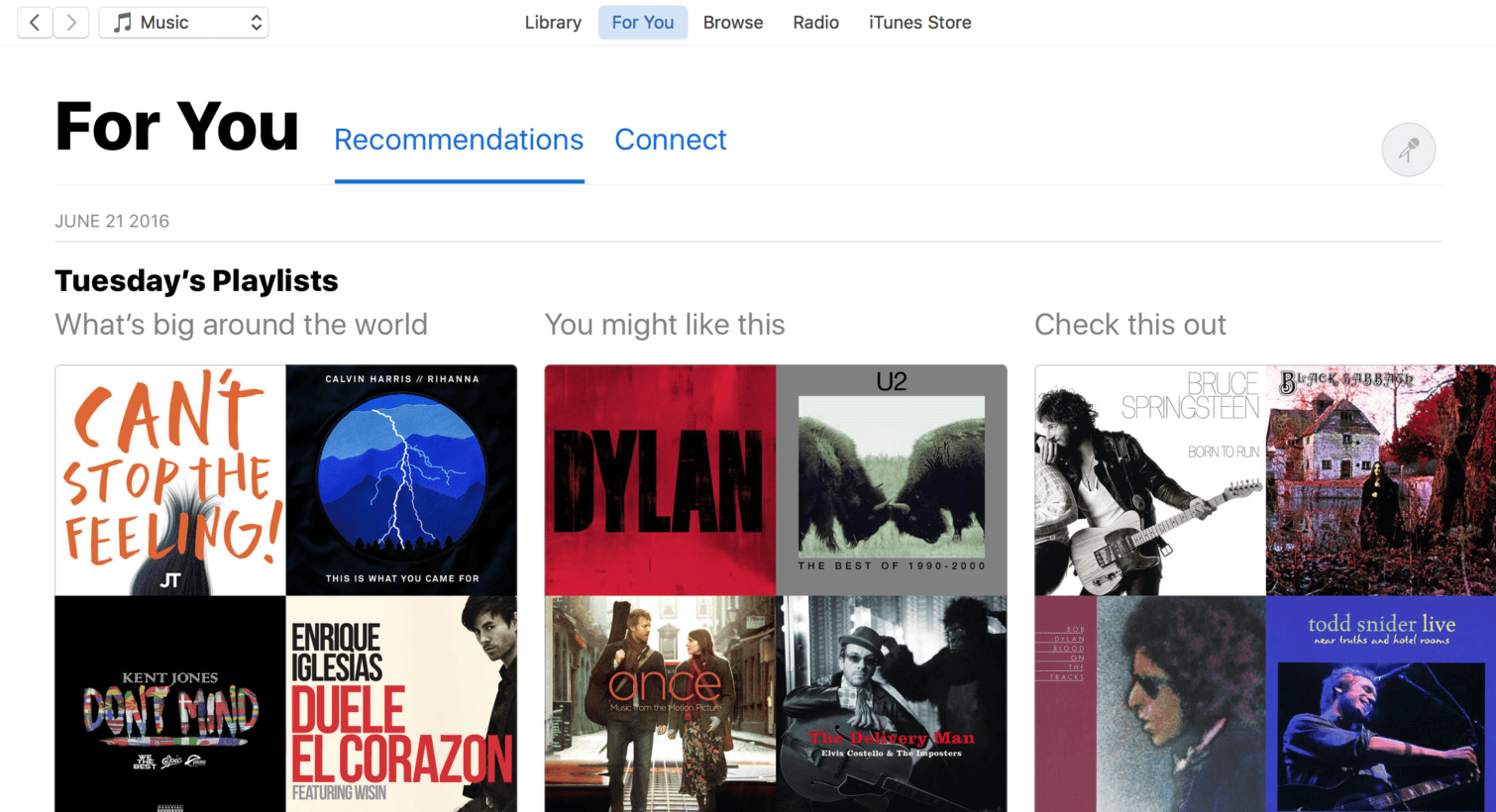
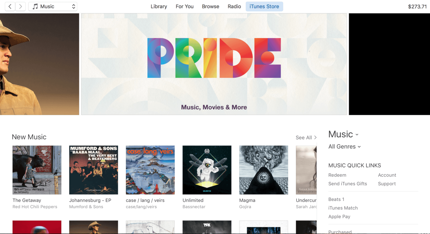
iTunes has a new look, focussed on Apple Music. The ‘For You’ section now lets you know why music was suggested (maybe you’ve been listening to a lot of John Legend lately, I don’t know). ‘Browse’ offers curation from Apple’s team of Apple Music editors, while ‘Radio’ makes Beats1 and other stations more prominent.

Using macOS Sierra
I’ll be quite upfront and say that Sierra as I tested it is still very beta. Apple Watch authentication, Apple Pay and Universal Clipboard aren’t quite ready for proper testing, so we won’t be talking about them in-use today.
The real winner in Sierra, to my mind, is iCloud. I know much of the sensationalism will involve Siri, but I’m going a different route.
For those who bounce between devices — and that’s all of us — having your files synced across all of your devices with zero effort is just plain sexy (yes, I called file sync and iCloud sexy; send help).
Case in point: I have a MacBook Pro that’s typically on my desk, and a MacBook I travel with. There have been several times I’ve written something on or saved a screenshot to my Pro, then forgot to add it to iCloud so I could access it on the road.
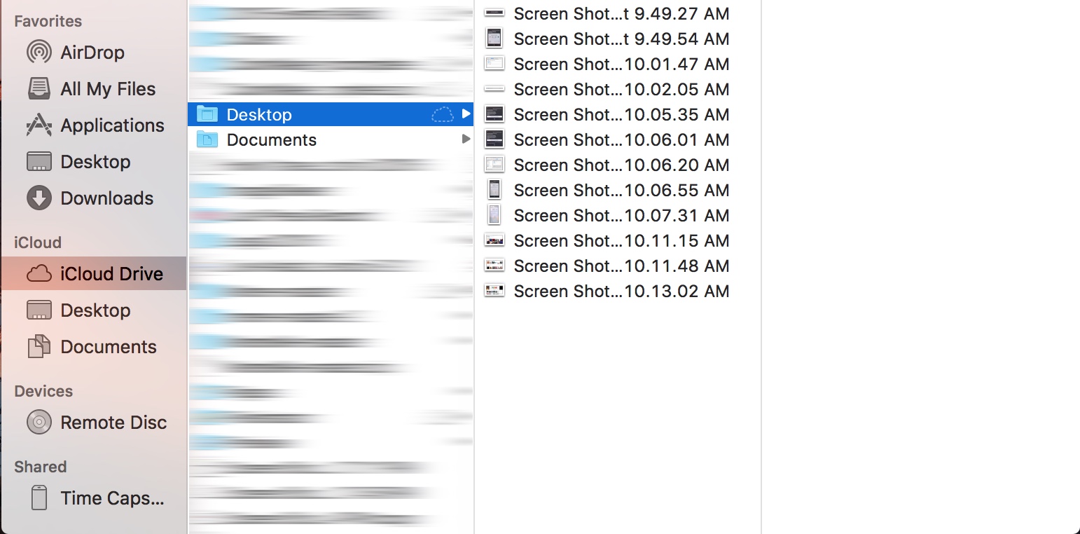
In syncing my files automatically, I never have to worry about that. I can just work and not have to think about which device I’m on, or if I saved something to multiple spots. That those files are also available on iCloud Drive on my iPhone or iPad is icing on the cake. It’s subtly brilliant.
Siri is very vanilla. Her main purpose seems to be ease of use; it’s easier to bark a command at Siri then open up Safari and do a search, or try to dig through Spotlight.
Beyond simple search, Siri is contextually aware if you ask her to be by adding cards to your Today view. I can’t consider a reason to have that feature beyond sports scores (and maybe stocks?), but it’s handy.
By default, Siri is available on the dock or menu bar, and can be removed from the dock if you like. Really, accessing her via the menu bar feels far more intuitive than the dock anyway.
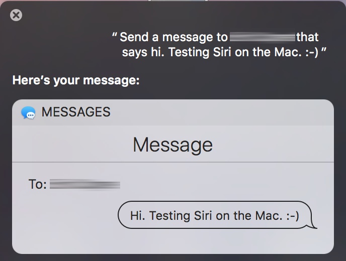
One of the nicer features of Siri is app launching and her ability to dig through System Preferences for you. Sending messages is also cool, but best for starting conversations.
Tabs is really nice for full-screen apps. I like it for side-by-side views in Maps when planning trips; it’s great for finding locations and transit routes in different views when planning trips and meetings. That’s just my workflow, of course.
Similarly, it’ll be really good for third-party apps. If I could use tabs in Tweetbot rather than columns, I’d likely use lists a lot more frequently.
iTunes and Apple Music is snappier looking, and a bit smarter about telling me how it arrived at conclusions. I now have a better idea as to why it’s feeding me some recommendations, which quietly encourages me to open myself up to new music.
My issue with the new look is that it hasn’t come to the iTunes Store yet. Transitioning from the bold new Apple Music desktop view to iTunes is jarring, and shows how dated iTunes has become.
Picture-in-picture is a great feature, but ultimately an add-on. There’s enough reason to like it, but it’s also something Apple should have done some time ago, and a feature you’ll probably forget about as often as you use it.
Photos hasn’t changed much, but Memories is pretty great. I tend to travel a lot and take a bunch of pictures, and having them corralled into some sort of experience for me is nice.
Memories takes some time to kick in fully, but offered some rough sketches immediately. In about ten seconds after I launched Memories, it gave my a ‘best of’ for the past few months and a look at my trip to Twitter Flight last Fall (for some reason). It wasn’t an immediate ‘wow,’ but it showed me in short order how neat Memories can be.
Editing photos with the new ‘brilliance’ feature is hit-and-miss, but it also depends on what kind of images you capture. It’s a good one for outdoor shots in good lighting it seems (HDR images seem to be the most affected; again, it’s not quite finished so I’ll dive into it more in a full review later this year), but it won’t make every image you snap amazing.
Conclusion
Sierra isn’t groundbreaking, and may not be a release consumers look back on as anything beyond being the first macOS build. Where Yosemite was a turning point, Sierra is silently laying groundwork for a really bright — and maybe bigger — desktop future.
Tabs requires no work from developers. Picture-in-picture is standard, too. Photos, iCloud and Siri — those are all baked in.
They’re also optional. You can disable Siri, and syncing desktop and downloads to iCloud is off by default. Tabs can be sidestepped by opening new windows, too.
Apple has given us a lot of optional goodies, and that may just prove their motive. Use this stuff, don’t use it — Apple doesn’t care to force your hand, but I think your experience will be better if you do.

Also, I can’t be more clear that Apple isn’t using your images for machine learning. I don’t know if Apple’s method of licensing larger image caches for scanning results in better optimization, but I also don’t care. I simply don’t want my images scanned by anyone or anything, and no amount of free storage or clever features will change that. Apple is doing most of what Google Photos does, without being creepy. Bravo.
Sierra isn’t about hitting home runs, or adding the biggest features. It’s more like a proof of concept. Developers have long lamented macOS’ underlying framework for creating apps, AppKit, for needing a Swift (pun!) kick in the pants. With Siri available for the desktop, perhaps change is coming. Now that there’s reason to want more from a familiar face (voice?), maybe Apple is preparing to deliver it. Until now, the only real similarity between iOS and macOS has been that both have apps; with some strong overlapping components, I’m hoping developers get what they deserve.
If Apple gives developers the kind of granular access to create experiences on macOS for Siri that they can within iOS 10, it breathes a bit of life into the platform. Now that we have Siri, let’s do more with it!
I feel similarly about iMessage apps. Apple will let you view much of the cool stuff iMessages can do with Sierra, but you can’t create those experiences. That feels really wrong, and I hope Apple finds a way to bring those apps to iMessage for the desktop as well as mobile in the next macOS build (Monterrey?! Lets go coastal!).

Sierra is a solid update for macOS, even in beta. When stable, it’ll feel seamless. Right now, it’s a really good desktop experience that peers just enough into iOS without relinquishing its desktop soul.
And that’s the dream, isn’t it? Convergence is often tossed around topically, but Windows 10 is proof that desktop and mobile are not the same thing — and we don’t want them to be. With Sierra, Apple is showing us that desktop and mobile can work similarly and cohesively without losing their individuality.
This may even be the most exciting time for Apple’s desktop in recent memory. Not only is the company building on its existing products and services, it has given us powerful new ones (at least for the desktop) we can look forward to seeing more from.
If you don’t believe me, just ask Siri.
Get the TNW newsletter
Get the most important tech news in your inbox each week.
