Charlotte Demonque is the community manager at Fontyou, a Paris-based online co-creation platform dedicated to typography. This post originally appeared on the Fontyou blog, and has been adapted with permission.
Typography, like school friends, has its own language. Talking about kerning with your best typelover can be cool. But if you haven’t learned to speak Typographish in school, a type conversation can easily become mumbo jumbo.
Keep calm, we will answer everyday questions in this article, such as “what is kerning, mother fonter?”. We will also discuss other words ending with “ing”, trying our best to make you understand their meanings.
GLYPH – “ISN’T IT AN EGYPTIAN THING?”
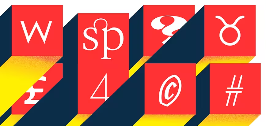
The word “glyph” comes from Greek (and not Egyptian) “gluphê” meaning “carving”. Originally, a glyph was a carving line representing an ornament. Today, it is still a graphic sign and particularly a visual representation of a character, letter, figure, ligature… contained in a font.
A glyph is different from a character. When you type a character on your keyboard, the program commands a code that reaches the original image, the glyph. For example, in the word “file”, the 2 characters “f” and “i” can be only one glyph “fi” (a ligature). “File” can be written with 4 characters but only 3 glyphs!
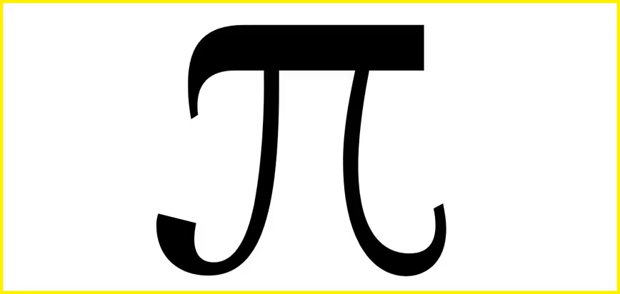
– π, a great (Greek) glyph!
Encoding – “Is it Geeksland right here?”
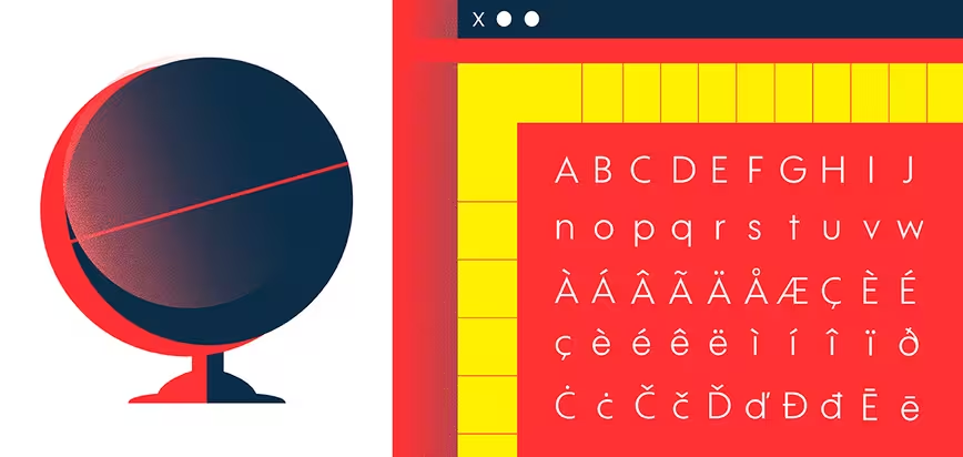
If all code seems too geek for you, then yes, we are kind of in the middle of Geeksland here. Encoding is to inject code into a font to define the character set of this font. The glyph is associated with a code, a sort of link, which only belongs to it. All glyphs are ranged in a table were each glyph is connected with its code.
So when you type a love letter, like “N”, the good glyph (capital N, typed with shift+n) appears thanks to this old geekie encoding! The encoding also represents a standard format of character sets. As with pretty summer clothes, there are different sizes and shapes of encodings (MacOS Roman (256 glyphs), Cyrillic alphabet, Chinese, etc.). Fontyou’s encodings exist in XS, S, M or L!
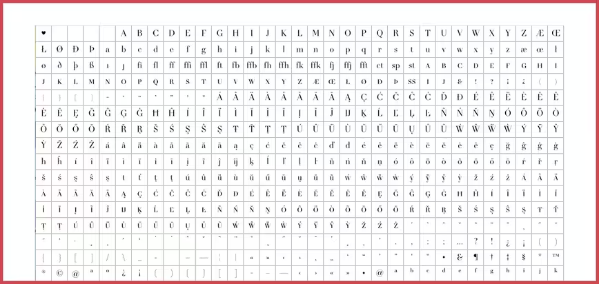
– Encoding table, character set of Telemaque FY (release soon ;)
Hinting – “Something about that movie with Matt Damon?”
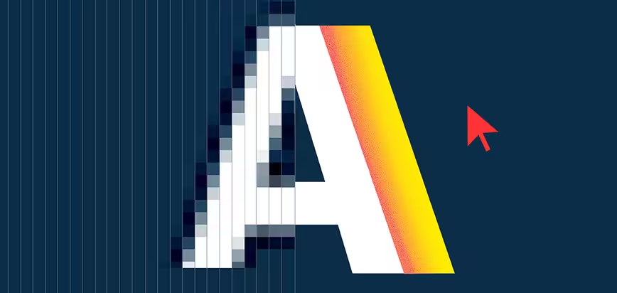
To hint a font is adding instructions to it in order to improve the screen display, particularly in low resolution. Hinting is adapting the glyphs outlines to the pixel grid. Lots of fonts (and good web fonts) are hinted automatically, which is nice because hinting can be very fastidious (and expensive).
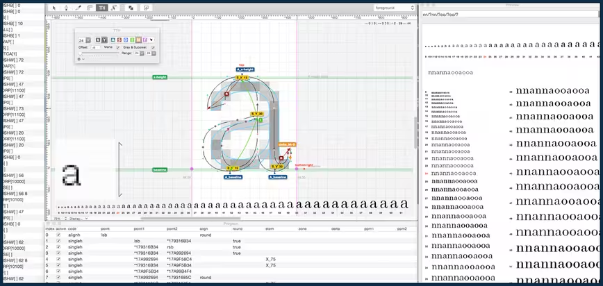
You can hint a font manually on font creation/edition software (where letters are based and guided on a RGB grid), by giving it amazing TrueType instructions (like SANGW[ ] (Set Angle Weight) or MDAP[a] Move Direct Absolute Point). Now you will hinting!
– Work space on TTH (TrueType hinting extension for RoboFont).
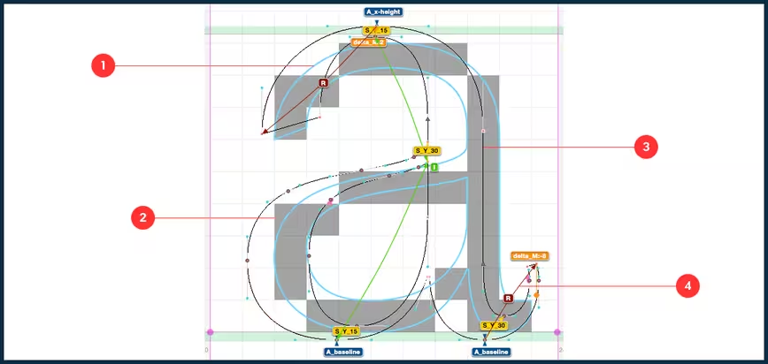
– Hinting an “a” (“Wait, I have to put a small delta here“, Jérémie Hornus).
1) Hinted outline
2) Resulting bitmap
3) Original glyph outline
4) Visual commands (then converted in instructions)
Kerning – “What is kerning, mother fonter?”
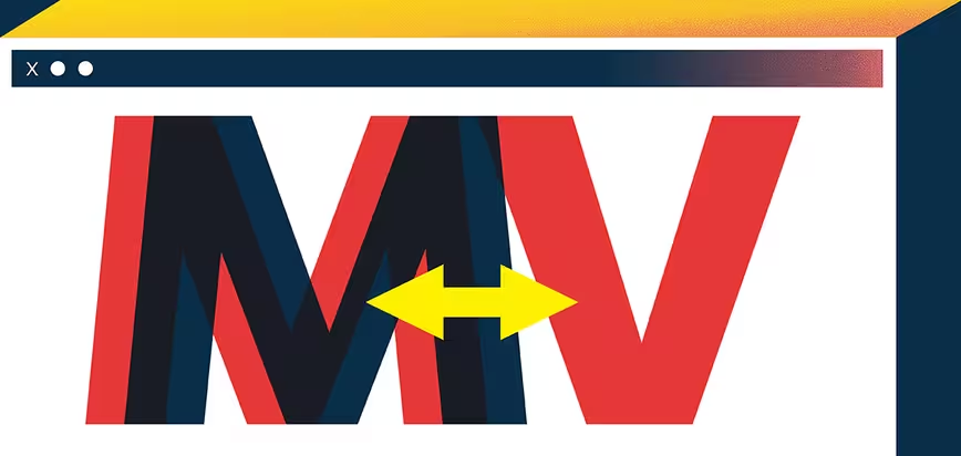
A kerning pair is an adjustment of the white space between two glyphs. To kern is to add kerning pairs to a font in order to make the combinations harmonious and improve the words’ shape. Great glyph relationships always start with a good kerning. Not to be confused with “tracking”, which is the overall adjustment of space between glyphs.
– The initial space between “A” and “V” is particularly wide. We used MetricsMachine to adjust the kerning above.
OPENTYPE – “NOT A CLOSEDFONT, RIGHT?”
Once open a type, Adobe invented PostScript and the Type 1 fonts. The two godmothers who were not invited to the computer language baptism decided to develop their own font format. Apple and Macintosh gave birth to TrueType (.ttf), Type 1 fonts’ nemesis. Life goes on and in 1996, Adobe and Microsoft launched OpenType, an extension of TrueType (.otf file format). OpenType refers to advanced typographic features such as programmatic glyph positioning and substitutions. And they lived happily ever after.
UNICODE – “WHAT IS A FONTING MAGIC PONY DOING HERE?”
Unicode is not a fake horse, quite the opposite. It is the international standard character encoding. Unicode supports characters from all languages in the universe (unlike ASCII which speaks only English). As you know what “encoding” means, you understand that Unicode rules the way characters appear on a computer (text file, graphic document, web page etc.). UTF-8 and UTF-16 are the most usual types of Unicode encodings.
MASTERING – “LIKE MASTERING A MUSIC ALBUM OR WHAT?”
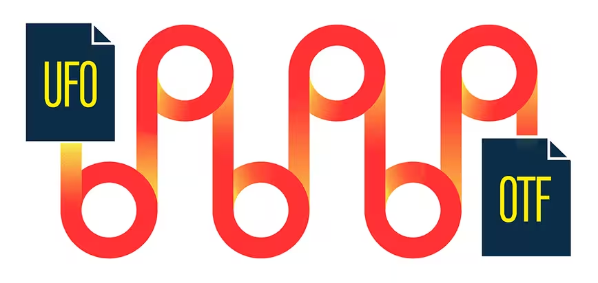
Almost exactly like mastering a music album, yes! The mastering is the last step of the production process, when the final source file that will be used to make a font (or an album) is created. In type design, mastering comes after drawing, spacing and kerning. After the mastering, the source file (UFO, VFB, etc.) is generated as a font.
Web fonts – “If it’s not a font for the web, what is it?”
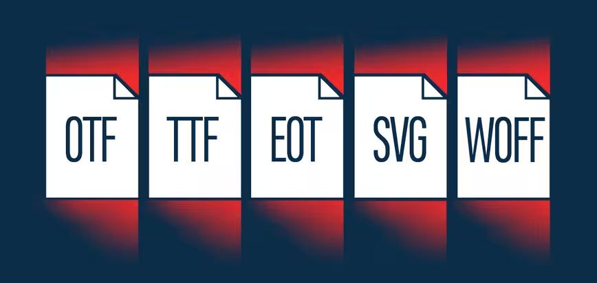
Oh, it is, kind of. Web fonts are fonts formated to be eligible in web browsers. There are default web fonts in every computer system, like Comic Sans MS that you can find on every sarcastic website. To use a font as a web font, you have to purchase it in the right format (.eot, .ttf, .woff, .svg) and with the right license (a desktop license is not enough).
You can also download free web fonts (like in Google Fonts) or convert your font to generate web fonts (like in Font Squirrel) if your license allows it. Web fonts require legibility, flexibility, diversity, efficiency and compatibility to be good web fonts. Web fonts are integrated in a CSS style and linked to HTML, that’s why we call them the “developers’ darlings”.
Some of you may still ask themselves typocritic questions. Even after reading and highlighting (neon yellow) dozens of pages and articles to write this lexicon, I still can don’t ‘get’ everything on the topics above. But isn’t typography just a big and beautiful mystery? For those who wonder what a silly person is doing in the type vocabulary, a dingbat is an ornament or illustrative letter in a font. And if you like to know more about type jargon, just tell us and we will try to tell you!
Cute and magic Illustrations by Diane Pellotieri.
Read Next: The 10 commandments of typography
Get the TNW newsletter
Get the most important tech news in your inbox each week.
