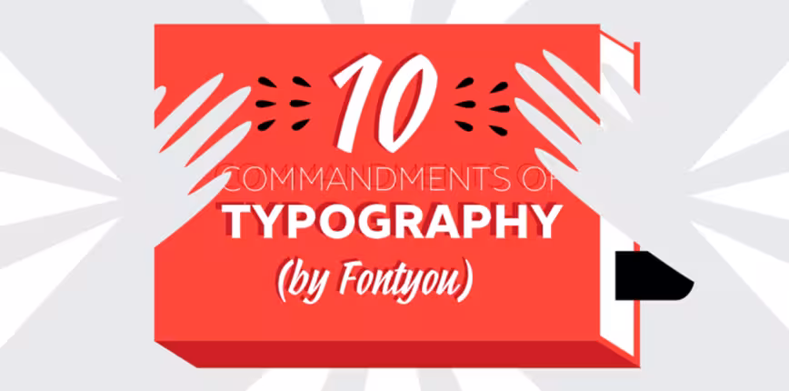
Valentine Proust is Creative Director at Fontyou, a Paris-based online co-creation platform dedicated to typography. This post originally appeared on the Fontyou blog, and has been adapted with permission.
With millions of beautiful typefaces scattering the Web, we felt it was time to lay down the rules on what makes typography great, and how to use them effectively. From graphic design pros to new creatives, here are our 10 commandments for making the best out of typography.
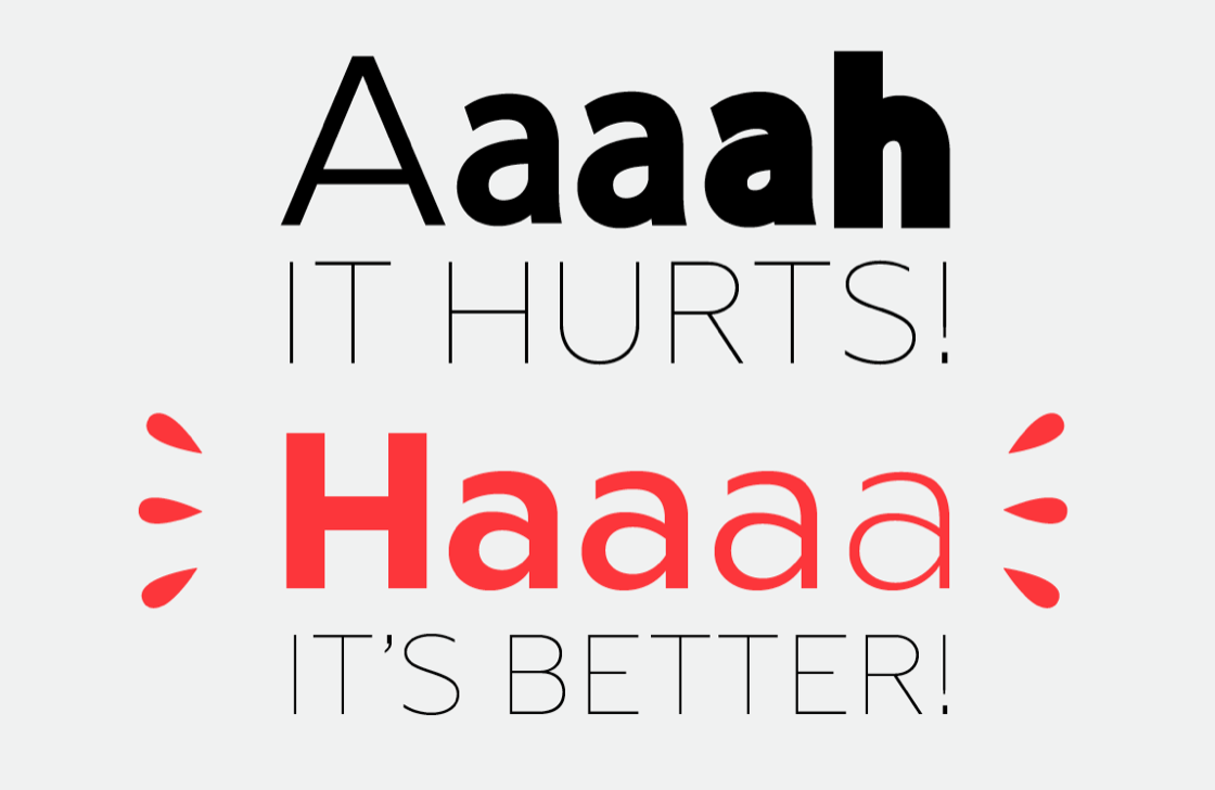
1. You shall not deform
There are so many font families with several weights and styles, so why do some of you insist on bolding manually?

The 💜 of EU tech
The latest rumblings from the EU tech scene, a story from our wise ol' founder Boris, and some questionable AI art. It's free, every week, in your inbox. Sign up now!
If you need something bold or light, choose a font with several weight. Please don’t just add an outline; although this is an easy way to make an existing font bold, you stand the 99 percent chance of damaging the letter design, be it in its counter forms, serifs, endings, or otherwise.
The same rule goes for widths. Some designers will change a font’s width manually to save some space. Instead of deforming the typeface, select something that is already condensed or ultra condensed.

If you didn’t know, a real small cap has a specific design, it’s not only an uppercase which have been reduced. If you shrink an uppercase to fit with the x-height, you’ll damage contrasts, so choose a font with small caps.
2. No more than two fonts you shall combine
Ideally, combine two fonts, (okay, a maximum of three) and enjoy all their styles and variations to create contrasts.
For example, choose a serif font and a sans serif font and play with weights, italics, small caps etc. Avoid to combine two fonts of the same family, and always remember that contrast is the key.
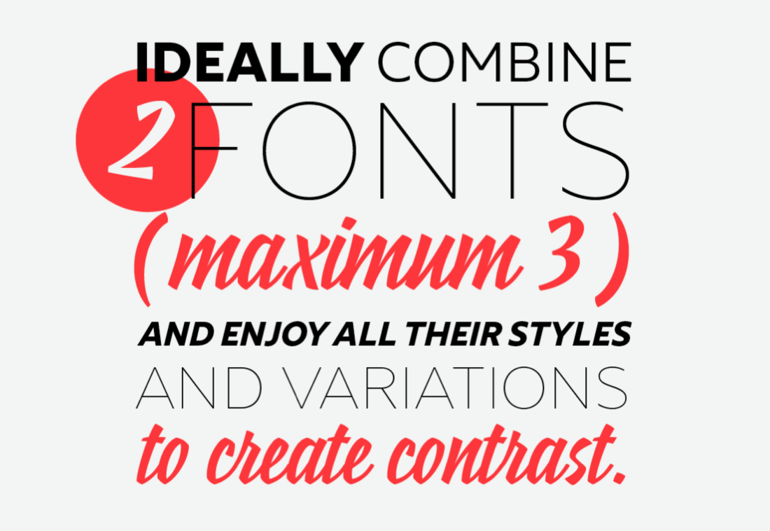
You can go with multiple typefaces if you want, but the more you use, the more likely you can lose uniformity. Also it just starts to look rather messy.
3. Too short or too long lines you shall avoid
The lengths of lines considerably influence the reading and the understanding of the word. Short lines will provoque a jerky feel, while extra long lines will strain your eyes.
Too short:
Too long:
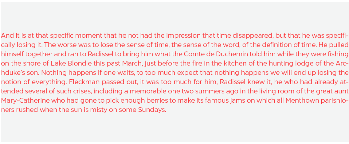
A simple way to calculate the justification is to use Robert Bringhurst’s method, which is to multiply the font size by 30. So if the font size is 10px, use a justification for 300px or about 65 characters per line.
4. Good rules of composition you shall apply
The automatic justification of a text can generate some composition aberrations. Unequal spaces between words, rhythm problems, unbalanced typographic color… blegh!

To avoid a mess, you’ll have to adjust some settings to get a better visuals. Justification is about the letters distribution on the lines. You can change the space between words and between letters for easy reading.
Everyone has a preference on what composition looks best, but ideally you want a good amount of white space to relax the eyes. Line breaks are also essential for a good composition as long as they don’t leave too big of a gap. Lastly, watch out for widows and orphans… at least on your computer monitor.
5. Of fake friends you shall beware
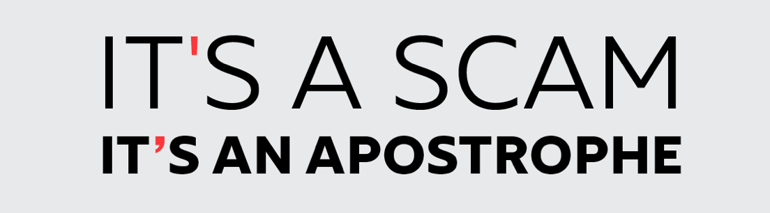
The apostrophe should not be confused with the prime symbol (minute).
The double quote mark should not be confused with the double prime (second).
The ellipsis is not the same as “dot dot dot”!
Check your computer’s keyboard shortcuts to find the easiest way to type them out. Some of these symbols may look the same, but in design, the difference is crucial.
6. Accent marks on uppercases you shall put
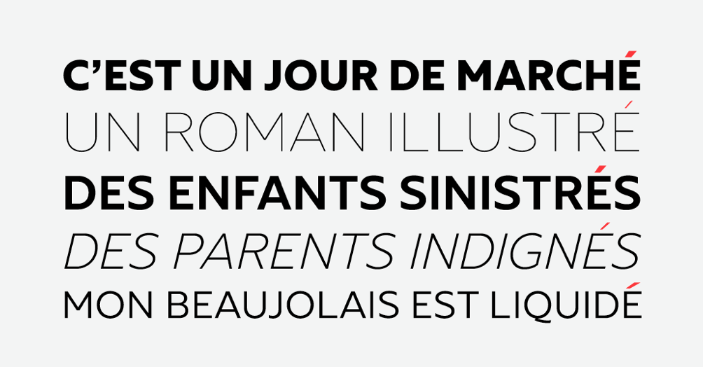
For international languages that contain accent marks, remember to retain them for uppercase letterings. Going without accent marks on uppercase letters is like… well, no accent marks on lowercases. We don’t need a metaphor, we need comprehension!
7. Abbreviations you shall learn
Abbreviation can be practical when it comes to condensing space in graphic designs. Here is a table that shows some English and French practical abbreviations. There are, of course, many others – but these are the ones we personally use often. It helps to stick these abbreviations in place of typing the full world when space is limited.
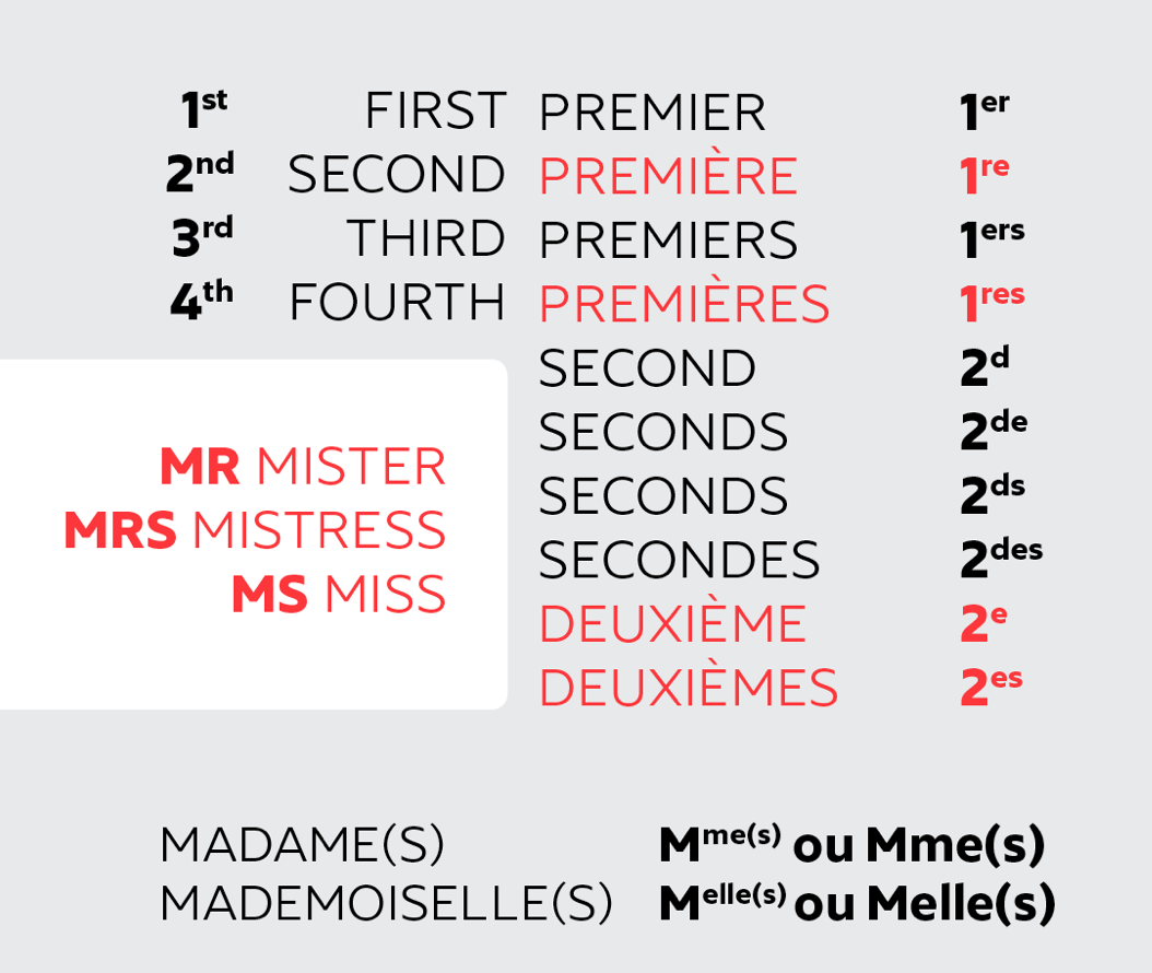
And MM. is not for Mickey Mouse but for Messieurs (and so M. for Monsieur).
8. Spaces you shall respect
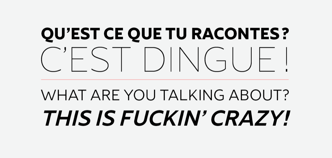
In French, there is a thin space (espace fine insécable) before every punctuation composed of two exclamation marks (i.e., ?!)
In English, there are no spaces before punctuation. Easy!
9. Fonts you shall respect
Fonts are like baby animals, rare pearls and protected natural species – you must take care of them and show some r-e-s-p-e-c-t. There are people who spend their days (and often their nights, weekends, family holidays…) to think, draw and make fonts. Good fonts come at a cost because of the valuable time it took to create them.
Fonts are precious, but not in a Gollum way.
10. These fonts you shall never use!

This is not an order, this is just a best friend’s advice! Seriously, there’s no reason for them, even if you’re being ironic.
Read next: The best typefaces of 2014
Get the TNW newsletter
Get the most important tech news in your inbox each week.