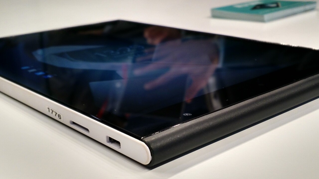
Jolla’s first smartphone was a runaway success for the Finnish company founded by ex-Nokia employees in 2011, so at the end of last year, it decided to capitalize on that momentum and announced its first tablet.
The Jolla Tablet, which runs the same custom SailfishOS as the smartphone, hasn’t gone on sale yet, but it will next month in a number of markets. I spent a little time taking a poke around the device at MWC 2015 this week to see what it had to offer.
Design and hardware
The Jolla Tablet might only cost $249, but it’s not skimping too much on the hardware.
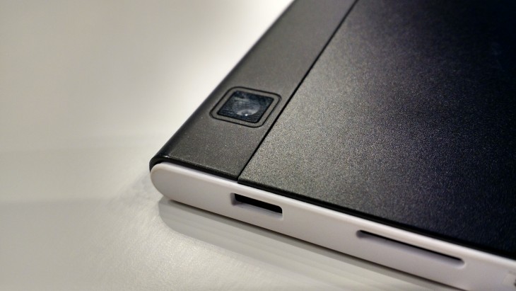
Under-the-hood there’s a 1.8GHz quad-core processor, 5-megapixel camera, 2-megapixel front camera and 2GB of RAM to keep things ticking over nicely. The rear camera is placed along the edge of the device, rather than in the middle.
While not top of the range specs, they’re respectable enough for most tablet use and should provide a capable enough experience. From my testing, everything flowed smoothly and there wasn’t any lag or unresponsiveness in switching apps or swiping at the screen.
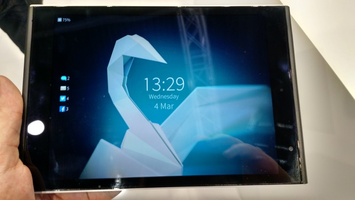
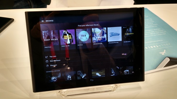
However, the quality of the 7.85-inch, 2,084 x 1,536 pixel display is particularly worth calling out. Even on the show floor under the bright lights of MWC, images were sharp and bright, rather than washed out and hard to see. Obviously, we’ve not had the chance to check it out in direct sunlight, but I’d be expecting good things based on this test.
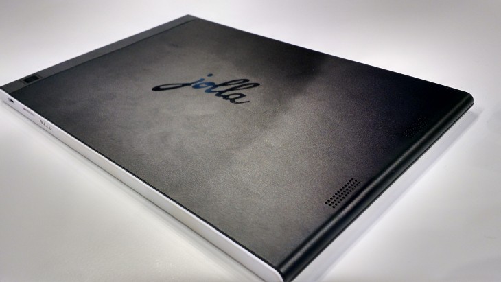
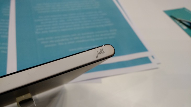
The design of the Jolla Tablet is somehow refreshing. I’m not a huge fan of overly square-edged devices – the new Xperia M4 Aqua, for example, feels a little uncomfortable to me – but the rounded edges of the Jolla Tablet make it easy to hold and the rear cover helps with that too. Both sides of the device are a bit of a fingerprint magnet though.
Officially it measures up at 203 mm x 137 mm x 8.3 mm and weighs 384 grams, making it around 40 – 50 grams heavier than an iPad mini 3, and 8mm thicker. In reality, these aren’t differences that are going to matter all that much.
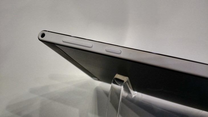
While there’s no hardware controls on the front of the device, you’ll find the volume rocker and power buttons along the top edge, along with a headphone socket.
Software
The unit I used was running a newer version of the Sailfish OS than is currently available for the Jolla smartphone, and with it comes a number of worthwhile improvements.
While it’s Linux-based, but not an Android fork, you won’t be totally lost. You will need to take a bit of time to learn how to get around if you’ve not used it before though.
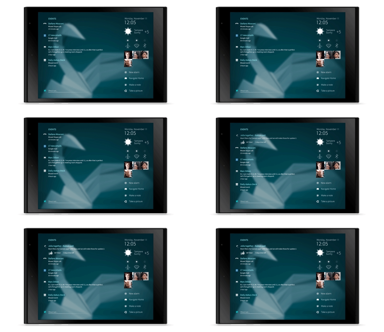
With the first version of the OS, that was a problem, it could be tricky to navigate and harder to discover some features than necessary. Now, following the update, there’s new gesture controls to make it easier to find your way around and between apps.
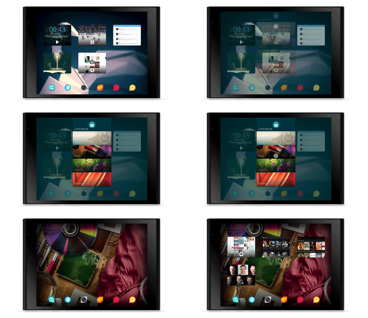
As with other platforms, swiping from the left or right will move you between home screens and your notification panels, while swiping up from the bottom will take you to your list of installed apps, for example. You will need to learn all the new gestures though, as there’s no on screen buttons (or hardware controls) on the front of the device.
Swiping down from the top allows you to put the tablet into different modes, like silent, party, driving, etc.
You can get new apps from the Sailfish store, but can also install Android apps too – where necessary, these get emulated on-screen controls due to the lack of the back button you’d find on a regular Android device.
First impressions
Having only had a short time to play around with the device (and no opportunity to test the speakers, camera etc.) it’s a bit too early to form any final opinions about the capabilities of Jolla’s tablet.
However, with hardware that feels good in the hands and looks a little different than its rivals, if it fares well in a more demanding test it could well be a viable alternative to mainstream Android tablets or iPads, providing you can get used to the OS.
Read next: Jolla is building a secure version of its Sailfish OS as a rival to Android
Get the TNW newsletter
Get the most important tech news in your inbox each week.
