Jolla was founded by a group of ex-Nokia employees who strongly believed that MeeGo deserved a second chance. Two years on, the Finish startup is launching its first smartphone with a new take on the forgotten platform, called Sailfish OS.
I went hands-on with an early version of the Jolla smartphone in June and came away feeling curious, but unconvinced by the execution. Today, I was able to examine a final build of the device and see if my earlier reservations were unfounded. Can a reinvigorated MeeGo compete with Windows Phone, Firefox OS and Tizen for third place in the smartphone market?
Design
The Jolla smartphone is dense, compact and regimented. From afar, the two-part design gives the device a thick, slightly bulbous look, but it’s actually less than 10mm thick and in the hand, it feels surprisingly slim.
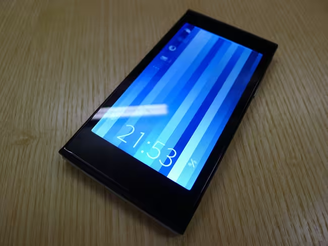
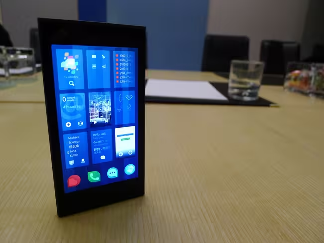
The 4.5-inch display is the focal point of the handet. Aside from the power button and volume rocker, the device is devoid of any hardware buttons. This gives the front of the Jolla smartphone a clean, minimalist look whenever you lay it down on a flat surface.
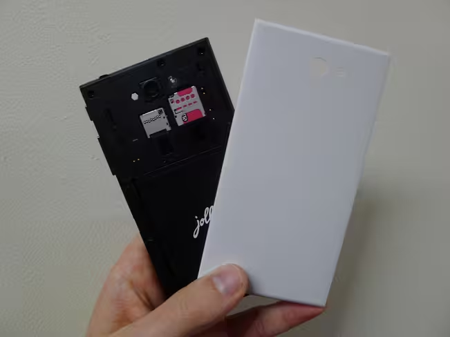
As soon as you turn the device over, the scrappy startup’s design aspirations are apparent. Every Jolla smartphone comes in a reserved matte black on the front, but the back cover is available in a range of colors including red, teal and navy blue. These two halves were designed specifically to contrast with one another: The front panel is flat along the top but rounded on the sides, while the back is precisely the opposite. They clash in a way that we haven’t seen in a smartphone before: It’s an unfamiliar look, but one that slowly grew on me.
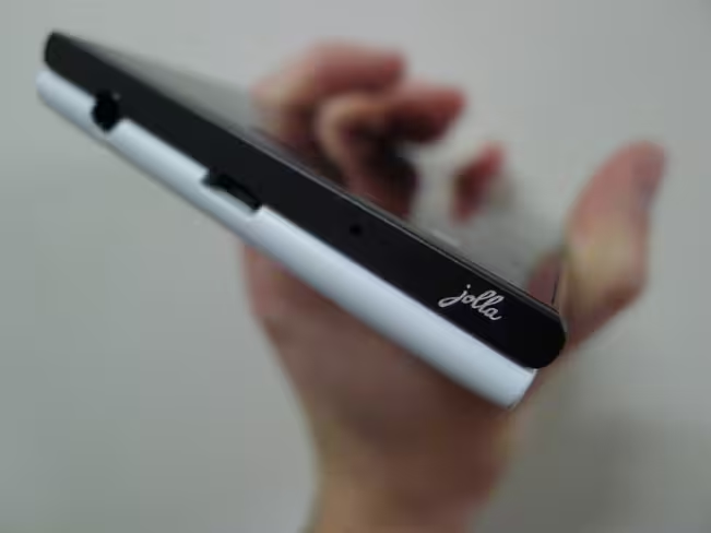
Two small speaker grilles lie on the bottom of the handset, alongside a standard headphone jack and microUSB port up top. Jolla has etched its rather beautiful logo on the top of the device and on the standard rear back covers, but otherwise there is very little branding or blemishes on the device.
Jolla has opted for a brave, memorable design here, but it’s not the most attractive or premium smartphone on the market. The first Sailfish OS smartphone is certainly distinct and different, but that doesn’t mean it’s any better than what’s already out there.
The ‘Other Half’
Jolla is pushing the idea of a smartphone formed from two different halves. Each removable back cover is light and flimsy, but through an NFC chip it can be used to activate specific content normally dormant on the device or the Jolla Store. The company’s own offerings tweak the look of the UI to match the color of the cover, creating a harmonious design between software and hardware.
The hope is that third-party brands will create their own covers, which consumers can then buy to unlock new content from within the Jolla store, including apps, wallpapers, fonts and sounds. Barcelona Football Club, for example, could offer a background image of the team and a well-known chant or anthem as the ringtone.
The startup also hinted that these covers could be used to add new hardware features. Throughout my fairly brief testing period, I was able to use a few of Jolla’s self-produced covers, but the scope and ambition of the concept is evident. These covers are yet to be used in a truly meaningful way, but that could change once third-parties start experimenting with the device.
Software
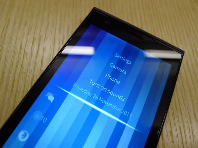
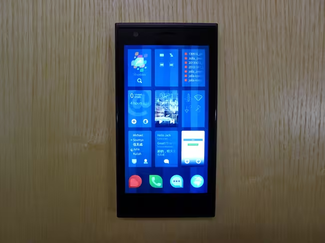
For the most part, the design of Sailfish OS remains unchanged since I last saw the Jolla smartphone. The power button or a concise double-tap on the screen wakes the device, revealing a lock screen with the time, your recent notifications, connectivity and sound profile.
None of these icons are actionable though. It’s a static visualization, so to find any of your emails, text messages or Facebook alerts, you’ll need to dig a little deeper into the UI of the Jolla smartphone. Pulling down from the top of the screen reveals a pulley menu with quick actions based on where you are within Sailfish OS. For the lock screen, this includes quick access to the camera, the contacts in your address book and system settings.
Sailfish OS is constructed using a vertical UI though, rather than the horizontal design that most of us have grown accustomed to on Android and iOS. It’s no less intuitive than these platforms, but it’s certainly different. After waking the device, a swipe up reveals the home screen with an app dock and app switcher.
It’s a three-by-three grid that offers a small preview of the nine most recently used apps. An immediate concern is that as soon as you boot a tenth app, the ninth will immediately disappear from the switcher. Most days, I’m rarely using more than nine apps simultaneously, but the cap is certainly notable. There is a workaround though: When you long-press to close a piece of software, the device will show all of the apps that are currently running on the device.
Tapping on the thumbnail once will launch the app, but with a long-press you can also slide to the left or right to access one of two shortcuts. The address book app, for instance, lets you jump to either the dialer or your list of contacts.
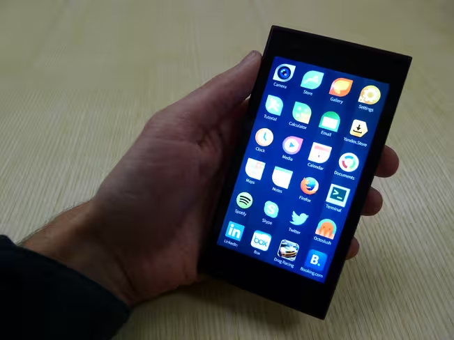
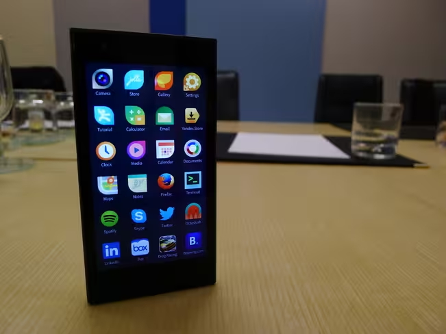
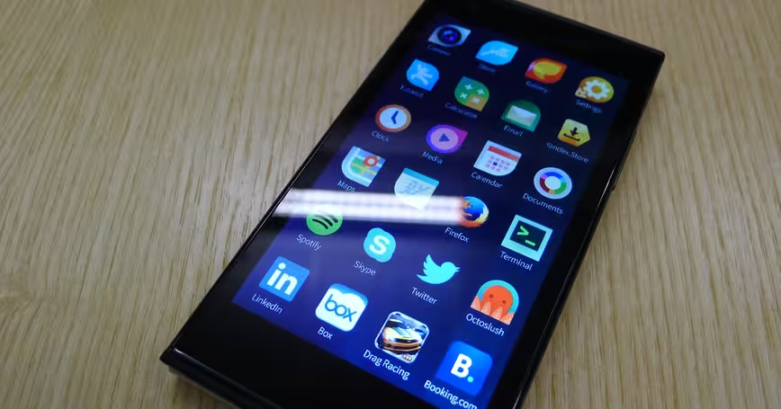
Swiping up from the home screen reveals the app drawer. Immediately, you’re hit by the quality of the app icons. They’re bright and beautiful, with an unusual cuboid shape that Jolla has rounded off at two opposing corners. Hands down, I think these designs are better than the stock offerings on iOS and Android.
Unfortunately, the handset that I used was plagued with technical issues. The Jolla team warned us of a few known bugs going in, but there were a number of unforeseen problems. Apps would crash, stutter or launch randomly, and many of the gestures didn’t behave as expected. Even if a small percentage of these problems make their way into the retail version, I suspect Jolla’s customer support team is going to have their work cut out.
Notification Center
Unlike iOS and Android, you can swipe up from the bottom of the display to access the Sailfish OS notification center, known as Events. Tapping on the alert will send you to the app in question, while a long-press will dismiss it from your list. Deleting notifications in this fashion is a little slow, especially in comparison to the fantastic swipe-to-dismiss gestures found in Android.
Camera
Android smartphones have a reputation for sub-par cameras, so Jolla had the opportunity to differentiate with its first smartphone.
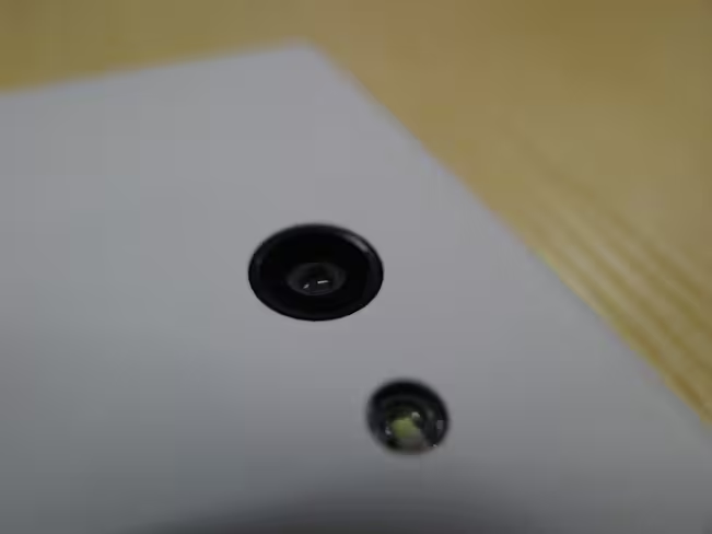
The handset is equipped with an 8-megapixel rear-facing camera, but sadly it produces some pretty underwhelming images. Files are recorded with an unacceptable amount of noise, even in optimal lighting conditions.
The camera app is fairly intuitive, with limited white balance, focusing and flash options from a pull-down at the top of the screen. Experimenting with these tools can offer some small improvements, but it’s not enough to rectify the underlying problems.
Apps
Jolla offers some basic Sailfish OS apps covering email, maps, notes, calendar appointments and more. The Jolla Store is almost empty though, with few high-profile names aside from Wikipedia.
The saviour is Android. Once you’ve downloaded the relevant app from Jolla’s marketplace, the Yandex Store will be added to the device and you can download a number of apps that support Android 4.2. These reside in the app drawer and are integrated with the home screen app switcher, just like any other piece of Sailfish OS software.
Android and Sailfish OS have a different design language, so using apps conceived for Google’s mobile operating system can be pretty jarring sometimes. Nevertheless, it’s a welcome solution for the app support problem.
BlackBerry and Windows Phone have struggled to boost their native app offerings, however if Jolla can keep up with Google’s firmware updates, it might be able to avoid that problem entirely. Unlike BlackBerry 10, Android feels like an embedded part of the Sailfish OS experience. Access to the Google Play store would have been ideal, but the Yandex Store is a serviceable alternative.
The bottom line
The Jolla smartphone is certainly unique. The styling of the hardware is unusual and the gesture-based Sailfish OS is intriguing. I enjoyed my time with the device, but I’m still not sure who this handset is for.
If you’re not happy with iOS, Android or Windows Phone, the Jolla smartphone is worth looking at. But how many people feel that way? Power users and tech aficionados perhaps, but my gut feeling is that most consumers will be satisfied with one of those three platforms.
It’s too early to make a final judgement on the Jolla smartphone, but it surprised me in ways that I didn’t expect. A flawed, but unashamedly atypical device.
Get the TNW newsletter
Get the most important tech news in your inbox each week.
