Now that the world has had more than a survivable dose of ‘Metro,’ Microsoft’s new pan-empire design initiative, people outside the company are starting to jump onto the firm’s bandwagon.
One Chris Preston put together what might be our favorite piece fan fiction that we have seen in recent months. Preston took Steam, the popular games client, and ran it through the mechanics of Metro. What came out the other end is simply stunning. In the words of Paul Thurrott, concerning your coming reaction to the pics, “[G]et a napkin first. There’s going to be drool.” You can view the original forum posting of the images here.
Here is what you need to look for: live tiles, swipe-oriented layouts, the user tile at the top right as with the rest of Windows 8, and the bottom toolbar, as is standard across the operating system. Now, the images:
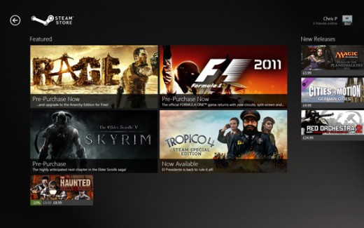

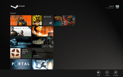
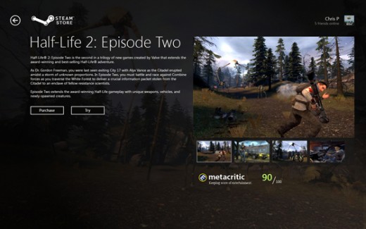
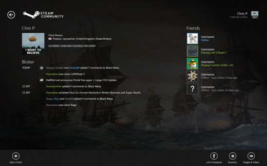
Preston, a self-described enthusiast of “UI and UX,” calls the mockups “very early.” We would love to see what he can do with more time.
In case you are a bit confused, Metro is the name of Microsoft’s design strategy that has compile as a companion to its move into touch. In other worse, as the standard Windows user interface is antithetical to touch, the company has been forced to build a brand new design scheme to handle fingers. Metro can now be found in Xbox, Windows Phone, Windows, Office, and potentially Windows Server.
For our take on Metro, check out our early review of Windows 8 which includes hands-on notes.
Get the TNW newsletter
Get the most important tech news in your inbox each week.


