Yesterday at a private, all-day press event, Microsoft laid bare much of Windows 8. TNW was in attendance, and along with every other invited publication was lent a tablet running a developer preview of Windows 8. Though we have had scant time to test the device, our experiences thus far have allowed us to form some rather solid opinions as to what Microsoft is building, and whether the market will share the company’s enthusiasm for what it has created.
This post has two parts, the first of which is a quick hands-on discussion of what Windows 8 feels like in practice. For this section we will rely on only our experiences with the loaned tablet. We again want to iterate that we have had very little time to test thus far. Also, we are not allowed, at the time of posting, to share who made the device, what its specifications are, and so forth. We apologize, but the non-disclosure agreement that we signed is very strict. As the week continues, expect much more. The second section of this entry will be something of an information dump. TNW managed to type some 5,000 words of notes during the briefing, and while we are not going to bring you more than you might want, our goal is to provide you with the data that you need now.
Let’s get our hands dirty.
Hands on with Windows 8
A few caveats, to start. The copy of Windows 8 that is running on our slate is rather limited. Certain features are simply missing. Microsoft has disabled them. The device is not designed for general consumption, and thus its features are very specific. Much of what we were shown is not present on the actual computer that we have. We cannot say more than that at this time. In following coverage, we will will explain further, and provide a more detailed exegesis on the hardware itself.
The slate contains a few pre-built, touch-centric applications, put together by Microsoft interns we were informed. The device is more designed to demonstrate what Windows 8 will feel like, than to provide a full look at what the company is planning. However, we could say that the hardware is not under-powered, but that is all.
Moving to Windows 8, the first thing that you need to know is that it is now an operating system with two faces. It is certainly not Windows 7 with a touch layer simply tacked on top. The touch interface, which you have seen pictures of, is now a core element of Windows, and is on equal footing with the more classic desktop. It is important to note that Microsoft began to plan Windows 8 before Windows 7 shipped, putting the genesis of the coming version before the release of the iPad; Windows 8 is not a harried response to the iPad in any way, having been born before Apple’s slate was released.
When running Windows 8, a user will immediately notice that it runs very quickly, and with little noticeable lag. The lack of any delay is very pleasant. After all, one of the points of complaint that has plagued most tablets of the Android and WebOS stripe is that they are too slow. Windows 8, at least on our device, is not sluggish in the slightest. This would be the moment to discuss the details of the hardware in question, but as stated, we cannot.
The desktop, as you know it, is now one of two ways to view Windows. That might be confusing, as the desktop dates back to the first generation of the operating system. Let us explain. The touch interface is very easy to conceptualize. Have you used a Windows Phone? If so, it is a very similar experience, but with an expanded feature set. If you can recall, Microsoft banned its partners from building Windows Phone slates. There was general protest. Why? Because many consumers wanted one. The trick was on the market, however, as Microsoft has essentially made an integrated version of the Windows Phone ‘metro-style’ interface, and built it into Windows. Windows 8 tablets are Windows Phone slates, but in a better way than we perhaps expected. As Microsoft built the touch user interface for tablets, and touchscreens in general, it is better suited to slates than a strict port of Windows Phone could have been.
If you wanted the most simple way of explaining Windows 8 in practice, this is how I would describe it: Take a clean copy of Windows 7, update it as a few years of time will always allow, introduce certain touch features to its core experience, and then integrate an expanded Windows Phone interface that is built to interface with the desktop environment, and other Microsoft products. On paper it is a compelling combination, and in its current forms it is functional enough. We are of course working with very early builds, but there is potential in Microsoft’s vision.
We are going to delve into a great host of specific features and capabilities of Windows 8 below, but want to highlight here our two favorite, thus far, Windows 8 features that we have tested, the first of which is charms. Charms are new feature in Windows 8, and are one that most users won’t recognize as such as they are tools that fit in nicely, and hardly protrude further. Based on a small, sidebar strip on the right side of the screen, are the five charms: Search, Share, Start, Devices, and Settings. The are summoned by a slow swipe of the finger from the right edge of the device screen in towards the middle. They look like this:
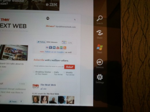
Each charm impacts every application. The search charm allows for file searching, web crawling, as well as finding things inside of installed applications. Share is a functionality that allows content to be shared via any application that is built to support the APIs that are provided. The goal of charms is to allow applications to access to a unified, and simple to understand, set of capabilities. This reduces user confusion, and allows for clean experience. We will talk more about charms below.
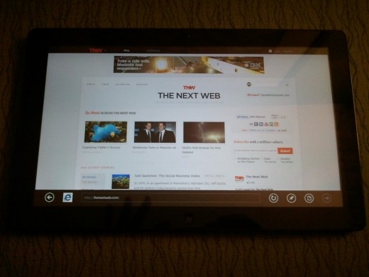
Our second favorite Windows 8 element is Internet Explorer. The touch variant of Internet Explorer 10, which will likely be tied to Windows 8, sports a user interface that is very suited for finger-based interaction. As in Windows Phone (the comparison will continue), the URL bar is on the bottom of the screen, making it easier to reach. Here is why the touch edition of Internet Explorer 10 is better than expected: Microsoft removed the chrome. By that we mean that when on a web page, there is no ‘application’ surrounding it; the browser itself disappears. This helps smaller screens, on tablets for example, to be effectively larger. Swipe up or down from the bottom or top, and the URL bar will appear. It’s a simple way to make the experience, in Microsoft’s terminology, ‘immersive.’ Here it is with the URL bar exposed:
To sum before we go into detail, Windows 8 is a promising fusion of metro-style touch applications, and the Windows experience that Windows 7 made popular once again. It’s certainly audacious, to add a fully new core-experience to Windows, but if Microsoft does manage to execute, it may have something special on its hands. However, more testing, with fuller builds, is required before we can predict further. Now, to the specifics.
The Past and New Beginnings
To begin the day of Windows 8 news, Microsoft turned to Windows 7. It touted, as it has for the past half year, how well the current edition of Windows is selling. To date, nearly 450 million Windows 7 licenses have been shifted. The company also pointed out that Windows 7 now beats Windows XP in terms of usage. Vista never even got close. Perhaps most importantly, it reported that some 542 million people use Windows Live services each month, something that we will return to.
Throat clearing aside, Windows 8 is a, to use Microsoft’s words, a ‘re-imagining’ of the Windows brand. The idea here is that from ‘the chipset to the experiences,’ Windows 8 is new. Chief in this is the fact that Windows 8 will function with ARM processors, along with Intel chips, and will support system-on-a-chip machines. This effectively opens the operating system to myriad new form factors, a crucial fact as the software is designed to work as well with your fingers as with a mouse and keyboard, in most circumstances.
Principle in the Microsoft ethic behind Windows 8 is that users want to touch their screens. The company joked that if you go to a computer store, and look at the screens of the laptops on display, many will have fingers smudges from people who assumed that they were touch-enabled. Windows 8 is in a response to this market demand.
Touch It
Windows 8 has a new splash screen that is very similar to the Windows Phone touch screen. It displays, upon the computer being booted or awoken, unread chats, emails, system notifications and the like. It’s a very simple way to find out where you stand, before you log in. Again, this draws on previous Microsoft design projects.
A simple swipe upwards leads a user to a log in screen. You can use a password, or choose to use something new entitled ‘picture password.’ Picture password allows a user to employ an image of their choosing, and a few per-recorded gestures in place of a written password. I could use a picture of my brother for example, and have my motions be to touch his eyes, and then trace his smile. That would unlock my computer. It’s a bit gimmicky, but it is a fun way to interact with your machine.
Upon passing security, the user is presented with the touch interface. This is exactly what you have seen before. Again, it is fast. Swiping back and forth is free of delay, and can almost happen too swiftly if one’s finger is enthusiastic. Not present in our test device, but coming in later builds, is the ability to zoom out completely, and see all of the live tiles (again, they are akin to what you already know from Windows Phone). As you zoom, they become simplified, allowing for entire groups to be moved around. Your games section, for example could be moved left to make it closer to the first section that you see while at a normal resolution.
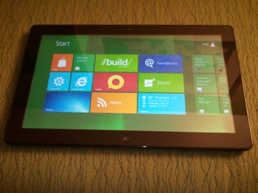
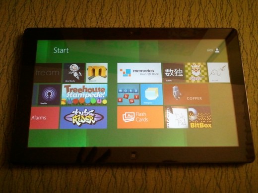
Microsoft repeatedly noted that it is trying to reduce ‘modes’ in Windows 8. More simply, it is attempting to reduce the number of steps required for any action. If a tile must be edited, instead of pressing on it for a set number of seconds, and then entering an interface that is required for changes to be made, short motions will be employed, and the user stays inside the normal bounds of the software. The goal, as the company stated several times, is ‘fluidity.’
Xbox Cometh
This is a very short note: Microsoft did flash on screen, briefly, and almost by accident, a tile that was clearly for Xbox LIVE. It was a dead ringer to what Windows Phone contains. To put it simply: Xbox integration is coming to Windows. Now you know. We are 95% sure about this. We will confirm it as soon as we can.
Metro-Style Applications
This is a phrase that you will tire of over the next year: Metro-Style applications. It’s a Microsoft creation, which explains its awkwardness. What it means is quite simple: The metro design aesthetic that the company has imbued into Windows Phone, Xbox, and now Windows, is coming to the applications that Windows 8 will run. This means that the design notes are a complete go, and that through charms and contracts, more on that in a moment, they will be consistent.
Charms. We already told you what they did, but they bring up another important topic: contracts. Contracts are a method by which applications which are not specifically designed to work together can interface. Through a collection of APIs, developers can build sections of their applications to support integration with other applications that have the same ‘couples.’ We will learn more as the week goes on how many different contracts there are, and what their uses will be, but the picture is as follows: Windows 8 will contain a system by which applications will interact with the operating system in a formalized manner, and have the potential to work together sans designed collaboration. That’s quite bombastic, but it has the potential to make apps more useful, provided developer uptake is effective.
Our last note on apps is that the loss of chrome, the removal of the Windows interface that we previously noted, is pervasive. When running a metro-style application, the operating system is gone, until you call it back. This is probably an improvement.
Windows Live: It’s Everywhere
Remember those more than 500 million people who use Windows Live services every month? Windows 8 is built to support them A simple logging into one’s Live account will allow for every data that is linked to that one master account to flow into a Windows 8 device.
This limits the need for importing and updating data; as it is in the cloud, so it shall be on your device.
A user can thus interact with their images, chat across a number of networks, draw in information from any social destination, and so forth, with one log in. Of course, that is provided that they have a fleshed-out Windows Live account, which is a larger detail that Microsoft perhaps yet knows.
Calendars, for example, are automatically linked, and displayed, in multi-color harmony. Whatever you find worthwhile in Live will be more than alive on Windows 8. It’s designed to play nice with all of Live, and keep your device up to date without you having to lift a finger. The device loaned contains nearly none of this, so we cannot comment directly at this time from a usage perspective. Later in the week, we hope to have more information. For now, Live is an integral part of the Windows 8 experience, but it is likely avoidable if a user wished to.
And obviously, Microsoft has built metro-style applications for mail, and all other Live web apps, making them fit in nicely with the rest of the Windows 8 touch interface.
Developer Odds and Ends
If you are not a developer, feel free to skip this section.
Microsoft has put together what it calls a ‘new application model’ for Windows 8. It has two main goals: To allow users to feel safe in acquiring, and trying applications, and to ensure the ‘fluidity of the experience.’
To meet those ideals, the company has built a new API surface called WinRT, which stands for Windows Run Time. The APIs that comprise WinRT focus on ‘communication and data, graphics and media, and devices and printing.’ This platform can be accessed writing in a number of languages, including, as we all know, HTML5 and Javascript. Microsoft commented that it does not want for developers to have to learn new things, or read a ‘big fat book,’ to code for Windows 8.
The company also promised an ‘awesome set of tools’ for each API, perhaps in an attempt to head off any complaints that it is asking people to develop in a new way. All of this comes together in a hierarchical way, with metro-style applications sitting on top of the supported languages, which rest on the WinRT APIs, all of which comprise the new application model
The Windows Store
As is already known, Windows 8 will contain an application store. This means that developers will have easy access to the Windows 8 userbase. That is more important than it sounds, as there will be hundreds of millions of users of Windows 8, even if it flops; people buying a new computer in 2013, for example, will buy one running Windows 8.
Upload to the store begins, fittingly, in Visual Studio.
The store is very metro, shockingly, with tiles that feature applications across a variety of genres. The store design is rather normal, and deviates little from what is currently offered on Windows Phone and by Zune.
Perhaps more importantly is that the company is building a rather complex, in the best possible sense, application dashboard for developers to use to track the success (or lack thereof) of their applications in the store. A large number of reports, from usage, to comparison to similar applications, to sales numbers, to trial downloads, will all be tabulated and displayed. For the data lovers, this will right up your crick.
As a final coda to these two developer sections, Microsoft made the point of stating that it wants developers to ensure that their apps are metro-styled in the design sense. It has systems that assist to that end.
Miscellany
And now, some bits and pieces that we want to mention, but briefly:
- Boot times are in fact faster, that was no gimmick.
- Windows 8 uses less memory than Windows 7. This is crucial for low-cost tablets.
- Microsoft has made several security changes to Windows 8 that build off its strong Windows 7 foundation, making the new operating system likely its safest yet.
- Task Manager has been rehashed, and is now far prettier and useful.
- USB 3.0 is real, and you are going to enjoy its speed.
- Reseting a computer, and refreshing to previous points is now simpler, and faster.
- Hype-V inclusion will be a major business selling point. It could drive enterprise adoption.
Concluding Thoughts
Windows 8 is such a huge topic, that even this 3,000 word monstrosity can’t begin to contain it, especially on the crazed deadline that everyone shown the software is operating under. Consider this an opening salvo.
Our view is this: There is much potential to in Windows 8. Microsoft has not uncovered more than a piece of the map, but there is a path to be found. If you think that Windows 7 is a workable operating system, and that the touch elements that have been detailed thus far look usable, there is a very good chance that Windows 8 will suit you.
But what about that niggling question, ‘what about the iPad?’ To be frank, I will, when they come out, take a Windows 8 slate over the iPad. Why? Because it simply does more. Will it sway iOS fans? No. But for the Windows using world, something good perhaps this way comes.
Now, why aren’t you watching the keynote?
Get the TNW newsletter
Get the most important tech news in your inbox each week.


