Do you know that, “the average open rate for welcome emails is a whopping 50 percent making them 86 percent more effective than email newsletters?”
Every e-commerce retailer sends a welcome email nowadays, and it’s the most popular forms of triggered emails. So, even if you haven’t chalked out your complete email marketing plan yet, chances are, you’re at least sending email to your customer base.
A welcome is the first step towards building a long-term customer relationship. But, just sending a plain welcome email won’t motivate your subscribers to move down the funnel. You need to implement a multi-step strategy like these smart marketers we studied did with their welcome series.
So, what’s the second step to get the best out of your welcome emails?
Well, we’ve gone through the process of signing up on a number of e-commerce stores to see who is taking the second, third, or may be the fourth step. Though the results are not very enticing as there are very few e-tailers who are even taking the second step, forget about third and fourth.
But, we’ve found few smarter ones who’ve demonstrated there’s more to welcome than just sending one single email. One single email cannot serve all your different goals that a welcome series can help you in achieving; whether it’s collecting more information about the subscriber, encouraging subscribers to connect on social channels, giving them more information about your brand, or nudging them forward through the sales journey.
Here is the list of three such retailers who know their stuff:
- Banana Republic
- Blue Nile
- Saks Fifth Avenue
Banana Republic
First email from the welcome series:
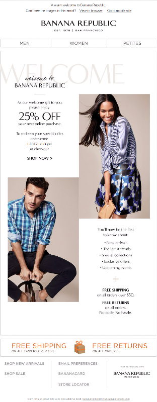
Few good things about this email
This welcome email surprises and delights with an offer that affirms the value of joining their list, and entices the recipient to shop at their online store. It’s very simple and direct with a single, but clear call to action.
The email gives recipients the option to update their preferences at the bottom of the email to ensure that the subscribers will get to hear exactly what they chose to receive.
Room for improvement
Landing in spam is a marketing fail. Encouraging subscribers to add you to their address book in the very first email they receive is very important. They should’ve utilized their pre-header space to do that.
Your CTA is the one thing which must stand out on the page to attract eye balls and encourage readers to click through. So, they should have used a high-contrast button instead of a link to make it stand out from the rest of the email.
Second email from the welcome series:
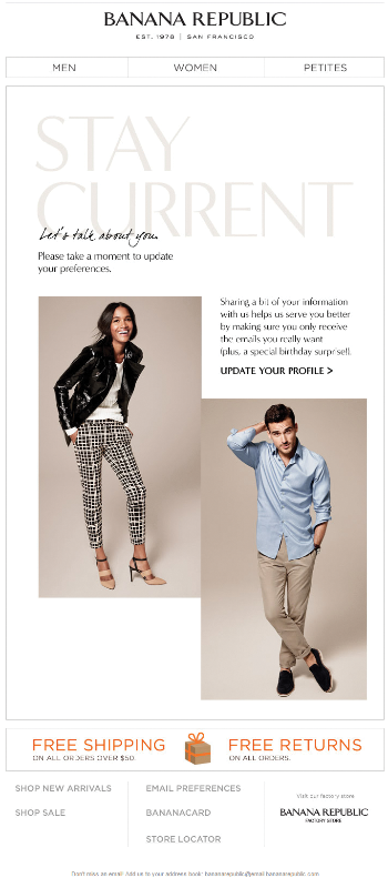
Subject line: We want to get to know you better.
Good things about this email
Personalization can certainly increase your conversions, and to personalize your emails you need data, but why should anyone share the information with you?
Well, they have clearly highlighted the benefit in the copy to make it easy for readers to understand what’s in it for them. In the whole message wherever you click, it takes you to update your preference page, which is a great way to motivate recipients to take action.
Also, loved their tag line – Let’s talk about you.
Room for improvement
Banana Republic provides an offer in this message (a special birthday surprise!), which may help readers to take action, but they haven’t highlighted it properly. Right now, it blends in with the copy. Ideally, they’d highlight this thing so the reader could easily see the benefit of updating their profile.
Third email from the welcome series:
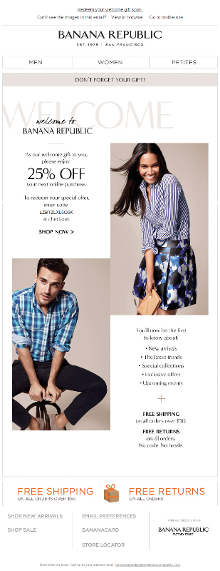
Subject line: Don’t let your welcome gift expire!
A few good things about this email
This email from Banana Republic is exactly the same as their first welcome message. The only thing they’ve changed is the subject line of the email which makes the purpose obvious. The main focus of the message is kept on the offer to encourage people to avail it.
This kind of email helps to grow your business by automatically reminding your existing subscribers about the offer they’ve not availed yet, and helps increase revenue from these subscribers by nudging them forward through the sales journey.
Room for improvement
Preaheader space is a valuable real estate especially in today’s world where more and more messages are getting opened on mobile devices and, they have literally wasted that space.
Though their subject line is good and has everything in it, from relevancy to urgency, but by utilizing the preheader space, they could instead have highlighted the discount.
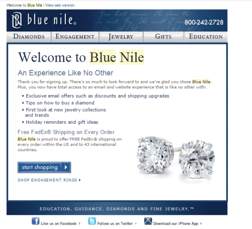
Subject line: Welcome to Blue Nile
Few good things about this email
I like this email because of its simplistic style and well-written copy which clearly highlights the benefits of joining their list. They have a clear call to action and have used a nice clear, contrasted button to deliver it.
Room for improvement
If you have free space, be sure to use it. They can improve this email by effectively utilizing their preheader space.
Second email from the welcome series:
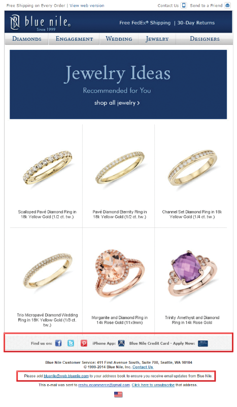
Subject line: Recommended Just for You – Take a Look
Few good things about this email
Blue Nile touts free shipping and 30 days free returns in the header of this email. Getting that information in front of the subscriber could help them take the next step. They’ve mentioned about the free shipping in the first email itself, but in this one they’ve highlighted it at the top of the email which is a better way to capture attention.
Instead of sending me random recommendations, they’ve done it on the basis of my browsing data to make it meaningful and relevant for me (as I have searched rings on their site and yes, the similar ones)
The primary CTA of the email “shop all jewelry” is perfect. Giving subscribers an option to browse other categories within the message, will encourage them to browse few more items that may be of interest directly from the email.
Lastly, they’ve included their social profile, app, and Blue Nile Credit Card links in the footer of the email, by including these secondary CTAs they’re giving their subscribers an opportunity to stay connected.
Room for improvement

According to Journal of Economic Perspectives, spam costs American consumers and firms nearly $20 billion each year. Include a request to whitelist your email address, in the welcome series. Doing so will increase the likelihood of new subscribers adding you to their address book.
Though they’ve asked subscribers to add them to their address book at the bottom of the email, but they should have utilized their preheader space to do that.
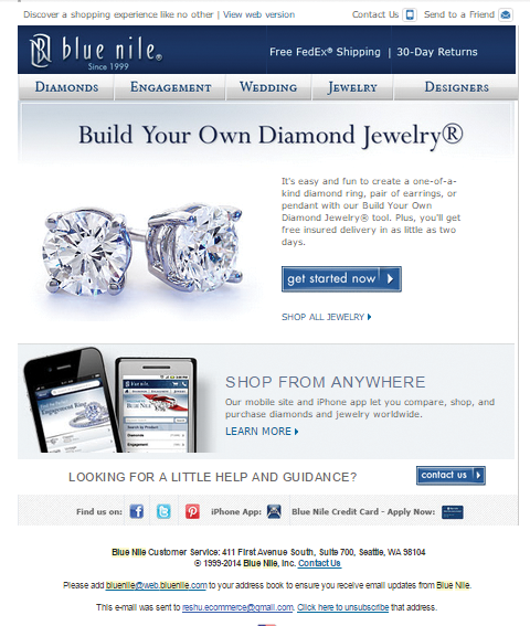
Subject line: It’s Easy to Find the Perfect Jewelry at Blue Nile
Few good things about this email
This email takes an unusual approach. Instead of asking subscribers to buy something or explore the new collection, it encourages them to create their own jewelry, which is a great way to encourage subscribers to buy from them without looking salesy at all.
Blue Nile also includes a “SHOP All JEWELRY” CTA within this email, making it easy for recipients to shop if they feel so. Perhaps the recipients may not want to create their own jewelry. Giving them an option to shop other jewelry is a good way to bring them back on the site even if they have no interest in creating custom jewelry.
Room for improvement
When it comes to utilizing their pre-header space, like all of their emails, this mail misses the mark too.
Fourth email from the welcome series:
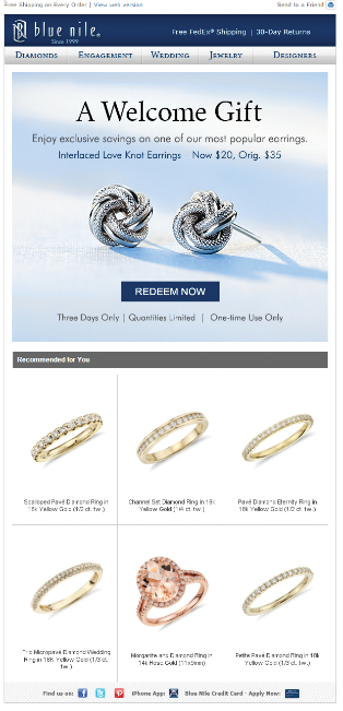
Subject line: A Blue Nile Welcome – $20 Earring Exclusive
Few good things about this email
New subscribers need extra motivation to make their first purchase, so giving them a welcome gift is a nice way to pull them towards taking that action.
The email is very simple and direct with just a single clear call to action button. But, at the same time they’ve included numerous clickable regions in the bottom half of the message to drive subscribers to their site to view more items, but in a clever manner.
Room for improvement
The purpose of this email is to create urgency as the offer stands valid for three days only, but they’ve not highlighted it properly except for the CTA, “Redeem Now.” Always make sure that if you are including urgency in your email, it isn’t lost in the copy.
Build on Your Welcome Email Step-by-Step
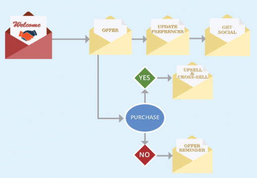
Just like building a new relationship in real life requires effort and frequent interaction, when it comes to building an online relationship, marketers forget this rule. Don’t just stop at giving new subscribers a warm welcome, take few more steps, and send a welcome series instead to increase your long-term engagement.
Read Next: How I grew my email subscribers from 0 to 5,000 in 6 months
Image credit: Shutterstock
Get the TNW newsletter
Get the most important tech news in your inbox each week.


