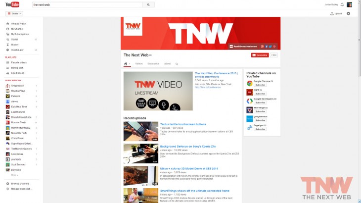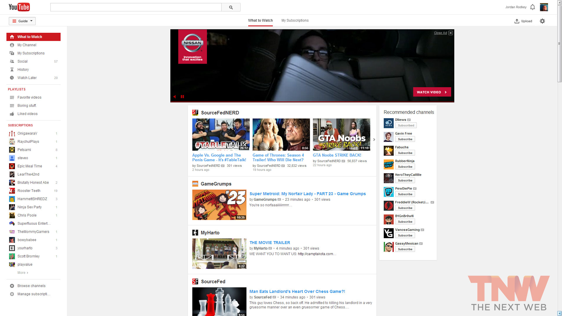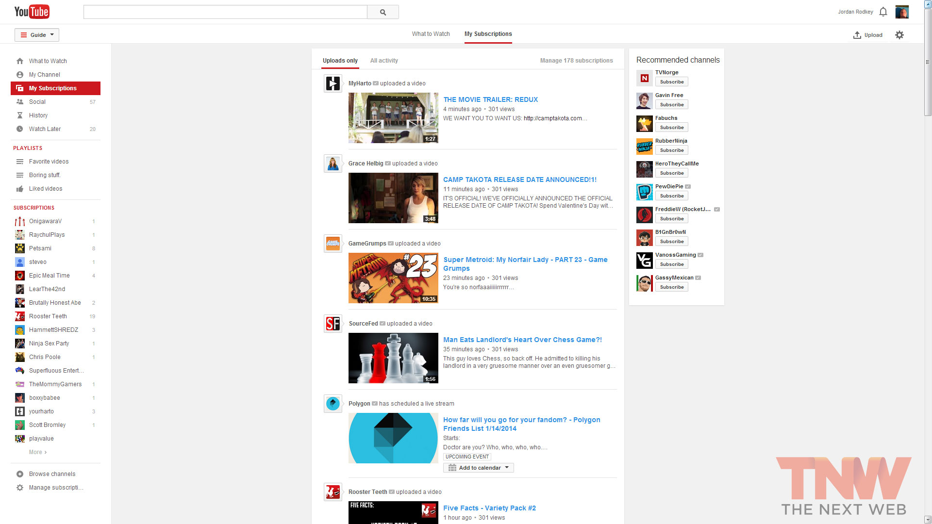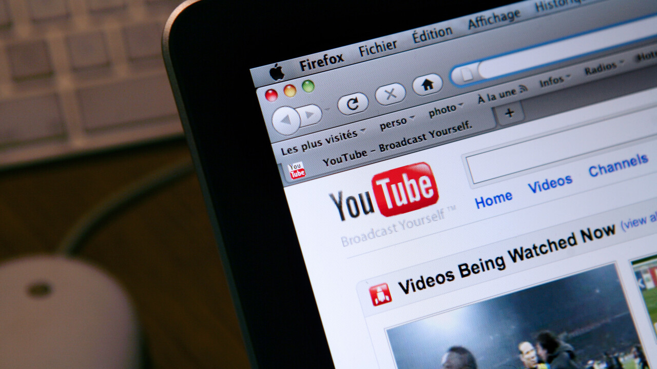
YouTube is in the process of testing out a new user interface, but while the company has made it available to a select few, there’s no word on when it will be rolled out to the public. As reported by Tech2Notify, the look and feel of YouTube appears to have been simplified and now is more on par with the service’s mobile apps, perhaps in an attempt to mirror the experience across all devices, no matter how videos are viewed.
A spokesperson confirmed this news and said in a statement: “With more videos coming to YouTube every minute, we’re always experimenting with ways to help people more easily find, watch and share the videos that matter most to them. We’ll consider rolling changes out more broadly based on feedback.”
Based on screenshots we’ve obtained, this is an aesthetic update to the social network. The focus is now firmly on the videos. In its current form, YouTube had a design with a few distractions — you didn’t know whether to look at the giant banner ad, the recommended channels list, or your subscriptions.
The new interface now hides the main navigation and subscriptions a compartment accessible by the “Guide” button. When you’re looking at a channel or your home screen, this new interface allows you to devote all your attention to the videos uploaded by the content creator.
Currently on YouTube, when you’re sorting through trending, recommended, or subscribed videos, it’s all bundled onto the same page. In the new design, these categories have been separated into two different screens. This makes it easier to flip through to see what’s hot on the video social network and what cool videos channels like The Next Web just posted.
As mentioned earlier, there’s no sign when this will be rolled out to the public — or even if it will see the light of day. Since it’s an experiment, YouTube could ultimately decide this isn’t in the best interest of its users and shutter the whole project.
This is the latest design update the company has made since June 2013 when it rolled out a redesigned “One Channel” layout to all of its users. As part of that effort, the initiative was geared towards helping content creators garner more subscribers, visits, and help with promotion.
YouTube’s move follows suit with what Twitter released earlier this week for its website that featured a refreshed look and feel that would match its iOS and Android apps.
Main photo credit: LOIC VENANCE/AFP/Getty Images
Image credits: Jordan Rodkey
Get the TNW newsletter
Get the most important tech news in your inbox each week.
