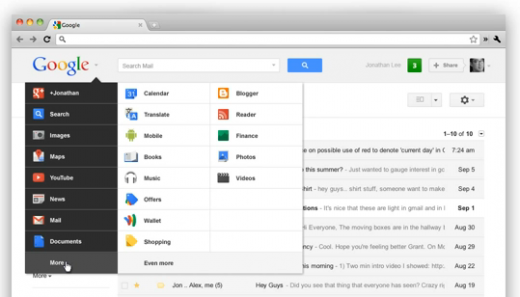
With the recent redesign of Google products across the board, we’ve been pretty happy overall. Many people, however, have expressed displeasure with that ever-present black bar at the top of their browser when they’re on a Google property. It seems, according to a leaked-then-pulled YouTube video, that it’s going away soon.
Right now, let’s say that you’re on Google+. You’ll see a bar that looks like this, going across the top of your screen:
While handy, it doesn’t quite do justice to the rest of the aesthetics of the new Google redesign, and it just feels a bit clunky and out of place. Soon, though, that’s going to change as Google introduces a new version of the Google Bar, complete with drop down menus and compressed navigation.
TNW reader Koen Peeters tipped us off to a video that he spotted on YouTube, which then quickly had its privacy settings changed. Fortunately, there’s another copy floating around and what could be coming soon is quite impressive.
So there you have it. Obviously we don’t know when the new bar is rolling out, but it’s a welcome change, for sure. In cast you’ve missed it, it’s not the first of sexy design changes for Google. Check out what the company did with the Google Search app for the iPad.
Get the TNW newsletter
Get the most important tech news in your inbox each week.


