The past 12 months has perhaps been one of the biggest years in the Guardian’s recent history.
Besides the Edward Snowden NSA revelation scoops that elevated the UK publication into the global consciousness, a unified .com brand was launched, pulling its international properties under one digital roof, and its website went on to smash the 100 million unique monthly visitors milestone back in March.
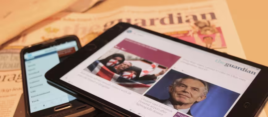
With that in mind, the Guardian is today rolling out completely redesigned native apps for Android and iOS, which sees the welcome mat laid out for iPad-optimized and Android tablet-optimized versions too (though these already exist for the Guardian’s Daily Edition app).
We take a quick peek under the hood to see what’s what with the Guardian’s overhauled app.
Getting personal
As you can see from the old version of the app (left) and today’s update (right), the single row has been abandoned for a multi-column layout that uses different-sized ‘cards’ to indicate a story’s significance.
The new layout better enables editors to curate stories according to their perceived importance, elbowing aside algorithms for the Guardian’s own “editorial voice” on the news agenda. Each ‘card’ contains a lot of meta data about a particular article, including what type of story it is (e.g. Comment piece), and the presentation adapts accordingly to the story-type.
But it also adapts to how important it is. “We’ve retooled the newsroom, so editors and journalists can now tell us that the Tony Blair story (for example) is more important right now, than the drug experts story further down,” explained Tom Grinsted, Group Product Manager at the Guardian, in an interview with The Next Web.
While the Guardian is clearly pinning a lot of importance on the authorial voice, vis-à-vis what stories are published, in what order, and how ‘significant’ it is, algorithms have a home here too. The sizing and article styling is informed based on all the data that’s being fed in. For example a feature story will have a full-width image at the top geared towards a lean-back experience, while a news article will have a more formal presentation.
Moreover, if you fire up the app on a different device, or flip your phone/table to landscape mode, the layout of the stories changes to suit the platform and orientation, but the key underlying data is still at play behind the scenes.
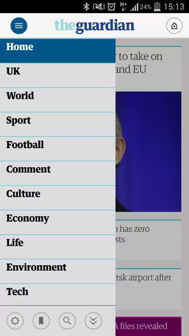
You’ll also notice that the main categories’ menu now slides out from the left, letting you jump directly to Sport, Football, UK, Tech, Environment and more. However, beyond consuming content, you will be fairly restricted with what you can do with the app without signing in (as is the case with the previous incarnation).
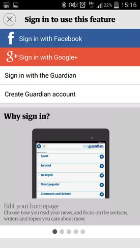
To edit and personalize your homepage, add favorites and more, you’ll have to sign in with Facebook, Google+, or use your Guardian credentials. A notable absence with this version is Twitter, which on the surface is a pretty surprising omission. The Guardian has its reasons for leaving it out, though, and we’re told that it had “not proved to be as popular” as the other sign in methods.
The new Guardian app really starts to shine post sign-in. While the existing version lets you select up to eight sections to appear on your homepage, now you can add as many as you like, and extends far beyond that of the pre-designated categories.
You can add (‘Follow’) your favorite journalists and columnists to your personal front page, as well as set personal alerts to notify you when they’ve published a new article.
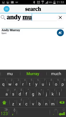
However, you can pretty much add any topic to your homepage using the search function, so long as the Guardian regards it as a ‘topic’. So, this could be your favorite football team, movie, tennis player – you name it.
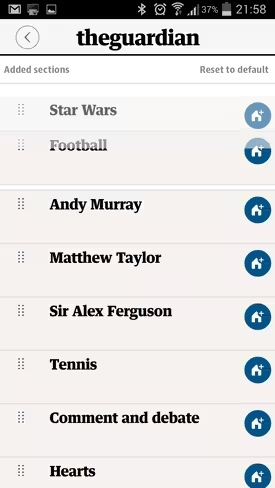
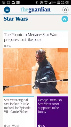
While a typical homepage with many publications may consist of ‘Sport’, ‘Entertainment’, ‘Politics’ and so on, the Guardian’s idea of personalization is pretty much exactly that – yours could be ‘Star Wars’, ‘Andy Murray’, ‘Sir Alex Ferguson’, ‘Comment and Debate’ or any permutation you can think of.
In settings, you can drag each category into your preferred order too, and if you want to revert to the Guardian’s default mode, well, you simply hit the ‘Reset to default’ button.
It’s worth adding here, however, that the main news at the top of the homepage is still the Guardian’s own selection of stories – you can’t change this. But if you scroll down just a little, you’ll start to see your own topics emerge into view.
Clearly, some topics aren’t really all that well suited to what is largely a ‘news’ app though. As you can see here, ‘Star Wars’ surfaces an article from the Guardian dating back to 1999. But it still helps to illustrate what’s possible.
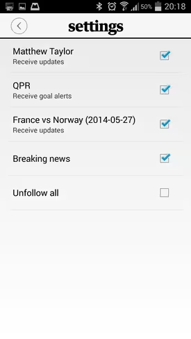
As we’ve noted briefly already, you can create alerts that let you follow your favorite journalists. You can do the same thing for live stories (e.g. election results), football games, tennis matches and so on too, in addition to following specific teams and receiving goal alerts automatically week-in, week-out. These can be switched on/off in Settings.
Offline mode works like a charm too. You can configure exactly what’s downloaded within settings, and everything that you can see on the homepage will be cached and be made available sans internet.
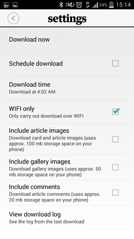 But with today’s update you’ll notice the offline caching is a lot speedier, and it’s a little more intelligent about what data it gets and when, while it also claims to keep the data for longer to give readers more time to catch up on the news.
Can I get a witness
You may remember the Guardian launched its GuardianWitness platform last year, which we said at the time opens up reporting to the masses through sourcing content from the public. Well, this is now coming to the main Guardian mobile app too.
Though the Guardian won’t be posting open assignments as such through the app as with the dedicated GuardianWitness Android and iOS apps, the broader platform integration does let users post relevant photos and videos directly from within the main app. Editors can choose to enable it for specific stories, and we’re told that the company is exploring more ways for users to interact with it in the future.
This should go some way towards encouraging more user-generated content, with the Guardian noting that this has been “built around the principles of open journalism.”
 Additionally, the updated apps now include all the content you’ll find on the website, and you’ll notice a much more visually-orientated offering this time around, including interactive features and data visualizations (which will become more apparent ahead of the football World Cup).
Road to launch
The apps have been a work-in-progress for the best part of a year now, with a team of more than 20 developers, designers, editorial staff and digital gurus working from the Guardian’s dedicated UX Studio, a testing space where they analyze how users interact with early iterations of products.
“The first thing we did was to create three wildly different prototypes for tablets, the idea being that not any one of them was going to go to market – but we wanted to see how far we could push the audiences in different directions,” explained Grinsted.
“So one of them was quite Twitter-esque, like a blended feed of content,” he added. “Another one was at the other end of the spectrum, with a much slower experience that was about aggregated stories. And the third was social, where we considered ‘what if the Guardian Voice took a back seat and your friends voices took a much more prominent role’?”
Those prototypes were tested on around 100 people in the lab over three days, but the later versions of the product were used by around 10,000 people during the beta program in the build up to today’s launch.
We’re also told there are interesting things on the horizon with the Guardian mobile app, with one possibility being geo-targetted requests for user-content using GuardianWitness. So, for example, if someone is at a music festival, or in the locale of a major incident, they could be asked to submit photos, videos or more.
The app remains free and ad-supported, and as before you can pay $3.99 (£2.49) a month to download and play puzzles, access premium content (e.g. hand-picked articles from the archives), and remove adverts.
The new Guardian mobile apps are available for Android 4.0 and iOS 7 now.
➤ Guardian: Google Play | App Store
Get the TNW newsletter
Get the most important tech news in your inbox each week.


