After snagging a video preview of the new Google design earlier today, we’ve just gotten wind that Google has decided to start rolling out the revamped Google Bar, according to the Official Google Blog.
According to the post, Google has a couple of focuses with the new change:
“We’re now ready for the next stage of our redesign—a new Google bar that will enable you to navigate quickly between our services, as well as share the right stuff with the right people easily on Google+. “
If you haven’t caught up with the new design just yet, never fear. Google tends to roll things out slowly, but steadily, and you should have it soon. For now, here’s what you’ll be seeing:
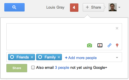
The support page for the new bar gives us a few more details, too. The bar is broken into 3 regions – the rollover-enabled logo, a search bar and then features and notifications on the right. Google makes a point of saying that, even if you’re not logged in to your Google account, you can still use the drop down on the Google logo to navigate to other services.
What’s especially interesting is the new right side, where you have a picture for your account management, but then immediately to the left you’ll see a +Share button, enabling one-click sharing any time that you’re on a Google site.

Get the TNW newsletter
Get the most important tech news in your inbox each week.


