YouTube might be getting a nifty facelift pretty soon. Google appears to be testing a new user interface for its video hosting platform that will make it much easier to browse for content while watching videos on your phone.
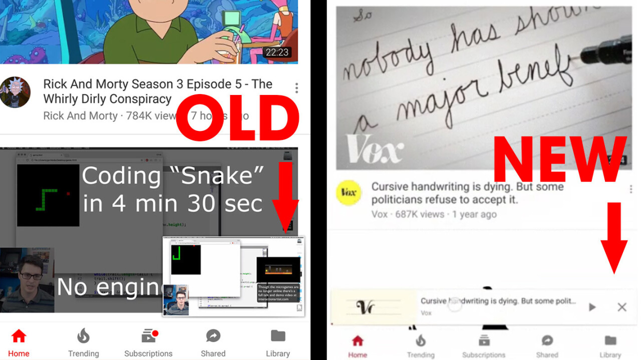
The current YouTube layout lets you minimize videos in the bottom so you can easily glance through other clips at the same time. While the feature is somewhat helpful, there’s not much else you can do with it now.
The new design seeks to amend this by giving users a little more control over playback. Anytime you minimize a video in the bottom, users will now see dedicated playback buttons next to the thumbnail. The new layout includes the standard ‘X’ button to close clips and a separate pause/play button.
In addition to the buttons, Google is now also displaying the title of the video next to the thumbnail.
The change was first spotted by Redditor Therexin who took to the Android subreddit to notify fellow users about the new feature.
The user has since shared a GIF that shows how the new design looks. Here it is:
As some users have already noted, the modification resembles the YouTube TV UI where Google has had dedicated playback buttons since at least 2013.
In case the new UI hasn’t yet landed on your phone, chances are that you simply weren’t included in the control group for the test.
As with other any other Google test, there’s no telling whether or when the feature will roll out to the official YouTube app.
Get the TNW newsletter
Get the most important tech news in your inbox each week.


