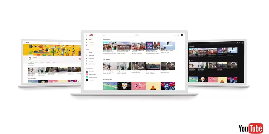
YouTube today announced it’s allowing everyone to preview its new site design — the cleaner, more minimalist version you never knew you wanted.
The site is far less cluttered than previous iterations and makes use of generous amounts of ever-so-appealing whitespace.
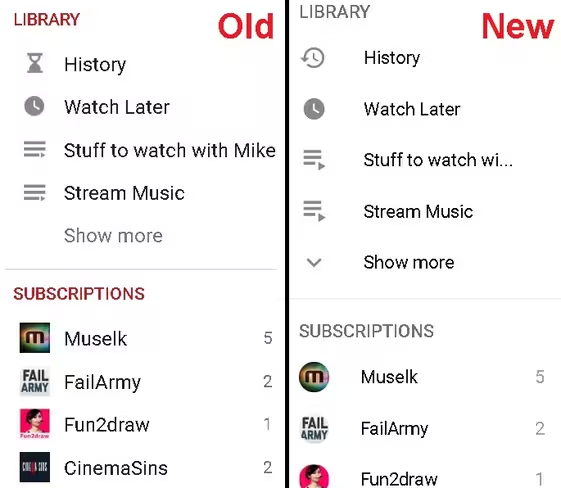
For visual comparison, here is my homepage menu bar from both versions of the site. Same homepage configuration, same browser, same monitor:
While you may not be able to use the redesigned site yet, you will be able to use the new Dark Theme, a black color-flip of the site identical to the secret Dark Mode discovered last month
You can preview the redesigned site here.
via Mashable
Get the TNW newsletter
Get the most important tech news in your inbox each week.
