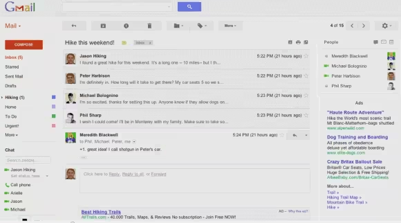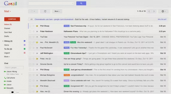
According to Google Operating System, Gmail, Google’s popular email system, is rolling out a facelift for the service.
Google took many years to lift the “beta” tag from Gmail, and has continued to iterate on the product via its “labs” section. Some of us have already been using the preview pane for a while, which will look very familiar to Microsoft Outlook and Apple Mail users.
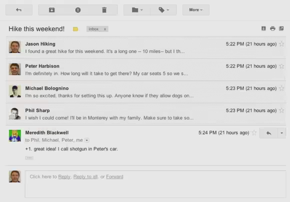
According to some people who already have access to the new default theme, text labels have been replaced with an action bar of icons, new interface for conversations, a better layout for all browsers in any size, and updated search box with advanced options.
Android 4.0 users will definitely recognize this new interface.
Some screenshots below show the simplifying of Gmail, which I’ve personally been using since it has launched.
The company has appeared to have posted a video about the new Gmail look on YouTube, but it is currently marked as private:
Google continues to slowly and methodically rollout changes to its products, rather than rush them. Vic Gundotra spoke yesterday about not wanting to rush Google+’s API’s, and would rather make sure the system is solid before bringing in third-party developers.
UPDATE: An awesome reader of ours, Michel, saved the video before it was gone and put it up on Vimeo.
Catch today’s latest Google news at TNW Google.
Get the TNW newsletter
Get the most important tech news in your inbox each week.
